 Skip to content
 Multi-step forms for landing pages break a long form into a series of small, easy steps, and that simple change can lift completions on forms that would otherwise scare people off. Instead of facing a wall of fields at once, the visitor answers one easy question, then another, building momentum toward the finish. This guide explains what multi-step forms are, why they convert, how to build one, and when to use them.
The psychology is powerful. A small first ask is easy to say yes to, and once someone starts, they want to finish what they began. By the time the harder fields appear, the visitor is already invested, so they push through instead of bailing.
Below, we cover what multi-step forms are, why they work, how to structure the steps, and the situations where they beat a single long form.
What a Multi-Step Form Is
A multi-step form splits a single form into multiple screens, each asking for a small piece of information. Rather than showing every field at once, it reveals them one step at a time, usually with a progress indicator showing how far along the visitor is.
It fits naturally into a strong landing page structure as the conversion engine. The same fields that feel daunting in one long block feel manageable when broken into bite-sized steps, which is exactly why this format can lift completions on your landing page forms.
Why Multi-Step Forms Convert
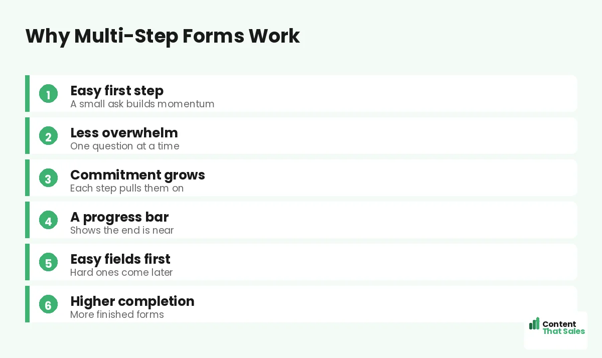
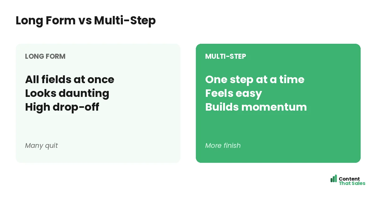
The big reason is reduced overwhelm. A long form looks like work and triggers people to quit before they start. A multi-step form shows just one or two fields at a time, so it always looks easy, no matter how many fields lie ahead.
There is also a commitment effect. Once a visitor answers the first easy question, they have started, and people like to finish what they begin. Each completed step increases their investment, pulling them toward the end of the form.
Start With an Easy First Step
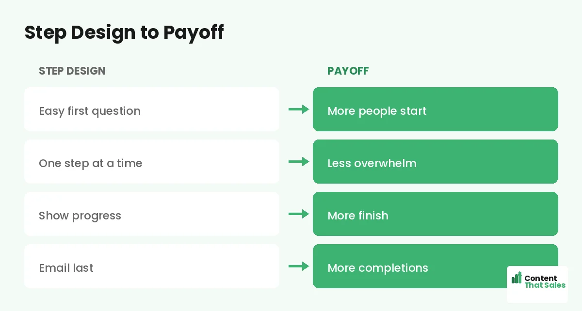
The first step should be the easiest, lowest-commitment question you have, ideally a simple choice with buttons rather than typing. An easy first step gets more people to start, and starting is the hardest part of any form.
For example, lead with a multiple-choice question about what they need. It feels effortless and engaging, like a quick quiz rather than a form. Once they tap that first answer, momentum carries them into the steps that follow.
Save the Hard Fields for Last
Put the higher-friction fields, like email and phone, near the end. By then the visitor has invested several steps and is far more likely to finish. Asking for contact details last, after they are committed, lifts completion on those crucial fields.
This order matters. If you demand an email on step one, you lose the people who would have warmed up over a few easy questions. Earn the commitment first, then ask for the contact details you actually need.
Show Progress
A progress bar or step counter reassures the visitor that the end is near. Seeing “step 2 of 3” tells them the form is short and finite, which encourages them to keep going. Without it, a multi-step form can feel endless and uncertain.
Progress indicators tap into our desire to complete things. As the bar fills, the pull to finish grows. Since readers scan more than they read, a clear visual of progress communicates instantly that they are almost done.
Keep Each Step Focused
Each step should ask for one thing, or a couple of closely related things, and no more. The whole point is to keep every screen light. Cramming several unrelated fields into one step defeats the purpose and brings back the overwhelm.
Clarity per step matters too. Use a clear question and obvious inputs so the visitor never hesitates. One focused, easy step at a time keeps the momentum going and the completion rate high all the way to the finish.
Did you know?
Putting the email field last in a multi-step form often lifts completions, because the visitor has already invested several steps and wants to finish.
When to Use a Multi-Step Form
Multi-step forms shine when you need more than a few fields. Quote requests, applications, bookings, and detailed sign-ups all benefit, which makes them powerful on a lead generation landing page. If a single-page version of your form looks long and intimidating, multi-step is likely the better choice.
They are less necessary when you only need an email. For a one-field opt-in, a simple form is fine. But the moment your form needs several fields, breaking it into steps can rescue the conversions a long form would lose.
Multi-Step vs a Short Single Form
If you can get away with one or two fields, a simple short form is often best, since fewer form fields beat more. Multi-step earns its keep when you genuinely need several fields and want to soften the impact of asking for them.
So the decision is not multi-step versus short, but multi-step versus a long single form. Whenever you would otherwise show a long, daunting form, steps almost always convert better. Match the format to how much you truly need to collect.
Avoid the Multi-Step Traps
Multi-step is not magic. Too many steps frustrate people, so keep the total short. A missing progress bar makes the form feel endless. And if early steps ask hard questions, you lose the easy-start advantage that makes the format work.
Also avoid splitting one or two fields into steps for no reason; that just adds clicks. Use multi-step to tame genuinely long forms, keep the steps few and focused, and always show progress. Misused, the format can hurt more than help.
Test Against Your Current Form
The only way to be sure is to test. Run your existing form against a multi-step version and compare completions and lead quality. Many businesses see a real lift from multi-step on longer forms, but your audience and offer decide the result.
Simple, clear copy keeps winning, since easy reading lifts conversions, and the same ease applies to form flow. Test, measure the full funnel, and let the data confirm whether multi-step is right for you.
Put It All Together
A multi-step form turns a long, daunting form into a series of small, easy steps: an effortless first question, focused steps, progress shown, and contact details saved for last. That flow reduces overwhelm and builds the momentum that lifts completions.
Use it when you truly need several fields, keep the steps few and clear, and test it against your current form. Done right, a multi-step form rescues the leads a long single form would lose, turning more visitors into completed conversions.
How Content That Sales Helps
We build forms that finish strong. That’s where we come in. At Content That Sales, we design landing pages with multi-step forms that reduce overwhelm and build momentum, so you capture detailed leads without scaring people off.
You share what you need to collect. We design a step flow that starts easy, shows progress, and saves the hard fields for last. The result is a longer form that still converts, turning more visitors into qualified leads.
Ready to Lift Your Form Completions?
Now you know how multi-step forms for landing pages reduce overwhelm and build momentum to lift completions on longer forms. An easy first step pulls people in. So why let a long, daunting form lose the leads you worked to earn?
Let’s build a multi-step form that converts. Book your free consultation now. Call us at 8801631988589 or email service@contentthatsales.com. Let’s turn your next visitor into your next lead.
Frequently Asked Questions About Multi-Step Forms
What is a multi-step form?
A form split into several small screens, each asking for a little information, usually with a progress indicator, instead of showing every field at once.
Why do multi-step forms convert better?
They reduce overwhelm by showing one easy step at a time, and they use commitment: once a visitor starts, they want to finish what they began.
What should the first step be?
The easiest, lowest-commitment question, ideally a simple choice with buttons. An easy first step gets more people to start, which is the hardest part.
Where should the email field go?
Near the end. By then the visitor has invested several steps and is far more likely to finish, which lifts completion on contact fields.
Do I need a progress bar?
Yes. It reassures the visitor the end is near and taps the desire to complete things. Without it, a multi-step form can feel endless.
When should I use a multi-step form?
When you need more than a few fields, like quotes, applications, or bookings. If a single-page form looks long and intimidating, use multi-step.
Is multi-step always better?
No. For one or two fields, a short single form is best. Multi-step beats a long single form, not a genuinely short one.
Can Content That Sales help?
Yes. We design multi-step forms that reduce overwhelm and lift completions on longer forms. Reach out for a quick quote.