 Skip to content
 This lead generation landing pages guide walks you through every section of a page built to turn visitors into leads, the offer, the form, the proof, and the CTA, so you can capture more signups from the traffic you already have. A lead gen page has one job: collect a contact in exchange for value. Get the structure right and your conversion rate climbs. This guide covers what these pages do, the core sections, how to lift opt-ins, and the mistakes to avoid.
Lead generation is the engine of most businesses, and the landing page is where it runs. Send traffic to a focused page with a clear offer and an easy form, and you build a pipeline. Send it to a cluttered page, and you leak the leads you paid to attract.
Below, we cover the purpose of lead gen pages, the sections every one needs, the levers that lift opt-ins, and the common errors that cost you leads.
What a Lead Gen Page Does
A lead generation page exists to capture a contact, usually an email, in exchange for something valuable. That might be a guide, a quote, a consultation, or a demo. Everything on the page serves that single goal, with no competing distractions.
Unlike a sales page that closes a purchase, a lead gen page starts a relationship. It follows a focused landing page structure, trading value for contact details so you can nurture the lead toward a sale over time.
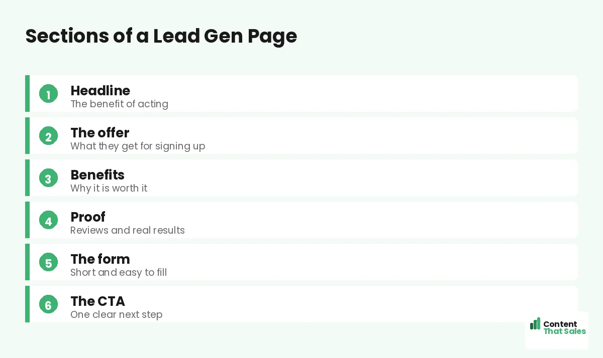
Section 1: The Headline
The headline promises the benefit of acting. It should make the value of your offer instantly clear, focusing on what the visitor gains, not what you do. This is the first thing they read and the biggest factor in whether they stay.
Lead with the outcome. “Get a free marketing plan in 24 hours” beats “Sign up for our service.” A benefit-led headline pulls in the right people and sets up the rest of the page to convert them into leads.
Section 2: The Offer
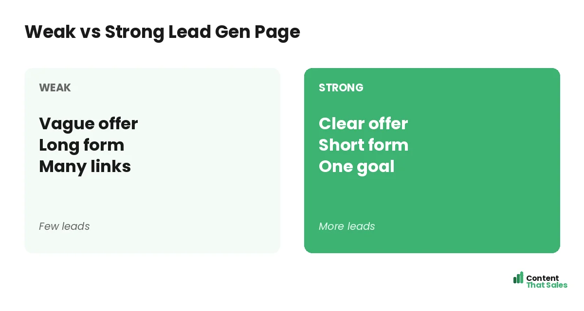
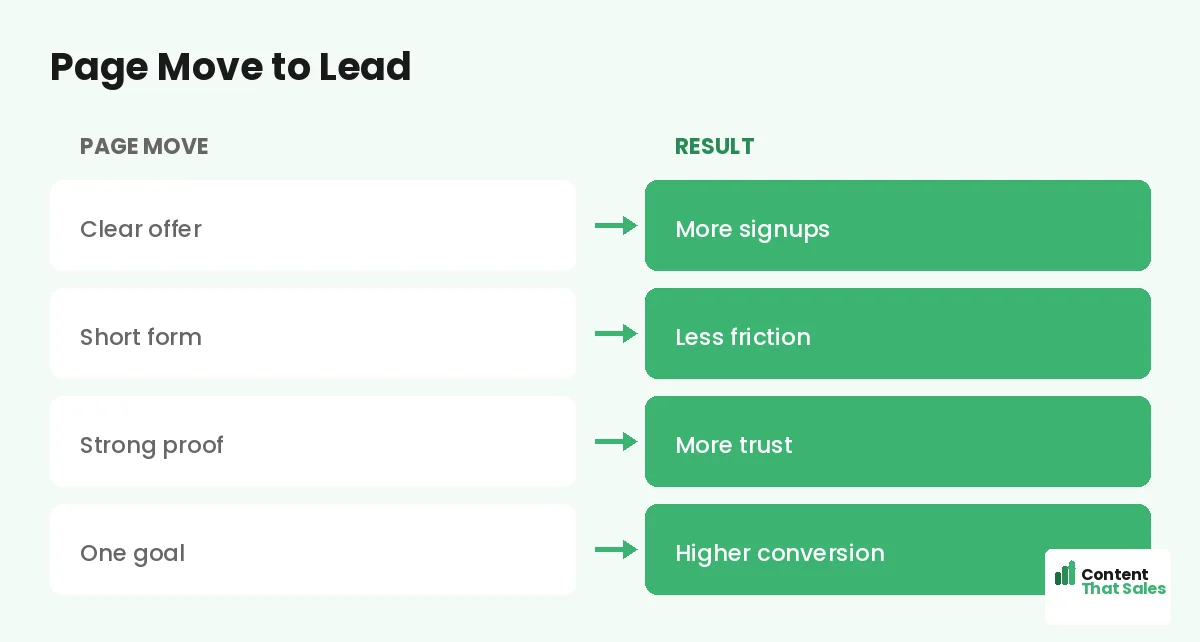
The offer is the heart of a lead gen page. It is what the visitor gets for handing over their contact. Make it specific, valuable, and relevant to your audience. A weak or vague offer is the most common reason these pages underperform.
Spell out exactly what they receive and why it helps. The stronger and clearer the offer, the easier the trade feels. A great offer can carry a simple page, while a poor offer sinks even a beautifully designed one.
Section 3: The Benefits
Below the offer, list the benefits, the reasons the visitor should want it. Frame each as a clear win, not a feature. This section builds the desire that makes someone willing to give up their email or pick up the phone.
Keep benefits short and scannable. Since readers scan more than they read, use bullet-style lines that each promise a result. A few strong, specific benefits convince far better than a long, vague paragraph.
Section 4: The Proof
Proof turns interest into trust. Add testimonials, reviews, client logos, a signup count, or results. Place your strongest proof near the form, where the visitor hesitates. Proof reassures them the offer is real and worth their contact.
Specific proof works best. “Joined by 5,000 marketers” beats “trusted by many.” When a visitor sees that others have taken the same step and benefited, their own decision to sign up becomes much easier to make.
Section 5: The Form
The form is where the lead is captured, so keep it short. Ask only for what you truly need, often just an email. Every extra field lowers completion. A clean, simple landing page form is one of the biggest levers on your opt-in rate.
Use clear labels and a button that restates the value. The form should feel effortless. You can learn more about each lead later, so resist the urge to ask for everything up front and watch your completions rise.
Did you know?
Cutting even one or two fields from a lead gen form can noticeably lift completions, because every extra field gives the visitor another reason to pause.
Section 6: The Call to Action
The CTA asks for the signup with one clear, benefit-led button. The label should restate what they get, not say submit. Make it stand out and repeat it where it helps, so a ready visitor never has to search for the next step.
Follow solid landing page CTA best practices. One focused action, stated clearly, converts far better than vague or competing buttons. The CTA is the moment the visitor becomes a lead, so make it easy and obvious.
How to Lift Your Opt-Ins
To raise conversions, strengthen the offer first, then shorten the form, add stronger proof, and sharpen the headline. Remove distractions like menus and extra links so the page has one clear path. Each change compounds into a higher opt-in rate.
A ready lead magnet landing page template gives you a proven structure to start from. Test one change at a time, keep what lifts opt-ins, and your lead gen page steadily gets better at filling your pipeline.
Keep One Goal
The fastest way to ruin a lead gen page is to give it more than one job. Remove the navigation menu, social icons, and links that pull focus. Every extra option splits attention and lowers the chance the visitor completes your one goal.
A focused page guides every visitor toward the same action: filling the form. One offer, one form, one CTA. The discipline of a single goal is what makes lead gen pages convert far better than a busy homepage ever could.
Common Lead Gen Mistakes
The biggest mistakes are a weak offer, a long form, a vague headline, and a cluttered page with many links. Others include hiding proof, burying the CTA, and asking for too much information before any trust is built.
Each of these leaks leads. Fix them one by one: sharpen the offer, trim the form, clarify the headline, and strip the distractions. Most lead gen pages improve dramatically just by removing what does not serve the single goal.
Put It All Together
A strong lead generation page pairs a benefit headline, a clear offer, persuasive benefits, solid proof, a short form, and one focused CTA. Keep a single goal, remove distractions, and the page turns visitors into leads at a far higher rate.
Simple, clear copy keeps winning, since easy reading lifts conversions. Build the page around one offer and one action, test and refine, and your lead gen page becomes a reliable engine for new business.
How Content That Sales Helps
We build lead gen pages that fill your pipeline. That’s where we come in. At Content That Sales, we write focused landing pages with a clear offer, a short form, and copy that turns visitors into leads.
You share your offer and audience. We write the headline, benefits, and CTA that lift your opt-ins, with one goal and no distractions. The result is a page built to capture more leads from the traffic you already have.
Ready to Capture More Leads?
Now you have a full lead generation landing pages guide: a benefit headline, a strong offer, clear benefits, solid proof, a short form, and one focused CTA. The structure is proven. So why let a cluttered page leak the leads you paid for?
Let’s build a page that fills your pipeline. Book your free consultation now. Call us at 8801631988589 or email service@contentthatsales.com. Let’s turn your next visitor into your next lead.
Frequently Asked Questions About Lead Generation Landing Pages
What is a lead generation landing page?
A focused page built to capture a contact, usually an email, in exchange for value like a guide, quote, or consultation. Everything serves that one goal.
What sections does it need?
A benefit headline, a clear offer, persuasive benefits, strong proof, a short form, and one focused CTA, all pointing toward a single action.
What is the most important element?
The offer. It is what the visitor gets for their contact. A weak or vague offer is the most common reason lead gen pages underperform.
How long should the form be?
As short as possible, often just an email. Every extra field lowers completion. Capture the essentials now and learn more about the lead later.
How do I lift my opt-ins?
Strengthen the offer, shorten the form, add stronger proof, sharpen the headline, and remove distractions so the page has one clear path.
Why keep only one goal?
Extra menus and links split attention and lower conversions. One offer, one form, one CTA guides every visitor toward the same action.
What are the common mistakes?
A weak offer, a long form, a vague headline, a cluttered page, hidden proof, and asking for too much information before any trust is built.
Can Content That Sales help?
Yes. We write focused lead gen pages with a clear offer and short form that turn visitors into leads. Reach out for a quick quote.