 Skip to content
 Landing page forms are where the conversion actually happens, and a poorly designed form can quietly kill an otherwise great page by making visitors give up before they finish. The form is the final step between an interested visitor and a captured lead, so every field, label, and button matters. This guide shows you why forms matter so much, how to design for completion, and the changes that reduce friction and lift your signups.
You can have a perfect headline, strong proof, and a tempting offer, but if the form feels like work, people abandon it. The form is the last hurdle, and the easier you make it to clear, the more leads you keep. Small form tweaks often produce big conversion gains.
Below, we cover what makes a form convert, how to cut friction, the role of trust signals, and the mistakes that cause abandonment.
Why the Form Makes or Breaks the Page
The form is the conversion point. Everything before it builds desire; the form captures it. If the form is long, confusing, or untrustworthy, all that built-up interest leaks away at the final step. The form deserves as much care as the headline.
A great form fits naturally into a strong landing page structure, feeling like an easy next step rather than a wall. When the form is smooth and simple, the visitor glides from interest to action without friction or second thoughts.
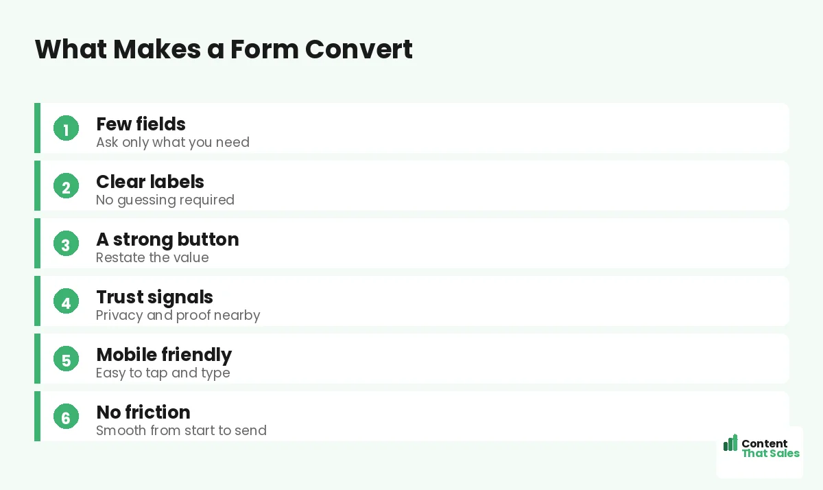
Ask for Only What You Need
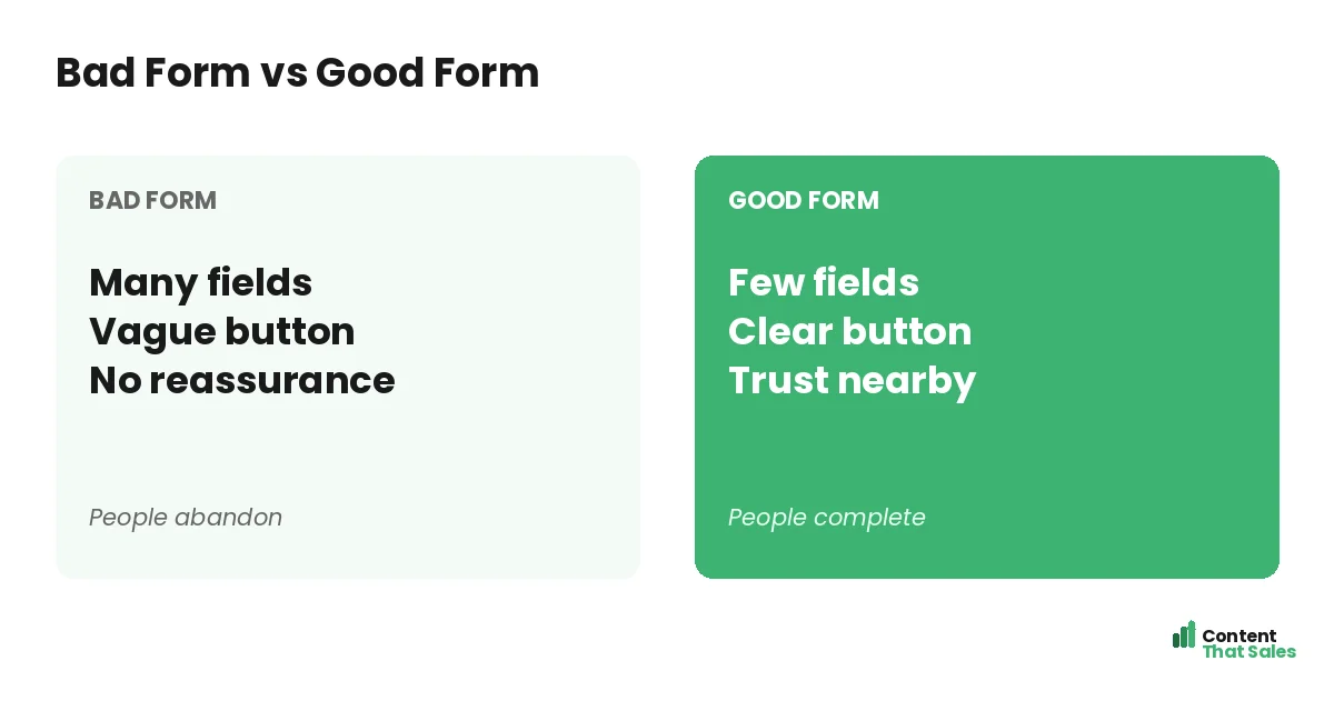
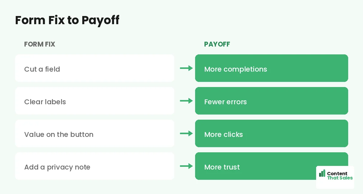
The single biggest lever on form conversion is the number of fields. Each one adds effort and a reason to quit. Ask only for what you truly need right now, often just an email. You can gather more later, once the relationship has started.
Before adding a field, ask whether you really need it to take the next step. If not, cut it. A short form almost always converts better than a long one, so default to fewer fields and earn the right to ask for more over time.
Use Clear, Simple Labels
Every field should be obvious. Use clear labels so the visitor never has to guess what to enter. Confusing or missing labels cause hesitation and errors, both of which lead to abandonment. Clarity keeps the visitor moving smoothly through the form.
Avoid jargon and keep labels short. If a field needs explanation, add a tiny hint. The less the visitor has to think, the more likely they finish. A form should feel effortless, and clear labels are a big part of that ease.
Write a Strong Button
The submit button is prime real estate. Do not waste it on the word “submit.” Use a button that restates the value, like “Send me the guide” or “Get my free quote.” A benefit-led button gives one last nudge to complete the form.
Make the button big, high-contrast, and easy to tap. It should be the clear next action. Following solid landing page CTA best practices, a strong button turns a filled-in form into a finished conversion.
Add Trust Signals Near the Form
Visitors hesitate right at the form, so reassure them there. A short privacy note like “We never share your email,” a security badge, or a line of proof beside the form lowers anxiety at the exact moment doubt peaks.
This is also where social proof works hard. A small testimonial or a signup count next to the form reminds the visitor that others took this step safely. Trust signals placed at the form turn last-second hesitation into completion.
Make It Mobile Friendly
Many visitors fill forms on a phone, so the form must work beautifully on mobile. Fields should be easy to tap, the keyboard should match the input, and nothing should require zooming. A clunky mobile form loses a huge share of signups.
Test the form on a real phone. Since readers scan more than they read, a mobile form must be instantly usable. If typing or tapping is awkward, mobile visitors quit, and that is most of your traffic.
Did you know?
Most form abandonment happens because the form feels too long or too risky, so cutting fields and adding a privacy note often lifts completions right away.
Reduce Friction Everywhere
Friction is anything that makes the form harder than it needs to be. Too many fields, unclear errors, a slow load, or a confusing layout all add it. Hunt down and remove every bit of friction between the visitor and the finished form.
Helpful touches reduce friction too: inline validation that catches errors gently, autofill support, and a logical field order. The smoother the experience, the more people finish. Every small friction you remove is a few more leads you keep.
Handle Errors Gracefully
Nothing kills a form faster than confusing errors. If a visitor makes a mistake, show a clear, friendly message right at the field, explaining how to fix it. Never make them guess what went wrong or refill the whole form from scratch.
Good error handling keeps a frustrated visitor in the flow instead of bouncing. Validate as they go where you can, and keep their entries when something fails. Gentle, clear error handling rescues conversions that a clumsy form would lose.
Consider a Multi-Step Form
If you need several fields, a multi-step form can convert better than one long one. Breaking the form into small steps makes it feel easier and builds momentum as the visitor progresses. An easy first question gets them started.
This approach suits longer forms, like quotes or applications. A multi-step form turns a daunting wall of fields into a series of small, manageable asks, which often lifts completion on forms that would otherwise scare people off.
Match Form Length to the Offer
The right form length depends on the offer and your goal. A free newsletter warrants just an email. A high-value quote or demo can justify a few more fields, since the visitor expects to share more for something valuable.
Balance lead quantity against quality. More fields mean fewer but often better-qualified leads. Decide what your sales process needs, then ask for the minimum that serves it, the same way you choose your landing page form fields. The form should match the value of what you are offering in return.
Put It All Together
A converting form asks for only what you need, uses clear labels, has a benefit-led button, shows trust signals, works on mobile, and handles errors gracefully. Strip the friction and the form becomes an easy final step, not a barrier.
Simple, clear copy keeps winning, since easy reading lifts conversions, and the same goes for forms. Test one change at a time, watch completions rise, and your form turns more of your hard-won visitors into leads.
How Content That Sales Helps
We design forms that finish the job. That’s where we come in. At Content That Sales, we craft landing pages with forms built for completion, the right fields, clear copy, and trust signals that turn interest into leads.
You share your offer and what you need to capture. We build a page and form that reduce friction and lift signups. The result is a smooth final step that converts more of your visitors instead of losing them at the form.
Ready to Lift Your Form Completions?
Now you know how landing page forms make or break conversions, and how to design for completion with fewer fields, clear labels, trust signals, and graceful error handling. The form is the final step. So why let it cost you the leads you earned?
Let’s build a form that converts your traffic. Book your free consultation now. Call us at 8801631988589 or email service@contentthatsales.com. Let’s turn your next visitor into your next lead.
Frequently Asked Questions About Landing Page Forms
Why do landing page forms matter so much?
The form is the conversion point. Everything before it builds interest; the form captures it. A long or confusing form leaks that interest at the final step.
How many fields should a form have?
As few as possible, often just an email. Each field adds effort and a reason to quit. Ask only for what you need now and gather more later.
What should the button say?
Restate the value, like send me the guide or get my free quote, not submit. A benefit-led button gives one last nudge to complete the form.
How do I reduce form anxiety?
Add trust signals near the form, like a privacy note, a security badge, or a short testimonial, placed right where the visitor hesitates.
Does mobile form design matter?
A lot. Most forms are filled on phones. Fields must be easy to tap, the keyboard should match the input, and nothing should require zooming.
When should I use a multi-step form?
When you need several fields. Breaking the form into small steps feels easier and builds momentum, often lifting completion on longer forms.
How should I handle errors?
Show a clear, friendly message at the field, keep the visitor’s entries, and never make them refill the whole form. Gentle error handling saves conversions.
Can Content That Sales help?
Yes. We design pages with forms built for completion, the right fields, clear copy, and trust signals that lift signups. Reach out for a quick quote.