 Skip to content
 Visual hierarchy in landing page copy is how you format words so the eye knows what to read first, next, and last. It is the difference between a page people scan with ease and a wall of text they abandon. Strong copy is honestly only half of the real job here. If it looks like a dense brick, most visitors never read it. This guide shows you how to shape your words so they get read and act on.
Here is the hard truth. People do not read landing pages line by line. They scan. They hunt for bold words, headings, and short lines that promise a quick answer. Visual hierarchy feeds that habit. Format your copy for scanners, and you keep them moving toward the button.
Below, we cover the tools that create visual hierarchy in copy, how to use each one, and the mistakes that bury your best lines. By the end, your copy will look as good as it reads, and far more of it will actually get read.
What Visual Hierarchy in Copy Means
Visual hierarchy in copy is the look of your words, not just their meaning. It covers headings, bold text, paragraph length, bullets, and spacing. These choices tell the eye what matters before the reader reads a thing.
It works hand in hand with overall landing page hierarchy. Page hierarchy ranks the big sections. Copy hierarchy ranks the words inside them. Both guide the eye, just at different zoom levels. Think of page hierarchy as the map of a city and copy hierarchy as the street signs. You need both to reach the destination without getting lost or frustrated along the way.
Why Scannability Decides Whether Copy Gets Read
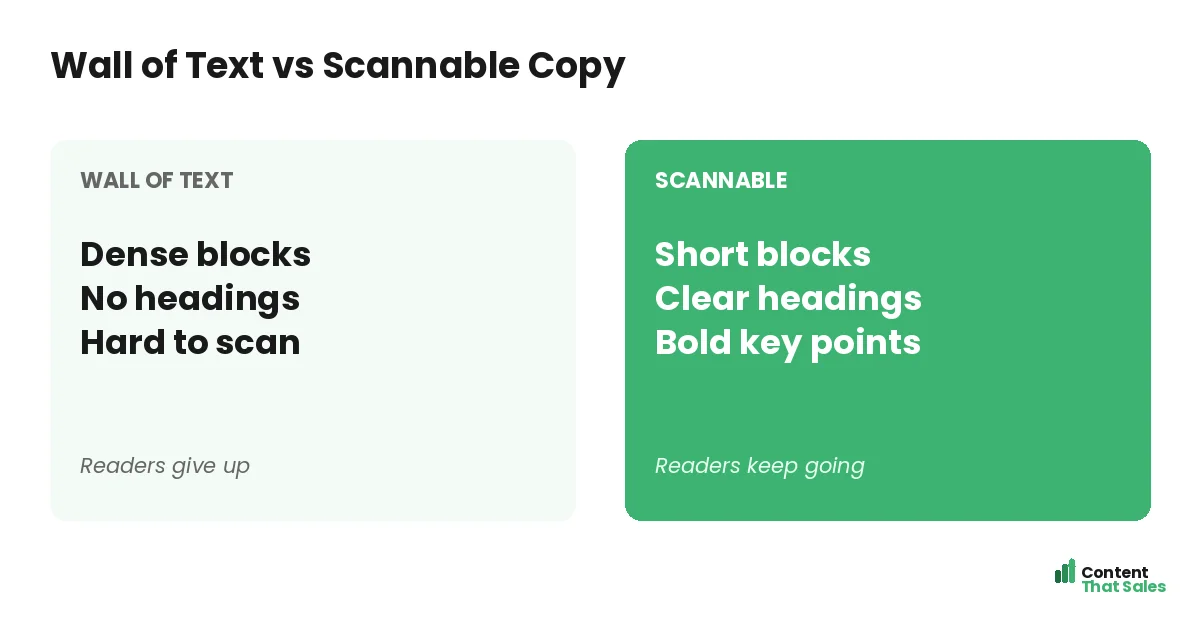
Most visitors skim first and read second. They glance for cues that say “this is worth my time.” If they see a dense block, they assume effort and leave. If they see clear chunks, they dive in.
This is not laziness. It is how people read online. People scan more than they read, often in an F-shaped path. Format for that path, and your copy gets a real chance to work.
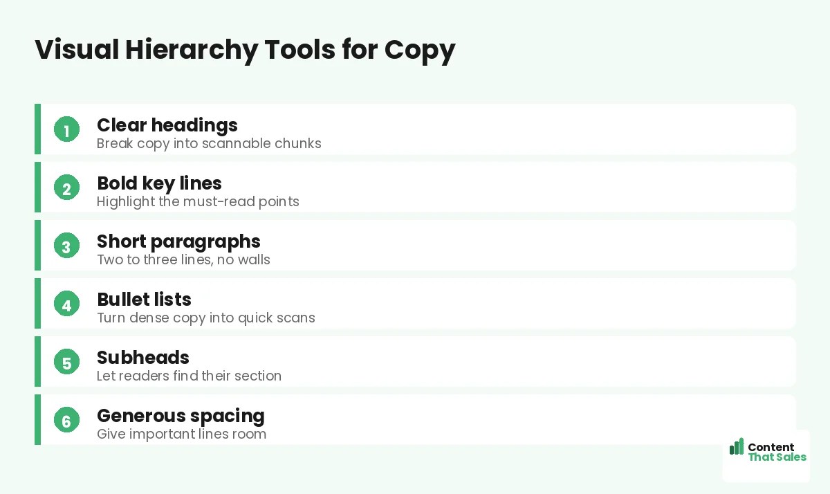
Use Headings to Break Up the Page
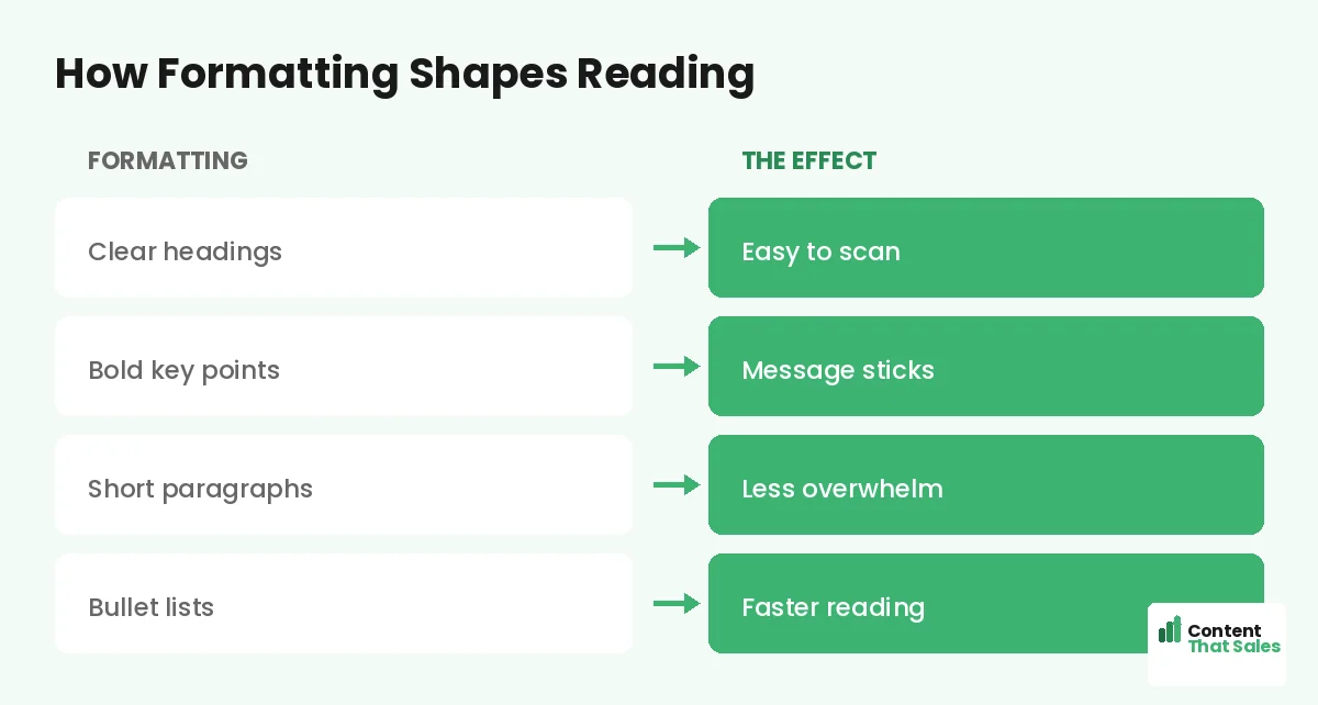
Headings are signposts. They let a scanner jump to the part they care about. Each heading should make a mini-promise, so even someone who reads only the headings still gets the message.
Write headings like little headlines, not labels. “Why most pages fail” beats “Section three.” Clear, benefit-led headings pull the reader down the page. They turn a long page into an easy scan. This matters most at the top, where your above-the-fold strategy and a clear first heading decide whether anyone scrolls at all.
Bold the Lines That Must Be Seen
Bold text is a spotlight. A scanner’s eye snags on it. So bold the one or two lines in each section that carry the key point. If they read only the bold bits, they should still get the gist.
But use it with care. Bold everything and you bold nothing. A few strong accents guide the eye. A page full of bold just looks loud and confusing. Restraint is what makes the spotlight work.
Keep Paragraphs Short and Light
Long paragraphs scare scanners. A block of six lines feels like work before a word is read. Short paragraphs of two or three lines feel easy. They invite the reader in instead of pushing them away.
Break ideas into small chunks. One idea per paragraph keeps each one light. White space between them gives the eye room to rest. The page feels faster, even when the word count is the same. That feeling matters, because a reader who senses an easy read keeps going, while one who senses a chore quietly clicks away.
Did you know?
Readers often decide to skip a paragraph based on its first few words. Front-load the key idea so scanners catch it before they move on.
Turn Dense Copy Into Bullet Lists
Bullets are a scanner’s best friend. They turn a crowded sentence into a quick, clean list. Use them for features, steps, or benefits. The eye reads a tidy list far faster than a packed paragraph.
Keep bullets parallel and short. Start each with a strong word. Do not hide a key benefit inside a long block when a bullet would make it pop. A good list can carry the most important part of your pitch. Just avoid turning the whole page into bullets. Lists work because they contrast with the prose around them, so they lose their power if everything becomes a bullet point.
Let Spacing Create Calm and Focus
Space is part of your copy’s look. Crowded text feels stressful. Roomy text feels calm and clear. Add space between paragraphs, around headings, and especially around your call to action.
A button with space around it feels like the obvious next step. A line with room to breathe feels important. Do not fear the gaps. They are not empty. They are doing the quiet work of focus, steering tired eyes toward the lines and the button you most want them to notice.
Match Word Order to Visual Order
Visual hierarchy and word choice should agree. Put the key idea in the first few words of a line, where scanners look. Lead headings and bullets with the benefit, not the setup. Front-load everything that matters.
This is where copy and design meet. To write with that order baked in, see how to write landing page copy that converts. Strong word order makes your formatting twice as powerful.
Common Visual Hierarchy Mistakes in Copy
A few slips bury good writing. Long paragraphs with no breaks. No headings to guide the scan. Bold used on everything or nothing. Bullets crammed with full paragraphs. Each one hides the message.
The fix is simple formatting, and easy reading lifts conversions on top. Short blocks. Clear headings. A few bold lines. Clean lists. The same words, formatted well, can convert far more readers.
How Content That Sales Formats Copy to Convert
Great copy deserves a great look. That’s where we come in. At Content That Sales, we write and format every page so it reads easily and scans fast. The message lands whether people skim or dive deep.
You share the offer and the goal. We craft the headings, the bold lines, and the lists that guide the eye. If you want done-for-you landing page copy, we make it effortless. The result is copy that looks as sharp as it sounds.
Ready to Turn Visitors Into Customers?
Now you know how visual hierarchy in landing page copy gets your words read. Clear headings. Bold key lines. Short paragraphs. Clean bullets. Room to breathe. So why let a wall of text bury your best pitch?
Let’s format your copy so every reader follows it with ease. Book your free consultation now. Call us at 8801631988589 or email service@contentthatsales.com. Let’s turn your next visitor into your next customer.
Frequently Asked Questions About Visual Hierarchy in Copy
What is visual hierarchy in landing page copy?
It is how you format words, with headings, bold text, short paragraphs, bullets, and spacing, so the eye knows what to read first. It makes copy easy to scan and act on.
Why does scannability matter so much?
Most visitors skim before they read. If your copy looks dense, they assume effort and leave. Scannable formatting invites them in and keeps them moving.
How long should paragraphs be?
Two or three lines is ideal. Short paragraphs feel light and easy, while long blocks feel like work and push scanners away.
Should I use bold text in landing page copy?
Yes, but sparingly. Bold the one or two key lines per section. If everything is bold, nothing stands out and the spotlight is lost.
When should I use bullet lists?
For features, steps, or benefits. Bullets turn dense sentences into quick scans, so the most important points pop for skimming readers.
How does white space help copy?
Space creates calm and focus. Room around headings, paragraphs, and the CTA signals importance and makes the page feel faster to read.
Is visual hierarchy the same as page hierarchy?
They work together. Page hierarchy ranks big sections, while copy hierarchy ranks the words inside them. Both guide the eye toward the action.
Can you format my landing page copy?
Yes. Content That Sales writes and formats copy so it reads and scans well. Reach out for a quick quote.