 Skip to content
 Landing page hierarchy is the art of ranking your page so the reader’s eye lands on the right things in the right order. Done well, hierarchy leads a visitor from the headline to the button without a single moment of confusion. Done poorly, everything competes, the eye wanders, and people leave. This guide shows you how to build a clear hierarchy that quietly steers every reader toward your one goal.
Most people do not read a page so much as scan it. Their eyes jump to whatever stands out. Hierarchy decides what stands out. So when you control the hierarchy, you control the journey. That is real power on a landing page.
Below, we cover what hierarchy is, the tools that create it, and how to use them to lead the reader. By the end, your page will guide the eye like a clear set of road signs.
What Landing Page Hierarchy Means
Hierarchy is the order of importance you give to elements on the page. The headline matters most, so it looks biggest. A detail matters less, so it sits smaller and quieter. The design shows the reader what to read first, second, and last.
This is not just about looks. It is about meaning. A clear hierarchy tells a story at a glance. The eye follows the ranking you set, and the message lands in the right order, every time.
Why Hierarchy Drives Conversions
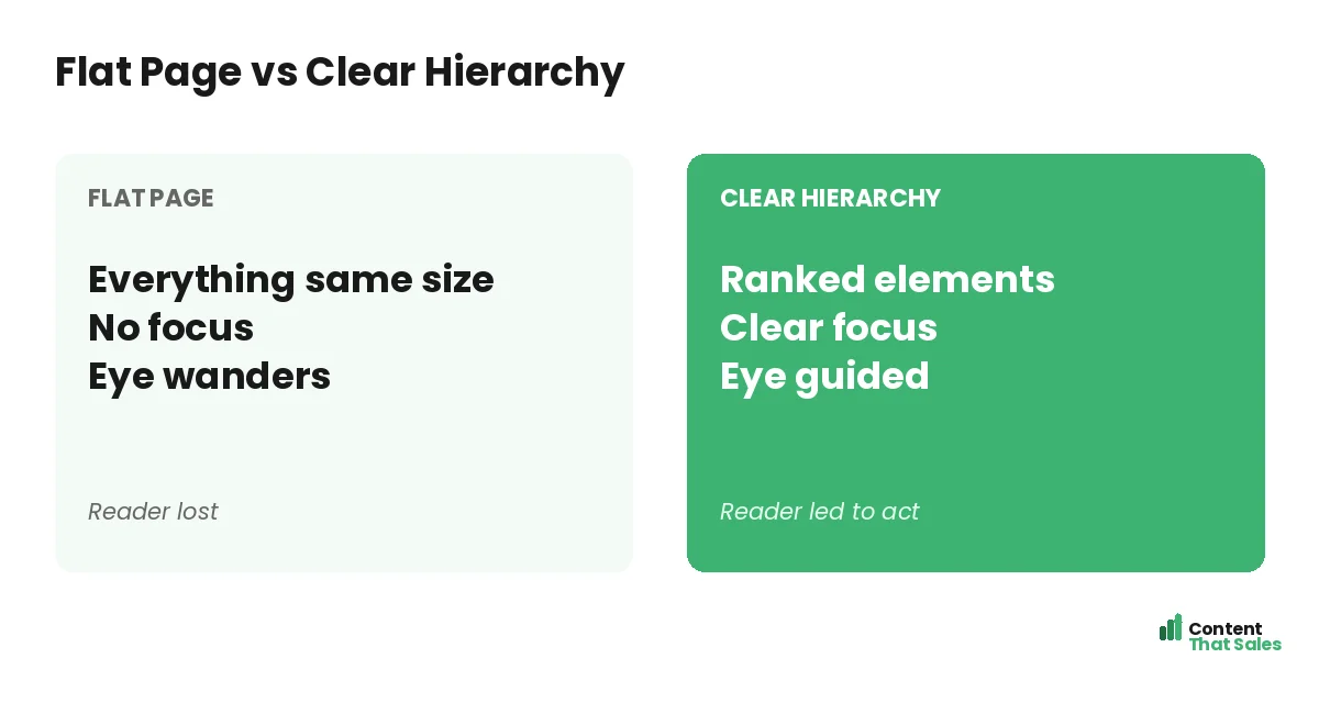
People decide fast and scan first. If everything shouts, nothing gets heard. A flat page with no ranking forces the reader to work, and work means friction. Friction means lost leads.
A clear hierarchy removes that work. It points the eye straight to the promise, then the proof, then the button. People scan more than they read, so hierarchy meets them where they are. Guide the scan, and you guide the decision. Ignore the scan, and even your sharpest sentences get skipped by a reader who never knew where to look.
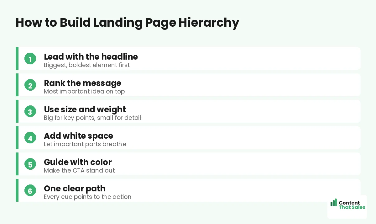
Start With the Most Important Message
Before design, decide your ranking. What must the reader see first? Usually the headline and its one promise. What comes next? The benefit, then the proof, then the call to action. Rank the message before you size a single word.
This order should match how a buyer decides. Hook, then desire, then trust, then action. It mirrors the best landing page structure. When the ranking matches the journey, the page feels effortless. Pair this ranking with a strong above-the-fold strategy, so the most important element wins the very first glance before any scrolling begins.
Use Size and Weight to Rank Elements
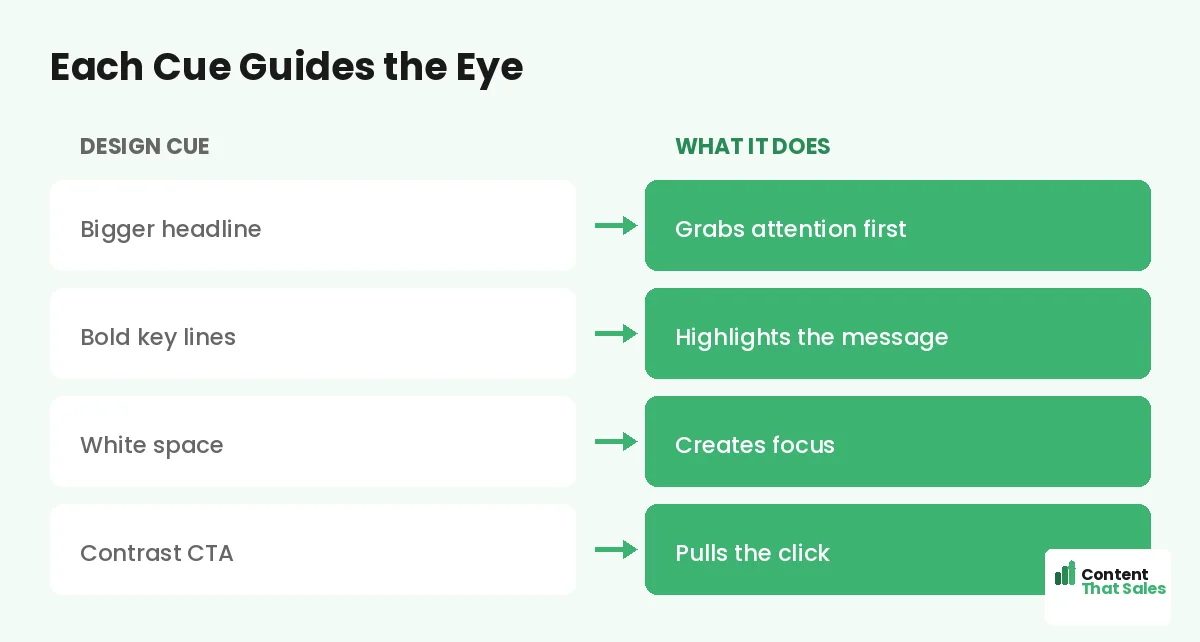
Size is your loudest tool. Big elements pull the eye first. So make the headline the largest text on the page. Make subheads medium. Make body copy smaller. The sizes alone tell the reader what matters most.
Weight helps too. Bold a key phrase and it jumps out of a paragraph. But use bold sparingly. If everything is bold, nothing is. A few strong accents guide the eye far better than a sea of heavy text.
Let White Space Do the Heavy Lifting
White space is not wasted space. It is focus. When you give an element room to breathe, the eye treats it as important. Crowd it, and it gets lost in the noise.
Use space to separate sections and frame your button. A CTA surrounded by white space feels like the obvious next step. Space creates calm, and calm helps the reader decide. Sometimes less on the page means more in results. A common mistake is fearing empty space and filling every gap. Resist that urge. The space around your headline and button is doing quiet, powerful work, even when it looks like nothing is there.
Did you know?
The eye is drawn to the biggest, boldest, and most isolated element first. Whatever you make stand out becomes the start of the reader’s journey.
Guide the Eye With Color and Contrast
Color directs attention. A button in a bright, contrasting color pulls the eye like a magnet. Keep most of the page calm, then let the CTA pop. Contrast is what makes the action impossible to miss.
Use your brand color with purpose. Save the boldest shade for the one thing you want clicked. When every element is loud, the button drowns. When the page is calm, the button shines.
Hierarchy in Your Words, Not Just Design
Hierarchy is not only visual. Your words have a ranking too. Lead each section with the key point, then add detail. Put the most important idea in the first few words, where scanners actually look.
Front-load your benefits and your button copy. Do not bury the win at the end of a long line. To write with this kind of order, see how to write landing page copy that converts. Strong word order supports strong visual order.
Create One Clear Path to the CTA
Every cue should point the same way, toward the action. Size, weight, space, and color all work as arrows. Line them up so the eye flows down to the button without a detour.
Avoid cues that pull the eye off the path. A flashy graphic in the corner or a bright link in the menu can steal a click. Keep the strongest visual pull on your one CTA. One path, one goal, more conversions. Trace the path yourself with a quick squint test. Blur your eyes and look at the page. If the headline and button are still the things that pop, your hierarchy is working as intended.
Common Hierarchy Mistakes
A few slips flatten a page. Headlines the same size as body text. A CTA that blends into the background. Walls of text with no spacing. Too many competing accents. Each one makes the reader work harder.
The fix is clear ranking, and easy reading lifts conversions too. Make the important things big and bold. Give them space. Make the button pop. Clear beats busy, in design as in words.
How Content That Sales Builds Hierarchy
Strong hierarchy blends words and design into one clear path. That’s where we come in. At Content That Sales, we rank your message and write it so the most important ideas lead, and the eye flows to the button.
You share the offer and the goal. We craft the headline, the order, and the CTA copy that guide the reader. If you want done-for-you landing page copy, we make it effortless. The result is a page that leads, not one that confuses.
Ready to Turn Visitors Into Customers?
Now you know how landing page hierarchy leads the reader. Rank the message. Use size, weight, space, and color. Point every cue at one action. So why let a flat page leave your reader lost and wandering?
Let’s build a page that guides every eye to the button. Book your free consultation now. Call us at 8801631988589 or email service@contentthatsales.com. Let’s turn your next visitor into your next customer.
Frequently Asked Questions About Landing Page Hierarchy
What is landing page hierarchy?
Landing page hierarchy is the way you rank elements so the reader’s eye lands on the right things in the right order. It guides the visitor from headline to button without confusion.
Why does visual hierarchy matter?
People scan before they read. Hierarchy decides what stands out, so it controls the journey. A clear ranking leads the eye and lifts conversions.
What tools create hierarchy?
Size, weight, white space, and color. Big and bold elements pull attention, space creates focus, and contrast makes the CTA impossible to miss.
How do I make my CTA stand out?
Give it a contrasting color and plenty of white space, and keep competing elements calm. The button should be the brightest, clearest thing on the page.
Is hierarchy only about design?
No. Word order matters too. Lead each section with the key point and front-load benefits, so scanners catch the message in the first few words.
What is the most common hierarchy mistake?
Making too many things stand out at once. Competing cues cancel out, so the eye gets stuck and the reader loses the path to the action.
How much white space should I use?
Enough to let important elements breathe, especially around the headline and the CTA. White space signals importance and creates calm focus.
Can you design my landing page hierarchy?
Yes. Content That Sales ranks and writes pages so the eye flows to the action. Reach out for a quick quote.