 Skip to content
 A free trial landing page template gives you a proven structure with copy prompts, so you can turn visitors into trial users without guessing what to write. A free trial page has one job, get the signup started, and a focused template makes that simple. This guide gives you the full template, with a prompt and example for every section, so you can build a high-converting trial page in under an hour and start filling your pipeline with users.
Why a template? Because trial pages follow a clear, repeatable shape. The headline promises a result, the benefits show quick wins, risk reversal removes fear, and the CTA starts the trial. A template bakes that in, so you fill the blanks instead of starting cold. Let’s walk through it.
Below, we give you each section, its copy prompt, and an example, plus tips to lift your trial signup rate.
Why a Free Trial Page Is Different
A free trial page sells the start, not the full product. The reader is not buying yet, they are agreeing to try. So the copy must lower every barrier to that first step and promise a quick win once they are in.
It follows the same focused flow as the best landing page structure, tuned for signups. One goal, start the trial. No clutter, no menu, just a clear result and an easy, low-risk way to begin.
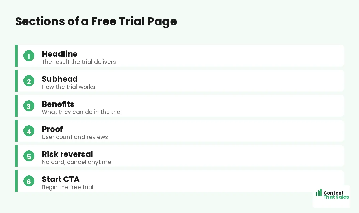
Section 1: The Headline
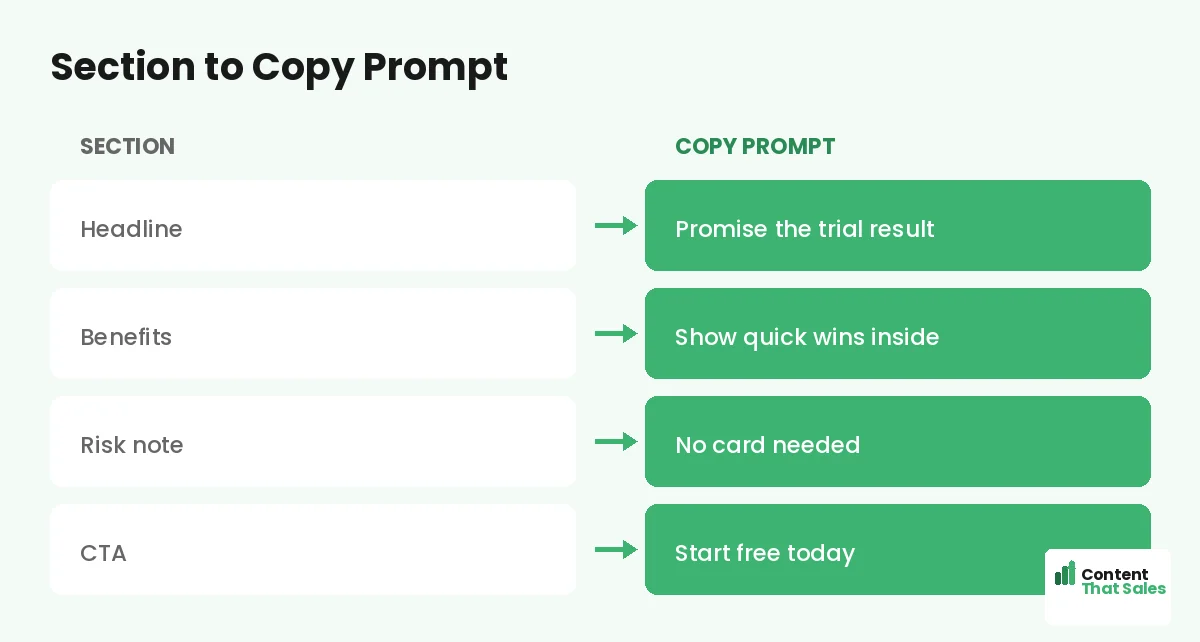
Lead with the result the product delivers, not its features. The reader wants the outcome, not a tour of buttons. Promise that outcome in one clear line so they instantly see why the trial is worth starting.
Copy prompt: “Get [result] with a free trial.” Example: “Send better emails in minutes, free for 14 days.” Name the payoff. A result-led headline makes the trial feel worth the few seconds it takes to start.
Section 2: How the Trial Works
Use the subhead to explain the trial in plain terms. How long it lasts, what is included, and how to start. Removing confusion here removes a quiet objection and makes the next step feel safe and simple.
Copy prompt: “[Length] free trial. [What is included]. [How to start].” Example: “14 days free, full access, no card needed.” Keep it short and reassuring. When the trial is clear, the reader is far more willing to begin.
Section 3: The Benefits
Show what the reader can do during the trial. List three to five quick wins they will reach fast, framed as results. The sooner they picture a win, the more likely they are to start and stick.
Copy prompt: “[Feature] so you [quick win].” Example bullets: “Templates so you launch a page today,” “Reports so you see results in a week.” People scan more than they read, so keep benefits short and outcome-led.
Section 4: Proof and Trust
Show that others trust the product. Use a user count, reviews, ratings, or recognizable logos. Proof reassures the reader that the trial is worth their time and that real people get value from the product.
Copy prompt: “[Number] of users. ‘[Short quote].'” Example: “Trusted by 20,000 teams. ‘Set up in five minutes.’ Alex.” Place this near the signup button, where doubt peaks, so proof does its work right before the reader commits.
Section 5: Risk Reversal
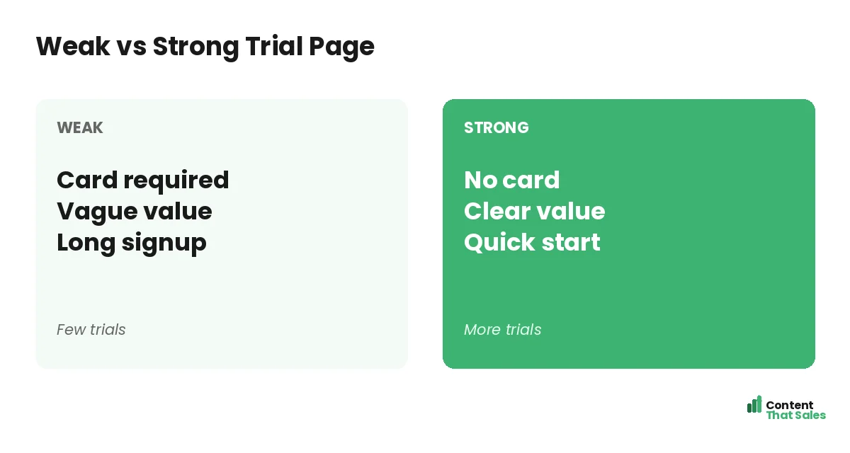
Remove the fear of starting. State clearly that no card is required, that they can cancel anytime, and that there is no obligation. The lower the perceived risk, the higher the signup rate. This section often lifts trials the most.
Copy prompt: “No [common fear]. [Reassurance].” Example: “No credit card. Cancel anytime. No strings.” Put this right beside the button. A reader on the fence often needs just one removed risk to finally click start.
Did you know?
Dropping the credit card requirement from a free trial can sharply lift signups, because it removes the biggest fear standing between a visitor and the start button.
Section 6: The Start CTA
Ask for the signup with one clear button. The label should restate the action and the value, not say submit. Keep the form short, since every field between the reader and the trial costs you signups.
Copy prompt: “[Action] for [value].” Example: “Start my free trial.” Follow solid landing page CTA best practices and repeat the button near the top and bottom. One clear, low-risk ask turns a visitor into a trial user.
How to Fill the Template
Work top to bottom, filling each prompt with your real product details. Get the result, the quick wins, and the risk reversal down first, then polish. Read the page aloud to catch anything stiff before you publish.
Pair this with the broader landing page copy template for extra prompts on proof and benefits. The structure stays the same; your details make it convert. In under an hour, you have a trial page ready to grow your user base.
Lower the Friction to Start
Every step between the click and the first win costs you signups. Cut the form to the essentials, skip the card if you can, and let the user reach value fast. The smoother the start, the more trials you keep.
Think about the very first minute inside the product. If the reader has to set up too much before seeing a win, many will quit. Guide them to a quick result, and a trial turns into a habit that turns into a sale.
Sell the Outcome, Not the Tour
It is tempting to list every feature on a trial page. Resist it. The reader does not want a tour, they want a result. Lead every benefit with the outcome and let the features sit quietly behind the promise.
Keep the page focused on one main result the trial delivers. A clear, single promise converts far better than a long feature list. Save the deep feature talk for inside the product, where it helps the user succeed. Clear, focused pages win, since simple copy lifts conversions.
The Full Template at a Glance
Here is the whole trial page in order: a result headline, a plain explanation of how the trial works, three to five quick-win benefits, proof near the button, clear risk reversal, and a short start CTA. Fill each blank and you have a page built to grow your users.
Keep this template for every trial you launch. One reusable structure means each new page is faster to build and more consistent. To sharpen the wording, see how to write landing page copy that converts.
How Content That Sales Helps
A template gets you started, but a pro makes every word pull its weight. That’s where we come in. At Content That Sales, we take this proven trial structure and fill it with copy tuned to your product and your audience.
You share the product and the trial terms. We write the headline, the benefits, and the risk reversal that get more signups. The result is a page built on a proven template and sharpened to turn visitors into trial users.
Ready to Grow Your Trial Signups?
Now you have a free trial landing page template. A result headline, clear trial terms, quick-win benefits, proof, risk reversal, and a short start CTA. Fill the blanks and you have a page built to grow your users. So why launch with a weak page?
Let’s turn this template into a page that grows your trials. Book your free consultation now. Call us at 8801631988589 or email service@contentthatsales.com. Let’s turn your next visitor into your next user.
Frequently Asked Questions About the Free Trial Page Template
What sections does a free trial page need?
A result headline, a plain explanation of the trial, three to five quick-win benefits, proof near the button, clear risk reversal, and a short start CTA.
What should the headline say?
Lead with the result the product delivers, not its features. The reader wants the outcome, so promise that in one clear line at the top.
Should I require a credit card?
If you can avoid it, do. Dropping the card requirement often sharply lifts signups, because it removes the biggest fear before the start button.
How do I lower friction to start?
Keep the form short, skip the card, and guide the user to a quick win fast. Every step between the click and the first result costs signups.
How many benefits should I list?
Three to five quick wins, each framed as a result the user reaches fast. Lead with the outcome and keep the points short and scannable.
Where should risk reversal go?
Right beside the start button. A reader on the fence often needs just one removed risk, like no card or cancel anytime, to finally click.
Should I list every feature?
No. Sell the outcome, not a tour. A single clear promise converts better than a long feature list. Save deep feature talk for inside the product.
Can you write my trial page?
Yes. Content That Sales turns this proven template into copy tailored to your product. Reach out for a quick quote.