 Skip to content
 A webinar landing page template gives you a section-by-section structure with copy prompts, so you can fill a virtual room without guessing what to write. A webinar page has one job, turn a visitor into a registrant, and a focused template makes that easy. This guide gives you the full template, with a prompt and example for every section, so you can build a high-converting webinar page in under an hour and start filling seats.
Why a template? Because webinar pages have a clear, repeatable shape. The headline promises a takeaway, the bullets show what they learn, the host earns trust, and the CTA captures the signup. A template bakes that in, so you fill the blanks instead of starting cold. Let’s walk through it.
Below, we give you each section, its copy prompt, and an example, plus tips to lift your signup rate.
Why a Webinar Page Is Different
A webinar page sells a free event, not a product. The reader trades their email and an hour of their time for a promise of value. So the copy must make that hour feel clearly worth it. The takeaways and the host matter most.
It still follows the same focused flow as the best landing page structure, but tuned for an event. One goal, register. No distractions, no menu, just a clear promise and an easy signup form.
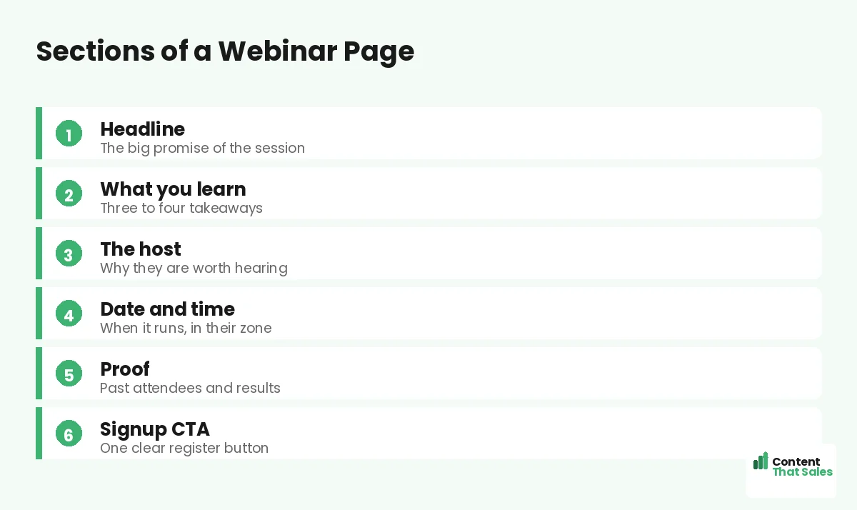
Section 1: The Headline
Lead with the single biggest takeaway of the webinar. Promise the transformation or the skill they will walk away with. This line decides whether they read on, so make it specific and valuable.
Copy prompt: “Learn how to [achieve result] in [timeframe].” Example: “Learn how to double your leads in one hour, live.” Name the payoff, not the topic. A specific promise pulls the right people in.
Section 2: What You Will Learn
List three to four concrete takeaways as bullets. Each one should be a clear win the attendee gets. This section is the heart of the page, since it proves the hour is worth their time.
Copy prompt: “You will learn [specific skill or result].” Example bullets: “The exact page that triples signups,” “How to write a headline in 5 minutes.” People scan more than they read, so keep bullets short and benefit-led.
Section 3: Meet the Host
Introduce the host and prove why they are worth an hour. Lead with the credential that matters to this audience, results, experience, or a recognizable name. Add a friendly photo to build connection.
Copy prompt: “[Host name] has [credential or result].” Example: “Sarah has helped 300 brands lift conversions by 40 percent.” Keep it short and focused on why they can deliver the promised takeaways. Trust drives the signup.
Section 4: Date, Time, and Format
Make the logistics impossible to miss. Show the date, the time in the visitor’s zone, the length, and the format, live or recorded. Clarity here removes a quiet objection: “will I be able to make it?”
Copy prompt: “[Day, date] at [time, with zones]. [Length]. [Live or recorded].” Example: “Thursday, June 12 at 2pm ET. 60 minutes. Live, with a replay.” Mention the replay if you offer one, since it captures the people who cannot attend live.
Section 5: Proof and Trust
Show that past attendees got value. Use a registrant count, a testimonial from a previous session, or logos of companies that attended. Proof reassures the reader that the time will be well spent.
Copy prompt: “[Number] have attended. ‘[Short quote].’ [Name].” Example: “Over 5,000 have joined. ‘Best free hour I spent all year.’ Mark.” Place this near the signup form, where doubt peaks, to push the hesitant reader over the line.
Did you know?
Offering a replay on the signup page can lift registrations noticeably, because it captures the people who want in but cannot attend the live session.
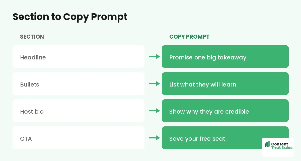
Section 6: The Signup CTA
Ask for the registration with one clear button and a short form. Keep the form to a name and email. Every extra field lowers signups. The button should restate the value, not just say submit.
Copy prompt: “[Action] for [value].” Example: “Save my free seat.” Follow solid landing page CTA best practices and repeat the button near the top and bottom. One clear ask turns interest into a registrant.
How to Fill the Template
Work top to bottom, filling each prompt with your real webinar details. Do not polish on the first pass, just get the takeaways, host, and logistics down. Then read the whole page aloud to smooth the flow.
Pair this with the wider landing page copy template if you want extra prompts for proof and benefits. The structure stays the same; your details make the page convert. In an hour, you have a page ready to fill seats.
Keep the Form Short
The signup form is where signups are won or lost. Ask only for what you truly need, usually a name and an email. Each extra field, like phone or company, drops your registration rate. You can learn more about your attendees later.
If you must ask for more, explain why or make the fields optional. The simpler the form, the more people complete it. For a free webinar, a low-friction form almost always beats a detailed one.
Add Urgency the Honest Way
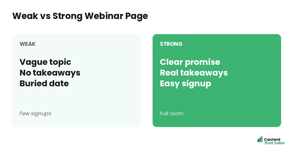
A little real urgency lifts signups. Mention the date so people know it is a one-time live event, or note limited seats if that is true. Never invent fake scarcity, since it erodes the trust your host worked to build.
Honest urgency might be “Live on Thursday only, replay for registrants.” That nudges action without lying. Real reasons to act now convert better than fake timers, and they keep your brand credible for the next campaign. Clear, honest pages win, since simple copy lifts conversions.
The Full Template at a Glance
Here is the whole webinar page in order: a takeaway headline, three to four learning bullets, a credible host intro, clear date and time, proof near the form, and a short signup CTA. Fill each blank and you have a page built to fill seats.
Keep this template for every webinar you run. One reusable structure means each new event page is faster to build and more consistent. To sharpen the wording, see how to write landing page copy that converts.
How Content That Sales Helps
A template gets you started, but a pro makes every word pull its weight. That’s where we come in. At Content That Sales, we take this proven webinar structure and fill it with copy tuned to your topic, your host, and your audience.
You share the webinar details and the takeaways. We write the headline, the bullets, and the CTA that fill the room. The result is a page built on a proven template and sharpened to convert clicks into registrants.
Ready to Fill Your Next Webinar?
Now you have a webinar landing page template. A takeaway headline, learning bullets, a credible host, clear logistics, proof, and a short signup CTA. Fill the blanks and you have a page built to fill seats. So why launch with a weak page?
Let’s turn this template into a page that packs your webinar. Book your free consultation now. Call us at 8801631988589 or email service@contentthatsales.com. Let’s turn your next visitor into your next registrant.
Frequently Asked Questions About the Webinar Page Template
What sections does a webinar landing page need?
A takeaway headline, three to four learning bullets, a credible host intro, clear date and time, proof near the form, and a short signup CTA.
What should the headline say?
Lead with the single biggest takeaway. Promise the result or skill the attendee walks away with, not just the topic. Specific promises pull the right people in.
How many form fields should I use?
As few as possible, usually a name and an email. Each extra field lowers your registration rate. Learn more about attendees after they sign up.
Should I offer a replay?
Yes, if you can. A replay captures the people who want in but cannot attend live, which often lifts total registrations noticeably.
How do I prove the webinar is worth it?
Show takeaways, a credible host, and proof like a registrant count or a quote from a past session. Place the proof near the signup form.
Where should the CTA go?
Repeat it near the top and again at the bottom. Use a clear button that restates the value, like save my free seat, not just submit.
Can I add urgency?
Yes, but keep it honest. Mention the live date or genuinely limited seats. Avoid fake timers, which erode the trust your host worked to build.
Can you write my webinar page?
Yes. Content That Sales turns this proven template into copy tailored to your event. Reach out for a quick quote.