 Skip to content
 The webinar landing page examples that get the most sign-ups all do three things well: they sell the takeaway, make the date and time crystal clear, and keep registration effortless. People do not sign up for a webinar. They sign up for what they will learn. The pages that fill seats promise a specific outcome, prove the host is worth an hour, and ask for almost nothing. This guide breaks down the webinar page patterns you can lift for your own event.
We focus on patterns, not brand screenshots, because the principle outlasts any single page. Once you see why these webinar pages convert, you can recreate that for your topic and audience. Treat this as a swipe file of structures. Let’s break down the moves that turn visitors into registrants.
Below, we cover the title, the takeaways, the host, the logistics, and the registration that make webinar pages convert, each with the lesson to apply.
What Great Webinar Pages Share
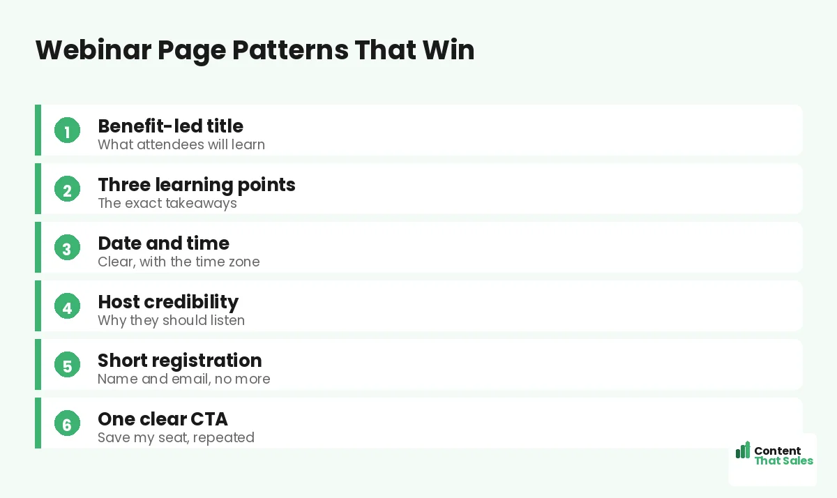
Across the best webinar pages, the same pattern repeats. A benefit-led title, three clear learning points, a credible host, a clear date and time, and a short registration form. They sell the value of the hour first, then make joining easy, the same focus you see in the best high-converting landing page examples.
This builds on the same fundamentals as any strong page, like the best landing page structure. The webinar twist is selling a future event the reader cannot see yet. As you read each pattern, watch how the winners make the value feel concrete before the ask.
Example 1: The Benefit-Led Title
Winning webinar pages lead with a title that promises a specific outcome, not a topic. “How to book 20% more jobs from your ads” beats “Marketing webinar.” The title sells the takeaway, so the reader instantly knows why the hour is worth it.
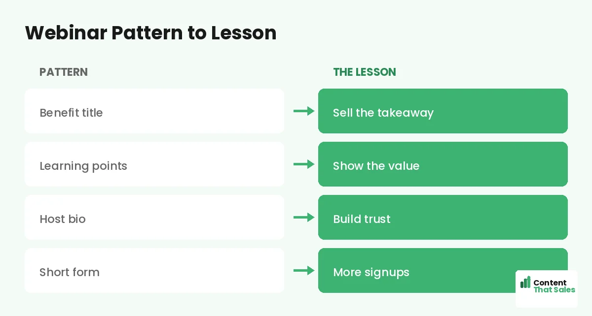
The lesson: title the webinar like a headline, around the reader’s win. A vague topic gets a shrug. A clear promise gets a signup. Make the title do the heavy lifting, just as it would on any high-converting page.
Example 2: The Three Learning Points
The strongest pages list exactly what attendees will learn, usually as three crisp bullets. “You’ll learn how to write a headline that converts, structure your page, and test for wins.” This makes the value tangible and easy to scan.
The lesson: spell out the takeaways so the reader can picture the payoff. People scan more than they read, so three benefit bullets do more than a paragraph of description. Concrete learning points sell the seat.
Example 3: The Credible Host Section
People want to know the host is worth their time. The best pages include a short bio with a photo and one line of credibility, like results delivered or years of experience. It answers the silent question, why should I listen to you.
The lesson: borrow trust from the host. A credible presenter makes the promise believable. Keep the bio short and focused on why the reader should care, not a full resume. Authority sells the registration alongside the value.
Example 4: The Clear Date, Time, and Format
Logistics matter more than people think. Winning pages state the date, the time with the time zone, and the format clearly. They also note whether a replay is available, which reassures people who fear they cannot attend live.
The lesson: remove every logistical doubt. Confusion about when or how to join quietly kills signups. A clear date, time zone, and replay promise let the reader commit without hesitation. Make attending feel easy and certain.
Did you know?
Offering a replay to registrants can lift sign-ups, because it removes the fear of missing out for anyone who cannot attend live.
Example 5: The Short Registration Form
The best webinar pages ask for almost nothing. A name and an email are usually enough. Every extra field, like company size or phone number, drops registrations. The form should feel like a two-second step, not a survey.
The lesson: keep the ask tiny. This mirrors the approach in our lead generation landing page examples, where short forms win. You can learn more about attendees later. First, get them registered with the least friction possible.
Example 6: Light Urgency and Social Proof
Webinar pages convert better with a gentle nudge. Real urgency, like limited seats or a closing registration date, encourages action now. A line of social proof, such as “join 2,000 marketers who attended last time,” adds reassurance.
The lesson: use honest urgency and proof to tip the hesitant. Keep both genuine, never fake countdowns or invented numbers. A real reason to register now, paired with proof that others found it worthwhile, lifts sign-ups without harming trust.
The Common Thread: Value Plus Ease
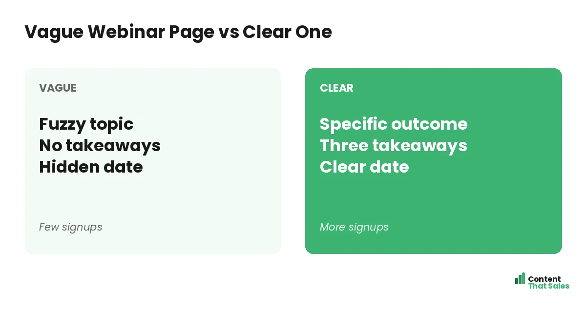
Strip away the topic and the pattern is the same. Sell the takeaway clearly, prove the host and the value, remove logistical doubts, and make registering effortless. Every winning webinar page balances strong value with a tiny, easy ask.
Lose either side and signups drop. A great topic with a confusing date loses people, and an easy form with a vague promise gives them no reason to act. Nail both, and the seat fills. That balance is the whole secret.
How to Steal These Patterns
Do not copy a competitor’s page outright. Lift the pattern and fill it with your topic, your host, and your takeaways. Write a benefit-led title, list three concrete learnings, add a credible bio, state the logistics, and keep the form short.
Ground it in proven landing page copy principles and keep the wording simple, since easy reading lifts conversions. The pattern gives you a fast start, and your details make it convert for your event.
Test the Pattern on Your Audience
A pattern that works for others is a strong start, not a promise. Test the structure on your own traffic. Try a benefit-led title against a topic title, or a shorter form against your current one, and watch the signup rate decide.
Change one element at a time so the result stays clean. Keep what wins, then test the next idea. Your audience, not a competitor’s page, should crown the final version. Borrow the pattern, then prove it for your own webinar.
How Content That Sales Builds Webinar Pages
A webinar page lives or dies on how well it sells the takeaway, and that is our craft. That’s where we come in. At Content That Sales, we write the title, the learning points, and the registration copy that fill seats.
You share the topic, the host, and the date. We build the page on a proven webinar pattern. The result is a focused page that turns visitors into registrants and your event into a full room.
Ready to Turn Visitors Into Customers?
Now you have webinar landing page examples that get sign-ups. Sell the takeaway. List the learnings. Prove the host. Clarify the date and keep the form short. So why run a vague event page when these proven patterns fill seats?
Let’s build a webinar page that packs the room. Book your free consultation now. Call us at 8801631988589 or email service@contentthatsales.com. Let’s turn your next visitor into your next registrant.
Frequently Asked Questions About Webinar Landing Page Examples
What makes a great webinar landing page?
A benefit-led title, three clear learning points, a credible host, clear logistics, and a short registration form. The best pages sell the takeaway, then make joining easy.
What should the webinar title say?
Promise a specific outcome, not just a topic. Title it like a headline around the attendee’s win, so the value is clear at a glance.
How short should the registration form be?
Usually just a name and an email. Every extra field lowers registrations, so ask for the minimum and learn more about attendees later.
Should I offer a replay?
Yes, it often lifts signups. A replay removes the fear of missing out for anyone who cannot attend live, so more people register.
Do I need a host bio?
Yes, a short one with a photo and a line of credibility. It answers why the reader should spend an hour listening to this presenter.
Should I use urgency on a webinar page?
Honest urgency helps, like limited seats or a closing registration date. Keep it real, never fake countdowns, so you lift signups without harming trust.
Will these patterns work for my webinar?
They are a strong start. Test the structure on your own traffic, change one thing at a time, and keep the version that converts best.
Can you write my webinar page?
Yes. Content That Sales builds webinar pages on proven patterns, tailored to your event. Reach out for a quick quote.