 Skip to content
 The best way to learn what works is to study high-converting landing page examples and copy the patterns, not the pixels. Across thousands of pages, the winners share the same moves: a clear promise, a single goal, strong proof, and an easy next step. Below are 20 example types that consistently convert, with the lesson behind each one. Instead of naming brands that may change tomorrow, we focus on the patterns you can apply to your own page today.
Why patterns over screenshots? Because a screenshot goes stale, but a principle lasts. When you understand why a page converts, you can recreate that success for your offer, your audience, and your goal. Treat this as a swipe file of structures, not a gallery to admire. Let’s break down the examples worth stealing.
We have grouped these 20 examples by goal, from lead capture to sales to local service. Each comes with the core lesson that makes it work, so you can lift the structure and make it yours.
What All High-Converting Pages Share
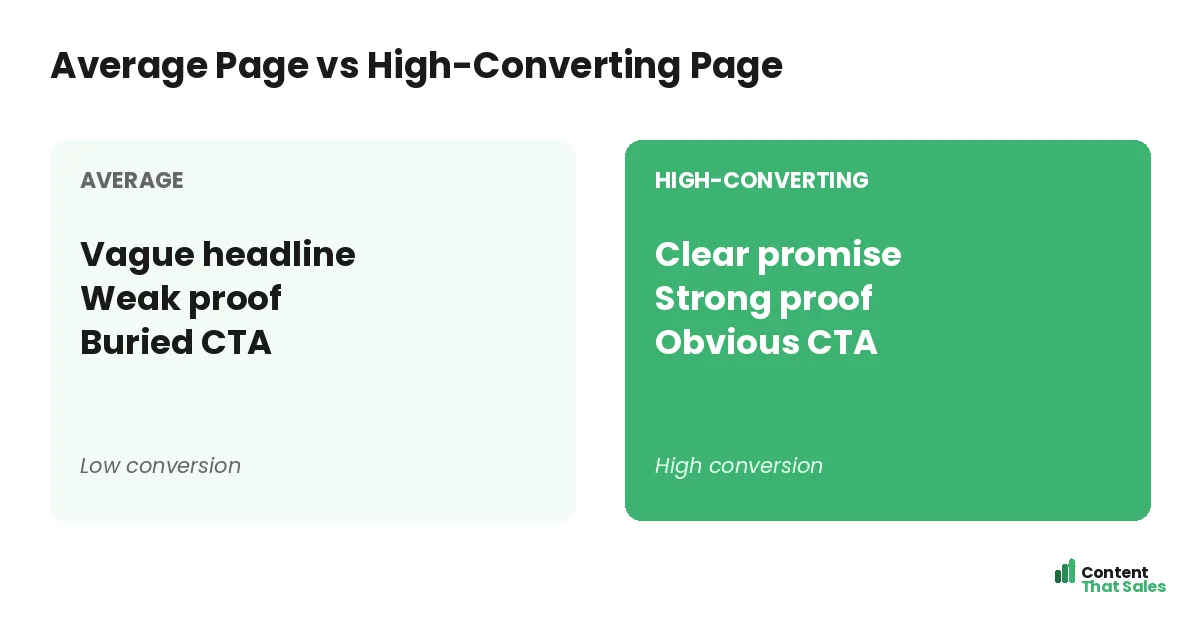
Before the examples, know the common thread. Every page on this list makes one clear promise, asks for one action, backs claims with proof, and removes friction. These four moves show up again and again, regardless of industry. They are the real reason a page converts.
This is the same backbone you find in the anatomy of a landing page. As you read each example, watch for those four moves. Once you can spot them, you can copy them. The structure is the lesson, not the brand behind it.
Lead-Capture Examples (1-5)
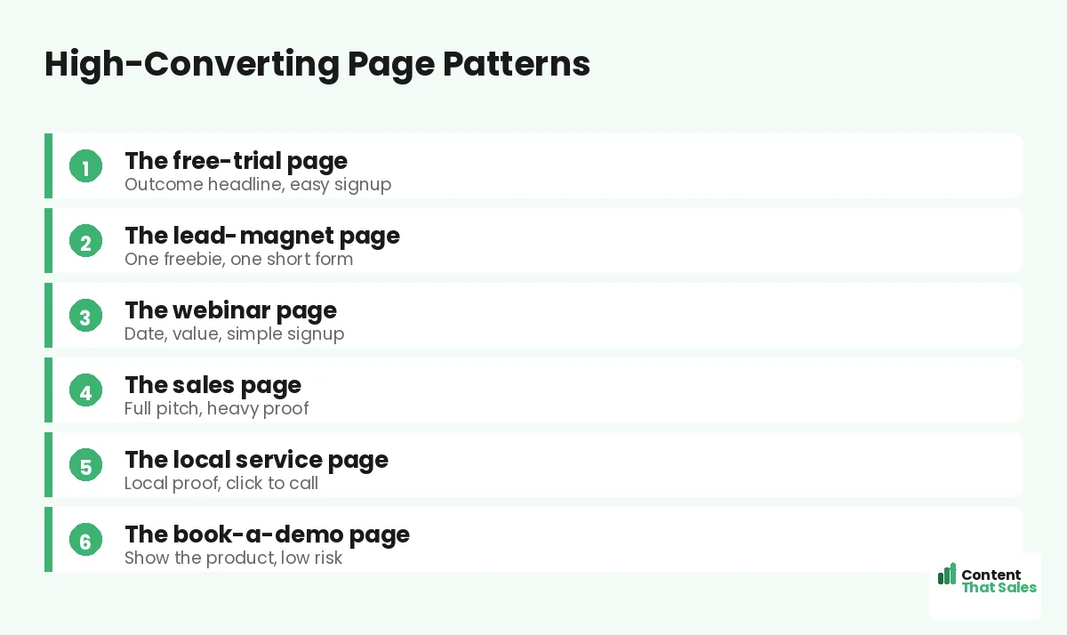
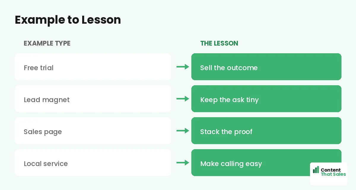
These pages exist to collect a contact, and the best ones keep the ask tiny. They trade a clear, valuable freebie for an email and remove every distraction. The lesson across all five is the same: one offer, one short form, one goal.
- The checklist opt-in: a single freebie, one email field, instant value
- The ebook page: a clear cover image, three bullet benefits, one button
- The newsletter page: a specific promise of what subscribers get
- The free-tool page: try the tool, then capture the email to save results
- The discount opt-in: trade an email for a code, with a clear payoff
Free-Trial and Demo Examples (6-9)
SaaS and software pages convert best when they sell the outcome, show the product, and make starting effortless. The winners lead with the result, not the feature list, and remove the credit-card wall. The lesson: reduce risk and show the value fast.
- The no-card free trial: outcome headline, one-click signup, product preview
- The book-a-demo page: a short form and a clear promise of what they will see
- The product-tour page: a short video or screenshots that show the win
- The freemium page: start free now, upgrade later, zero friction to begin
Sales-Page Examples (10-13)
Sales pages sell bigger or costlier offers, so they run long and stack proof. The winners answer every objection, paint the transformation, and repeat one clear call to action. The lesson: the bigger the price, the more proof and detail you need.
- The high-ticket course page: long-form, heavy proof, clear outcome
- The coaching page: a transformation story plus testimonials and a booking CTA
- The product sales page: benefits, demo, reviews, guarantee, then buy now
- The webinar-to-offer page: value first, then a single strong pitch
Local Service Examples (14-16)
Local pages win on trust and ease of contact. The best ones show local proof, list the service area, and make calling a one-tap action. The lesson: prove you are nearby and reliable, then make reaching you effortless.
- The emergency service page: click-to-call up top, fast response promise
- The quote-request page: a short form, local reviews, and a service-area list
- The single-service page: one service, local proof, and a clear booking CTA
Did you know?
Across industries, the highest-converting pages rarely have the flashiest design. They have the clearest message and the easiest next step.
Event and Webinar Examples (17-18)
Event pages convert when they make the value and the logistics crystal clear. The winners state what attendees will learn, the date and time, and keep the signup short. The lesson: sell the takeaway, then remove every reason to hesitate.
- The live webinar page: a benefit-led title, three learning points, one signup
- The workshop page: clear date, clear outcome, and a simple registration form
Specialty Examples (19-20)
A couple of patterns work across niches. The waitlist page builds anticipation for something not yet available, and the thank-you page turns a new lead into the next step. The lesson: every stage of the journey deserves a focused, converting page.
- The waitlist page: a bold promise, scarcity, and one email field
- The thank-you page: confirm the action, then point to a clear next step
How to Steal These Patterns the Right Way
Do not copy a page line for line. Copy the structure and the principle, then fill it with your own offer, proof, and voice. A pattern is a proven skeleton. Your details are the muscle. That combination is what makes a borrowed structure convert for you.
Start by matching the example type to your goal. Lead capture, free trial, sales, or local service. Then build on the best landing page structure and write each section to fit your reader. The example gives you a head start, and your specifics make it true.
Test the Pattern on Your Audience
A pattern that works for others is a strong starting point, not a guarantee. Your audience is unique, so test the structure on your own traffic. Try the example layout against your current page and watch the conversion rate decide.
This is where examples meet landing page conversion rate optimization. Borrow the pattern, then prove it for your offer. People scan more than they read, so keep any version clear and skimmable. Tested patterns beat assumed ones.
The Lesson Behind Every Example
Strip away the industries and the same truth remains. High-converting pages are clear, focused, proven, and easy to act on. They respect the reader’s time and remove every reason to leave. Flashy design is optional. Clarity is not, and clear, simple wording helps too, since easy reading lifts conversions.
If you remember one thing from these examples, remember that. Make one clear promise, ask for one action, prove it, and make saying yes easy. Do that, and your page joins the ranks of the high-converting ones, whatever your industry.
How Content That Sales Builds Pages That Convert
Knowing the patterns is one thing. Writing each section to convert is another. That’s where we come in. At Content That Sales, we take the proven structures and fill them with copy tailored to your offer and audience.
You share your goal and your offer. We pick the right pattern and write the page around it. If you want done-for-you landing page copy, we make it effortless. The result is a page built on what already works, customized for you.
Ready to Turn Visitors Into Customers?
Now you have 20 high-converting landing page examples to learn from. One clear promise. One goal. Strong proof. An easy next step. So why reinvent the wheel when these proven patterns are ready to steal?
Let’s build your page on a pattern that converts. Book your free consultation now. Call us at 8801631988589 or email service@contentthatsales.com. Let’s turn your next visitor into your next customer.
Frequently Asked Questions About High-Converting Landing Page Examples
What do high-converting landing page examples have in common?
They make one clear promise, ask for one action, back claims with proof, and remove friction. Those four moves matter far more than flashy design.
Should I copy a competitor’s landing page?
Copy the pattern, not the page. Their offer and audience differ from yours. Borrow the proven structure, then fill it with your own message and proof.
Which example type should I use?
Match it to your goal: lead capture, free trial, sales, or local service. The right pattern depends on the single action you want from visitors.
Do high-converting pages need fancy design?
No. The best pages win on clarity and an easy next step, not visual flash. A clean, focused page beats a beautiful but confusing one.
How long should a high-converting page be?
It depends on the offer. Simple lead-capture pages stay short, while high-ticket sales pages run long with heavy proof. Match length to the decision.
Will a proven pattern work for my audience?
It is a strong start, not a guarantee. Test the pattern on your own traffic and keep the version that converts best for your readers.
What is the single biggest lesson from these examples?
Clarity and focus win. One promise, one action, real proof, and an easy yes. Nail those and your page converts, whatever your industry.
Can you build a high-converting page for me?
Yes. Content That Sales uses proven patterns and tailors them to your offer. Reach out for a quick quote.