 Skip to content
 The best SaaS landing page examples worth stealing all do the same few things brilliantly: they sell the outcome, show the product in action, and make starting almost effortless. SaaS is crowded, and visitors compare several tabs at once, so a page packed with jargon loses fast. The winners promise a clear result up top, prove it with a preview and social proof, then offer a low-risk way to start. This guide breaks down the patterns you can lift for your own SaaS page.
We focus on patterns, not screenshots, because tools redesign their pages constantly. A principle lasts; a screenshot goes stale. Once you understand why these SaaS pages convert, you can recreate that success for your product, your buyer, and your trial. Let’s break down the moves that turn SaaS visitors into active users.
Below, we cover the hero, the product preview, the signup, the proof, and the structure that make SaaS pages convert. Each comes with the lesson to apply to your own page.
What Great SaaS Pages Have in Common
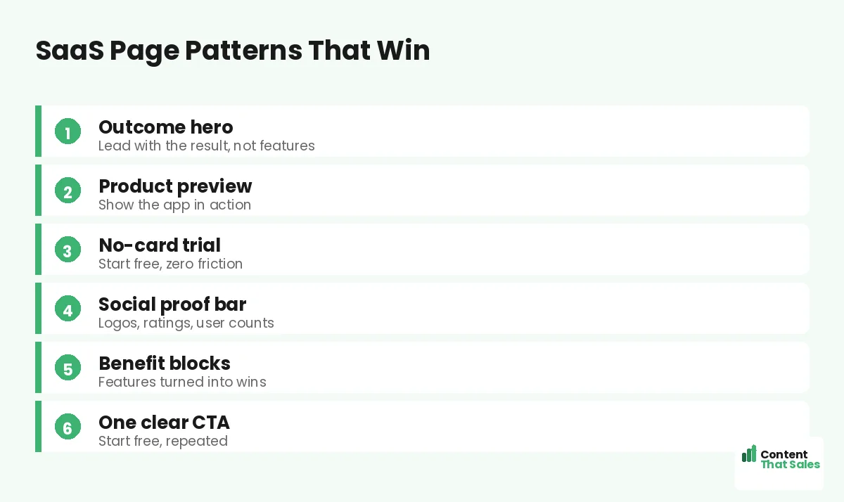
Across the best SaaS pages, the same pattern repeats. A clear outcome headline, a visual that shows the product, social proof that lowers risk, benefit-led copy, and one easy signup. They sell the result first and the features second. That order is the whole game.
This builds on the same fundamentals as any strong page, like the best landing page structure. The SaaS twist is showing the product and removing the credit-card wall, a move you will spot across the best high-converting landing page examples. As you read each pattern, watch how the winners make trying feel safe and easy.
Example 1: The Outcome-Led Hero
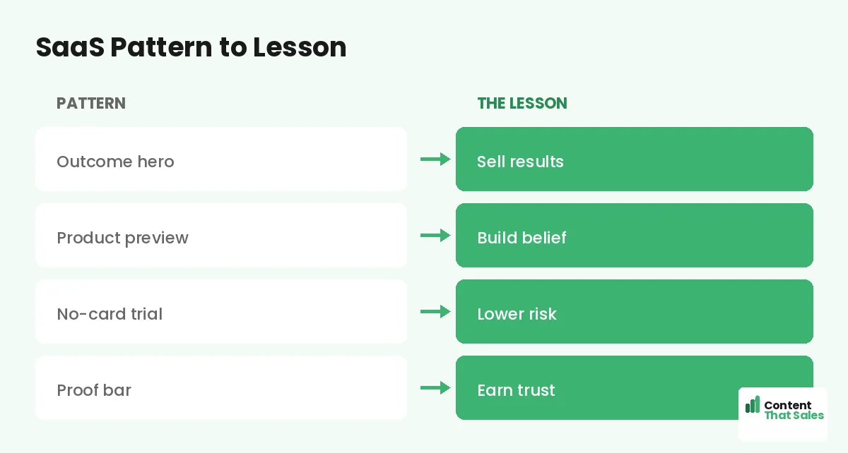
The strongest SaaS heroes lead with the result, not the toolset. Instead of “advanced analytics dashboard,” they say “see what’s working in one glance.” The visitor cares about the win, so the hero promises it in plain words and backs it with a short subhead.
Pair that headline with one clear button, usually “Start free.” The lesson is simple: open with the outcome your buyer wants, then let the features prove it lower down. A feature-first hero loses the visitor before they scroll.
Example 2: The Product Preview
SaaS buyers trust what they can see. The best pages show a clean screenshot, a short demo clip, or an interactive preview of the one screen that delivers the main outcome. It makes the promise real and helps the visitor picture themselves using it.
Keep the preview focused, not a wall of tiny screens. People scan more than they read, so one clear image of the win beats ten cluttered ones. The lesson: show the product doing the thing your buyer wants done.
Example 3: The No-Card Free Trial
The highest-converting SaaS pages remove the credit-card wall. A no-card trial lets people start with zero risk, which lifts signups sharply. The button says “Start free, no card needed,” and the form asks for almost nothing.
This pattern works because it shrinks the decision to a tiny, safe step. The lesson: lower the cost of starting as close to zero as you can. For the full playbook on this, see our guide to landing pages for SaaS free trials. Easy starts win more users.
Example 4: The Social Proof Bar
SaaS buyers fear wasting time on yet another tool. A proof bar calms that fear fast. Customer logos, star ratings, and a user count like “trusted by 10,000 teams” tell the visitor that others took the leap and stayed. Proof lowers risk.
Place proof near the hero and again by the signup, where doubt peaks. A single strong testimonial beside the button can do more than a wall of stars elsewhere. The lesson: borrow the credibility of your existing users to win new ones.
Did you know?
Dropping the credit-card requirement from a free trial can lift signups sharply. Lower risk at the door means far more people step inside.
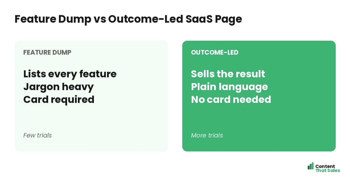
Example 5: Benefit Blocks Over Feature Lists
Winning SaaS pages translate every feature into a benefit. They use short blocks that pair a feature with the outcome it delivers. “Automated reports” becomes “stop building reports by hand.” Each block answers the question, what is in it for me.
This keeps the page skimmable and persuasive. The lesson: do not list features and hope. Show the win each feature creates. A reader who feels the benefit is far more likely to start the trial than one staring at a spec sheet.
Example 6: The Repeated, Single CTA
Across great SaaS pages, one action repeats down the page. “Start free” near the hero, again after the proof, and again at the end. The button never changes its goal. Wherever the visitor decides, the next step is right there.
This follows the rule of one goal per page. A page that asks for a trial, a demo, and a newsletter all at once splits focus. The lesson: pick one primary action and repeat it, so momentum builds instead of scattering.
Example 7: The Objection-Handling Section
Strong SaaS pages answer the big worries before they stop the signup. Sections like “no setup required,” “works with your tools,” and a short FAQ knock down doubts about time, fit, and lock-in. Each answer removes a reason to hesitate.
Add a clear guarantee or an easy-cancel promise to seal it. The lesson: list your buyer’s top objections and answer each one on the page. A visitor with no unanswered fears is a visitor ready to try.
Example 8: The Activation-Focused Flow
The best SaaS pages think past the signup to the first win inside the app. They hint at how fast value arrives, like “set up in five minutes.” The page and the onboarding tell one continuous story, so trials turn into paying users.
The lesson: do not stop at the click. Promise a quick first win and make sure the product delivers it. A signup that never reaches value is a wasted trial, so align the page with what happens after.
How to Steal These Patterns for Your SaaS
Do not copy a competitor pixel for pixel. Lift the patterns and fill them with your product, your outcome, and your proof. Lead with the result, show the app, drop the card wall, and stack real proof. Then write each block to fit your buyer.
Ground it in proven landing page copy principles and keep the wording simple, since easy reading lifts conversions. The patterns give you a head start, and your specifics make the page yours.
Test the Pattern on Your Audience
A pattern that works for other SaaS tools is a strong start, not a guarantee. Your buyers are unique, so test the structure on your own traffic. Try the outcome-led hero against your current one and watch the signup rate decide.
Change one element at a time so the result stays clean. Keep what wins, then test the next idea. Your audience, not a competitor’s page, should crown the final version. Borrow boldly, then prove it for your own product.
How Content That Sales Builds SaaS Pages
Turning features into outcomes is hard from the inside, since you know the product too well. That’s where we come in. At Content That Sales, we translate your tool into the results your buyers crave and build the page on proven SaaS patterns.
You share the product and the goal. We write the hero, the benefit blocks, the proof, and the signup copy. The result is a SaaS page that turns curious visitors into active trial users, built on what already works in the market.
Ready to Turn Visitors Into Customers?
Now you have SaaS landing page examples worth stealing. Lead with the outcome. Show the product. Drop the card wall. Stack proof and repeat one CTA. So why ship a feature-dump page when these proven patterns convert far better?
Let’s build a SaaS page that fills your trial funnel. Book your free consultation now. Call us at 8801631988589 or email service@contentthatsales.com. Let’s turn your next visitor into your next active user.
Frequently Asked Questions About SaaS Landing Page Examples
What makes a great SaaS landing page?
An outcome-led hero, a product preview, social proof, benefit blocks, and a low-friction trial. The best pages sell the result first and the features second.
Should I copy a competitor’s SaaS page?
Copy the pattern, not the pixels. Their product and buyer differ from yours. Borrow the proven structure, then fill it with your own outcome and proof.
Should a SaaS page lead with features?
No. Lead with the outcome the buyer wants, then let features prove it lower down. A feature-first hero loses visitors before they scroll.
Do I need a no-card free trial?
It usually helps a lot. Dropping the credit-card wall lowers risk at the door and lifts signups. You can ask for payment later, once value is clear.
How important is showing the product?
Very. SaaS buyers trust what they can see. A clean screenshot or short demo of the main outcome makes the promise real and builds belief.
How many CTAs should a SaaS page have?
One primary action, repeated down the page. Mixing a trial, a demo, and a newsletter splits focus. Pick one and repeat it.
Will these patterns work for my SaaS?
They are a strong start. Test the structure on your own traffic, change one thing at a time, and keep the version that converts best.
Can you write my SaaS landing page?
Yes. Content That Sales builds SaaS pages on proven patterns, tailored to your product. Reach out for a quick quote.