 Skip to content
 Using heatmaps to improve landing pages lets you see exactly what visitors do, where they click, how far they scroll, and where they leave, so you can fix the real problems instead of guessing. A heatmap is a visual map of visitor behavior layered over your page. It turns invisible patterns into clear, colorful evidence you can act on. This guide explains what heatmaps reveal, how to read them, and how to turn their insights into conversion wins.
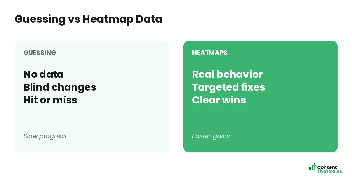
Analytics tell you what happened, like a high bounce rate, but not why. Heatmaps fill that gap by showing how real people interact with your page. They reveal the friction, confusion, and missed elements that numbers alone cannot explain.
Below, we cover the types of heatmaps, what each reveals, how to turn findings into fixes, and how to use them as part of a steady optimization habit.
What a Heatmap Is
A heatmap is a visual overlay on your page that shows where visitors click, move, and scroll, using color to mark activity. Warm colors mean lots of attention; cool colors mean little. At a glance, you see what draws the eye and what gets ignored.
Heatmaps reveal how visitors actually experience your page versus how you assume they do. Paired with a strong landing page structure, they show whether your key elements are getting the attention you designed them to get.
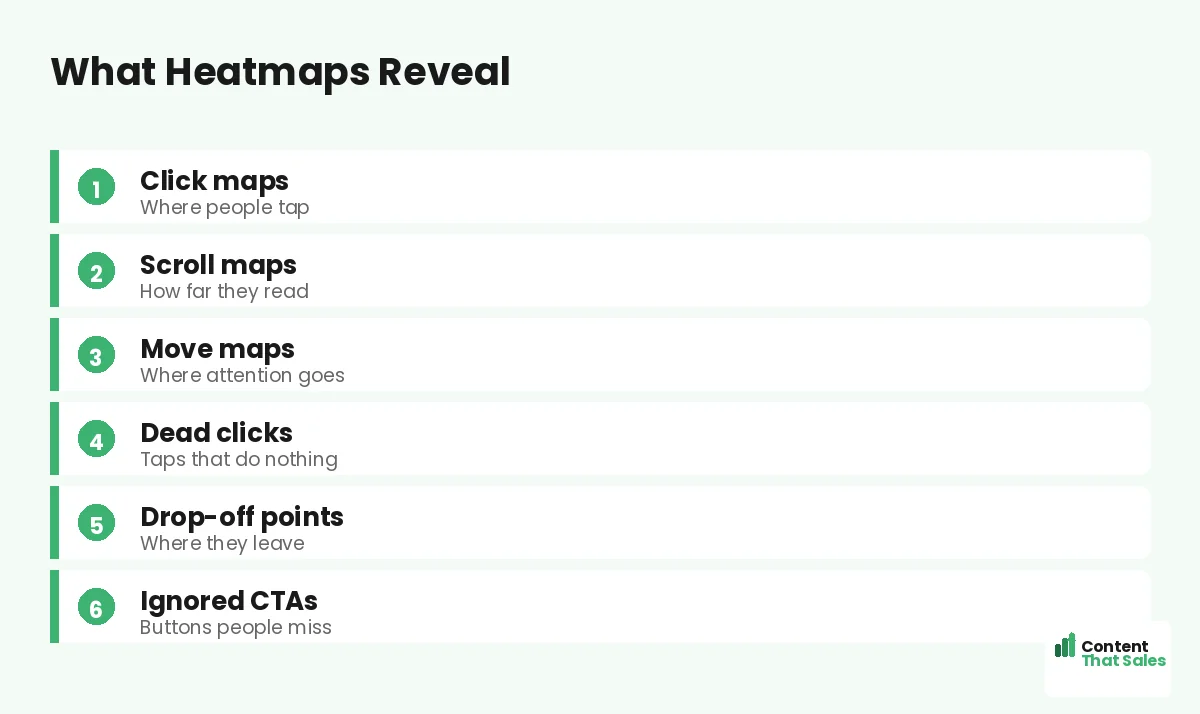
Click Maps
Click maps show where visitors tap or click. They reveal which buttons and links get used, and which get ignored. If your main CTA gets few clicks while a minor link gets many, that is a clear signal something is off.
Click maps also expose dead clicks, taps on things that are not clickable, like an image people expect to be a button. Those frustrations point to fixes: make the element clickable, or redirect that attention to your real CTA.
Scroll Maps
Scroll maps show how far down the page visitors go. They reveal where most people stop reading, the drop-off point. If few visitors reach your CTA or key proof, that content is effectively invisible to most of your traffic.
This is one of the most actionable heatmaps. If your scroll map shows a steep drop before the CTA, move the CTA higher or strengthen the content above it. Getting key elements into the zone people actually see lifts conversions directly, which is a core item on any landing page optimization checklist.
Move Maps
Move maps track where visitors move their cursor, which often follows where they look. They hint at where attention goes on the page. While less precise than clicks or scrolls, they help you see which areas draw focus and which are overlooked.
Use move maps to check whether attention lands on your most important elements. If the eye drifts away from your headline or CTA toward something minor, you may need to adjust the layout or visual hierarchy to guide focus where it matters.
Spot the Drop-Off Points
The biggest value of heatmaps is finding where you lose people. A sharp drop in the scroll map, a CTA with no clicks, or attention pooling in the wrong place all mark leaks. These are the spots quietly costing you conversions.
Since readers scan more than they read, heatmaps often show people skimming and bailing fast. Spotting exactly where they disengage tells you precisely where to focus your fixes for the biggest impact.
Find Ignored CTAs and Dead Clicks
Heatmaps reveal two common, costly problems: CTAs people ignore and dead clicks. If your call to action gets little attention, it may be poorly placed, weakly styled, or lost in clutter. The fix is to make it stand out and sit where eyes land.
Dead clicks show misplaced expectations, people clicking something that does nothing. Either make it functional or guide that intent toward your real CTA. Both insights turn wasted visitor effort into recovered conversions.
Did you know?
Scroll maps often reveal that most visitors never reach the CTA, which means simply moving it higher can lift conversions with no other change.
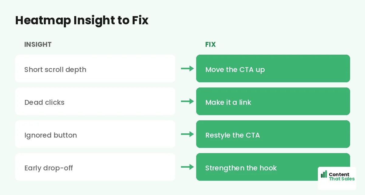
Turn Insights Into Fixes
A heatmap is only useful if you act on it. For each insight, write a fix. Short scroll depth: move the CTA up. Dead clicks: make the element a link. Ignored button: restyle and reposition it. Early drop-off: strengthen the hook.
Prioritize fixes by impact, tackling the biggest leaks first. Heatmaps make this easy because they point to specific, visible problems. Pair them with a full landing page audit to combine behavioral data with a principle-based review.
Combine Heatmaps With Other Data
Heatmaps are powerful but not the whole picture. Combine them with analytics, which show traffic and conversion numbers, and with session recordings, which show individual journeys. Together they give you both the what and the why.
For example, analytics flag a low conversion rate, a scroll map shows people leaving before the CTA, and a recording confirms confusion at a certain section. That layered view turns a vague problem into a precise, fixable one.
Gather Enough Data First
Do not act on a heatmap built from a handful of visitors. Patterns need enough traffic to be reliable, so let the data accumulate before drawing conclusions. A heatmap from ten visitors can mislead; one from hundreds reveals real trends.
Also segment where useful. Mobile and desktop visitors behave differently, so view their heatmaps separately. A page that works on desktop may have a hidden CTA on mobile, which is why mobile landing page optimization matters so much. Enough data, properly segmented, keeps your conclusions trustworthy.
Use Heatmaps as a Habit
Heatmaps are not a one-time check. Review them regularly and after every major change to see how behavior shifts. A fix you made may solve one problem and reveal another. Ongoing observation keeps your optimization on track.
Simple, clear copy keeps winning, since easy reading lifts conversions, and heatmaps confirm whether readers actually engage with that copy. Make heatmap review a regular habit and your pages keep improving with real evidence behind every change.
Put It All Together
Heatmaps turn invisible visitor behavior into clear, actionable evidence. Click, scroll, and move maps show what gets attention, what gets ignored, and where people leave. That insight lets you fix the real problems instead of guessing.
Gather enough data, read the maps, turn insights into prioritized fixes, and combine heatmaps with analytics and recordings. Make it a habit, and heatmaps become one of your most reliable tools for steadily lifting conversions.
How Content That Sales Helps
We turn behavior data into better pages. That’s where we come in. At Content That Sales, we read your heatmaps and analytics, then rewrite the copy and structure where visitors drop off or lose focus.
You share your page and your data. We find where attention fades and conversions leak, then fix the gaps with sharper copy and a clearer layout. The result is a page tuned to how your visitors actually behave.
Ready to See What Your Visitors Do?
Now you know how to use heatmaps to improve landing pages: read click, scroll, and move maps, find the drop-off, and turn insights into fixes. Real behavior beats guesswork. So why optimize blind when heatmaps show you the truth?
Let’s use your data to lift your conversions. Book your free consultation now. Call us at 8801631988589 or email service@contentthatsales.com. Let’s turn your next visitor into your next customer.
Frequently Asked Questions About Heatmaps
What is a heatmap?
A visual overlay on your page showing where visitors click, move, and scroll, using color to mark activity. Warm colors mean attention; cool colors mean little.
What do heatmaps reveal?
Where people click, how far they scroll, where attention goes, dead clicks, drop-off points, and ignored CTAs, showing how visitors actually experience your page.
What is a scroll map good for?
It shows how far visitors scroll. If few reach your CTA or proof, that content is invisible to most traffic, so moving it higher can lift conversions.
What are dead clicks?
Taps on things that are not clickable, like an image people expect to be a button. They reveal misplaced expectations you can fix or redirect to your CTA.
How much data do I need?
Enough for reliable patterns, usually hundreds of visitors, not a handful. Segment mobile and desktop too, since they often behave very differently.
Should I combine heatmaps with other data?
Yes. Pair them with analytics for the numbers and session recordings for individual journeys, giving you both the what and the why behind behavior.
How often should I review heatmaps?
Regularly, and after every major change. A fix may solve one problem and reveal another, so ongoing review keeps your optimization on track.
Can Content That Sales help?
Yes. We read your heatmaps and analytics, then rewrite the copy and structure where visitors drop off. Reach out for a quick quote.