 Skip to content
Mobile landing page optimization is no longer optional, because most of your visitors arrive on a phone, and a page built for desktop quietly loses them. Optimizing for mobile means designing for small screens, fast loads, easy taps, and short, scannable copy from the start. This guide shows you what mobile pages need, the fixes that lift mobile conversions, and how to design mobile-first so you convert the traffic that matters most.
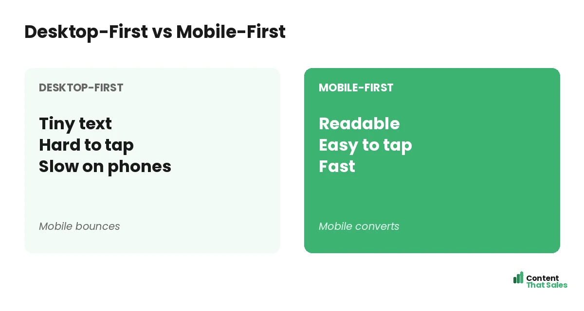
The mistake many businesses make is designing for desktop and squeezing it onto mobile as an afterthought. The result is tiny text, hard-to-tap buttons, and slow loads that send phone visitors away. Flipping to mobile-first thinking fixes that and lifts results.
Below, we cover what a mobile page needs, the key fixes for speed and usability, and how mobile-first design turns phone traffic into conversions.
Why Mobile Optimization Matters
Most web traffic now comes from phones, and for many ads, especially social, it is the overwhelming majority. If your page does not work well on mobile, you lose most of your visitors before they even read your offer. Mobile is where conversions are won or lost.
A page built on a strong landing page structure still needs mobile tuning to perform. The structure provides the bones; mobile optimization makes sure those bones work on the small screen where most people actually see your page.
Design for the Phone First
Mobile-first means designing for the smallest screen before scaling up, not the reverse. When you start with mobile, you focus on what truly matters and make sure the core experience works where most visitors are. Desktop then becomes the easy add-on.
This flips the usual habit. Instead of cramming a desktop page onto a phone, you build for the phone and expand. The result is a page that feels native on mobile rather than a shrunken, awkward version of a desktop layout.
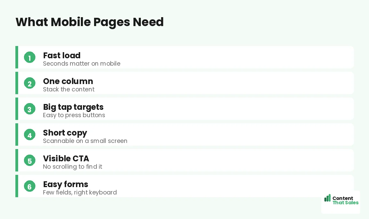
Make It Load Fast
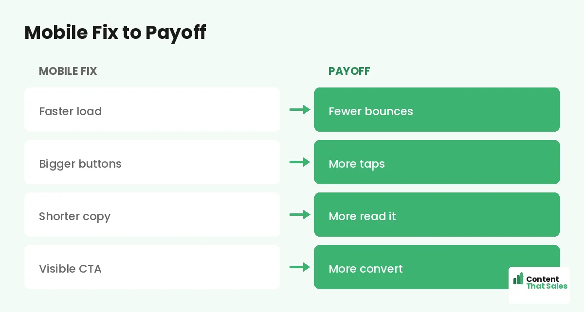
Speed is critical on mobile, where connections vary and patience is short. A slow page loses visitors in seconds. Compress images, trim heavy scripts, and cut anything that delays the load. Every second saved keeps more visitors on the page.
Mobile users often browse on the go, so they expect instant loads. A fast page is the foundation of mobile conversion. For more on this, a dedicated focus on page speed for landing pages pays off most on mobile.
Use a Single Column
Phones are narrow, so stack your content in one column. Multi-column layouts that work on desktop break or shrink awkwardly on mobile. A single column guides the visitor straight down the page in a clear, natural flow.
One column also makes the page easy to scan and scroll with a thumb. It keeps the reading order obvious and the layout clean. For mobile, simple vertical flow beats clever multi-column designs every time.
Make Tap Targets Big
Fingers are less precise than a mouse, so buttons and links must be big and well-spaced. Tiny or crowded tap targets cause mis-taps and frustration. Make your CTA button large, easy to hit, and surrounded by space.
This applies to every interactive element: buttons, links, and form fields. If a visitor has to zoom or tap carefully, you add friction. Generous, finger-friendly tap targets keep the path to conversion smooth on a small screen.
Keep Copy Short and Scannable
Long paragraphs that are fine on desktop feel endless on a phone. Keep mobile copy short, with brief sentences, small paragraphs, and clear subheads. Since readers scan more than they read, scannable copy is essential on mobile.
Break text into bite-sized chunks the eye can skim. Use bold subheads and short lines so the visitor can grasp your message while scrolling quickly. Tight, scannable copy respects the limited screen and the impatient mobile reader.
Did you know?
Most landing page traffic now comes from phones, so a page that is not optimized for mobile may be failing the majority of its visitors without you realizing it.
Keep the CTA Visible
On mobile, the visitor should never have to hunt for the next step. Keep your primary CTA visible early and repeat it as they scroll. A sticky button that stays on screen can work well, putting the action always within thumb’s reach.
Make the CTA stand out with color and size. Following solid landing page CTA best practices tuned for mobile, an always-accessible, obvious button means a ready visitor can act the instant they decide.
Simplify the Form
Forms are harder to fill on a phone, so keep them as short as possible. Ask only for essential fields, use the right keyboard for each input, and enable autofill where you can. Every bit of friction costs you mobile completions.
Big, well-spaced fields and a clear, value-led button make the form easy to complete with thumbs. If your form is long, consider a multi-step form that feels lighter. A frictionless mobile form is one of the biggest conversion wins.
Test on Real Devices
Never assume a page works on mobile, check it on real phones. Different screen sizes and browsers behave differently. Test how the page looks, loads, and taps on an actual device before you send traffic to it.
What looks fine in a desktop preview can break on a real phone: a cut-off headline, an unreachable button, a slow load. Real-device testing catches these issues so you fix them before they cost you conversions from live traffic.
Optimize Images for Mobile
Images are often the heaviest part of a page and the biggest drag on mobile speed. Compress them, size them correctly for small screens, and use modern formats. Light images keep the page fast without sacrificing how it looks.
Also make sure images add value rather than clutter. On a small screen, every element competes for limited space. Keep visuals purposeful and light, and your mobile page stays both fast and focused on the conversion.
Put It All Together
Mobile landing page optimization means designing for the phone first: fast loads, a single column, big tap targets, short scannable copy, a visible CTA, and a simple form. Get these right and you convert the majority of visitors who arrive on mobile.
Test on real devices, optimize images, and treat mobile as the primary experience, not an afterthought. Simple, clear copy keeps winning, since easy reading lifts conversions, especially on a small screen. Build mobile-first and your page wins where your traffic lives.
How Content That Sales Helps
We build pages that win on mobile. That’s where we come in. At Content That Sales, we design and write landing pages mobile-first, with fast loads, scannable copy, and easy taps that convert phone traffic.
You share your offer and audience. We craft a page that works beautifully on the small screen, where most of your visitors are. The result is a mobile experience that converts instead of frustrating, capturing the traffic that matters most.
Ready to Win on Mobile?
Now you know mobile landing page optimization: design for the phone first, with speed, single-column flow, big taps, short copy, a visible CTA, and a simple form. Most of your visitors are on mobile. So why let a desktop-first page lose them?
Let’s build a page that converts mobile traffic. Book your free consultation now. Call us at 8801631988589 or email service@contentthatsales.com. Let’s turn your next mobile visitor into your next customer.
Frequently Asked Questions About Mobile Optimization
Why is mobile optimization important?
Most web traffic now comes from phones, and for many ads it is the majority. A page that fails on mobile loses most of its visitors before they read your offer.
What is mobile-first design?
Designing for the smallest screen before scaling up. You build the core experience for the phone, where most visitors are, then expand it to desktop.
How fast should a mobile page load?
As fast as possible. Connections vary and patience is short, so a slow page loses visitors in seconds. Compress images and trim scripts to speed it up.
Why use a single column on mobile?
Phones are narrow. A single column guides the visitor straight down the page in a clear flow, while multi-column layouts break or shrink awkwardly.
How big should tap targets be?
Big and well-spaced. Fingers are less precise than a mouse, so small or crowded buttons cause mis-taps. A large, spaced CTA keeps the path smooth.
How should I handle copy on mobile?
Keep it short and scannable, with brief sentences, small paragraphs, and clear subheads, so visitors can grasp your message while scrolling quickly.
Should I test on real devices?
Yes. Desktop previews miss real issues like cut-off headlines or slow loads. Test on actual phones before sending traffic to the page.
Can Content That Sales help?
Yes. We design and write landing pages mobile-first, with fast loads and easy taps that convert phone traffic. Reach out for a quick quote.