 Skip to content
 Most landing pages underperform because of a short list of common landing page mistakes, not bad luck. Teams send great traffic to pages that confuse the reader, hide the offer, or bury the one action that matters. Each mistake quietly leaks the leads you paid for. The good news is that these ten mistakes are predictable, which means they are fixable. This guide names the biggest conversion killers and the simple fix for each, so you can plug the leaks fast.
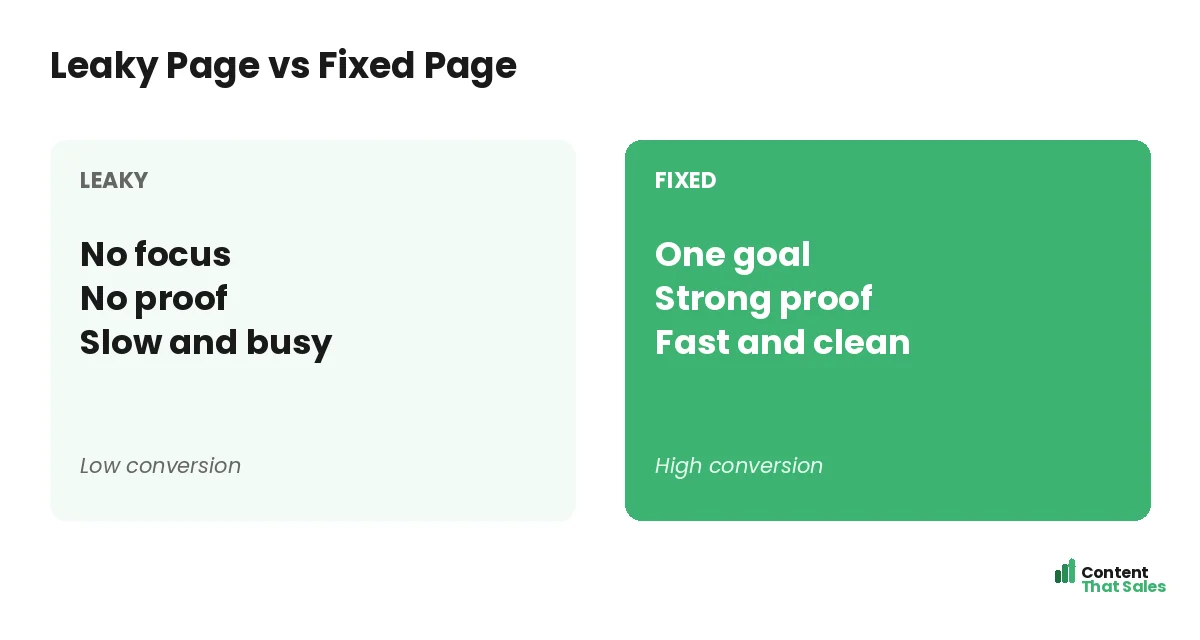
Think of your landing page as a bucket. Traffic pours in the top, but every mistake is a hole that lets leads drain out. Fix the holes and the same traffic suddenly fills the bucket. You do not always need more visitors. You need a page that keeps the ones you have. Let’s find and patch the holes.
Below are the ten mistakes that kill conversions most often, with why each one hurts and how to fix it. Run your page against this list and you will likely spot a few quick wins.
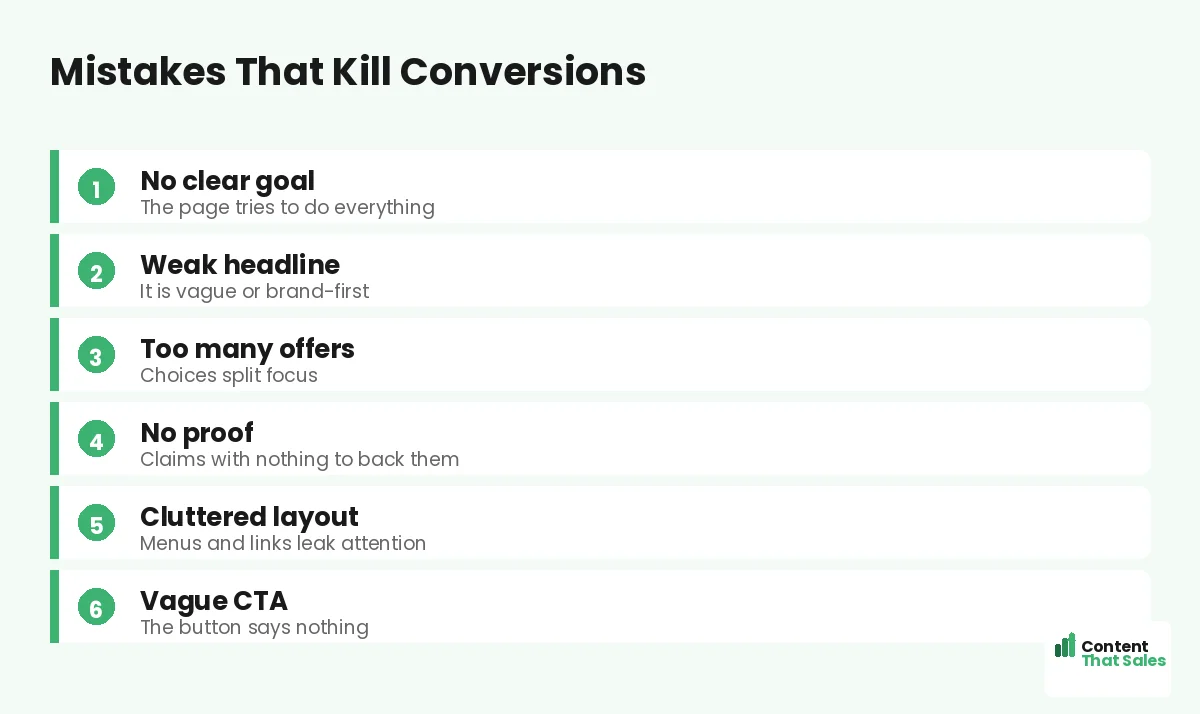
Mistake 1: No Single, Clear Goal
A page with many goals converts none of them well. When you ask for a call, a download, and a follow all at once, the reader freezes. Choice overload stalls action. The fix is one goal per page, with everything pointing to it.
Decide the single action before you write a word. Then cut anything that competes with it. A focused page guides the reader to one clear step, which is the foundation of every high-converting page.
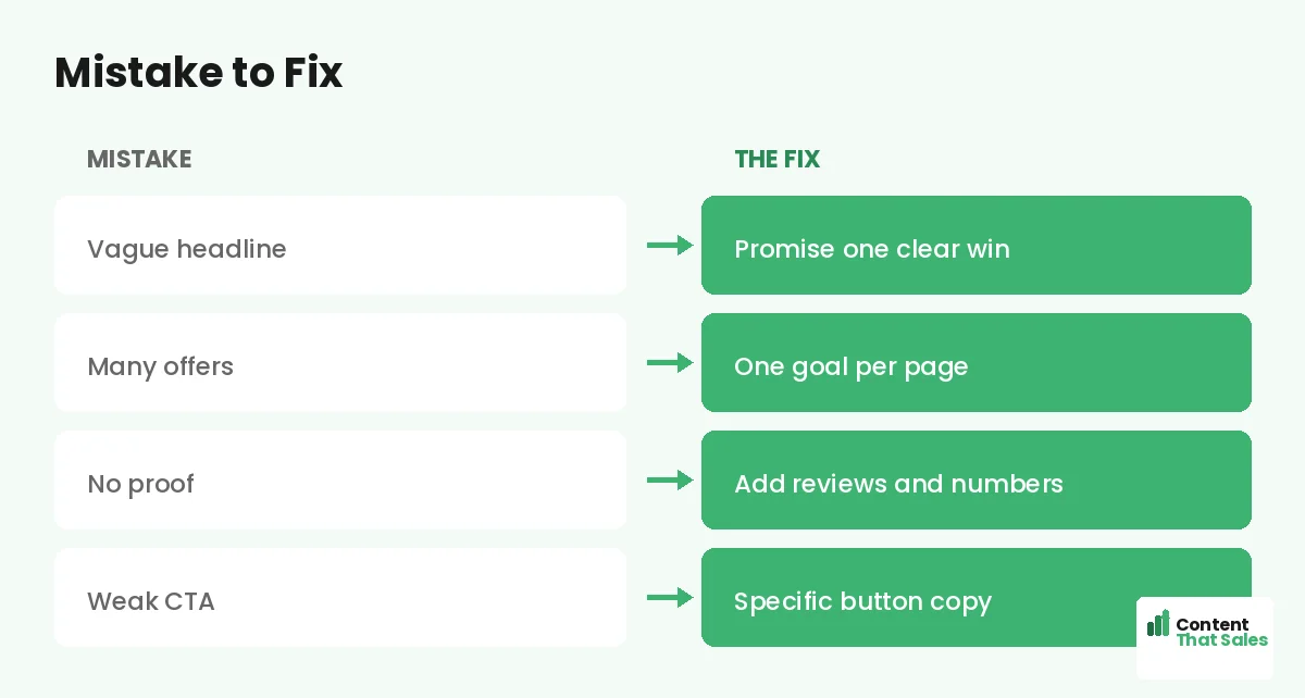
Mistake 2: A Weak or Vague Headline
The headline is read by most visitors and skipped by few, so a weak one caps the whole page. Vague lines like “We help businesses grow” say nothing the reader can picture. Brand-first headlines lose people who came for their own win.
Fix it by leading with a specific reader benefit. “Get more booked jobs in 30 days” beats a fuzzy claim. A sharp headline stops the scroll and gives the rest of the page a chance to work.
Mistake 3: Too Many Competing Offers
More offers feel generous but split focus. Extra asks can sink your conversion rate, because the reader cannot choose and so chooses nothing. One page should have one offer and one action.
If you have two offers, build two pages. This is the core idea behind why landing pages fail. Keep the page focused on a single ask, and conversions rise.
Mistake 4: No Proof to Back Your Claims
Anyone can claim to be the best. Without proof, it is just noise. Empty claims raise doubt instead of trust, and doubt near the button is deadly. The fix is real proof placed close to the ask.
Add reviews, testimonials, numbers, and logos. Even a simple count like “trusted by 200 owners” helps. People scan more than they read, so make proof easy to spot. Seeing is believing.
Mistake 5: A Cluttered, Distracting Layout
Clutter buries your message. A full menu, side links, sliders, and walls of text all steal attention. Each distraction is an exit. The fix is to strip the page down to the essentials.
Remove the menu, cut extra links, and use short blocks with clear headers. Let one button be the star. A clean, focused page guides the eye, while a busy one scatters it. Clean beats busy every time.
Mistake 6: A Weak or Hidden Call to Action
A vague button kills momentum. “Submit” tells the reader nothing, and a CTA buried below the fold gets missed. The fix is a specific, visible, repeated call to action.
Use copy that names the value, like “Book my free call.” Make the button stand out and place it high, then repeat it. To get the wording right, see how to write landing page copy that converts. A clear ask wins more clicks.
Did you know?
Adding a second offer to a page can drop conversions by a wide margin. One focused ask almost always beats two competing ones.
Mistake 7: Talking About You, Not the Reader
Visitors care about their own goals, not your company story. A page full of “we” and “our” leaves them cold. If the copy never names their problem and their win, they feel unseen and leave.
Flip the focus to the reader. Lead with their problem and the result they want, and use “you” more than “we.” A reader-first page feels like it was written for them, which is exactly what earns the click.
Mistake 8: Features Instead of Benefits
A page that lists specs leaves the reader cold. They want to know what they get, not what you have. “24-hour turnaround” is a feature. “Wake up to finished work” is a benefit. Lead with the benefit.
Run each feature through the question “so what?” until you reach the feeling. People buy the result, not the tool. Selling the outcome is what makes a reader lean toward the button instead of clicking away.
Mistake 9: A Long or Scary Form
Every extra form field sheds leads. A ten-field form feels like work and scares people off, especially on mobile. The fix is to ask for only what you truly need, often just a name and an email.
Trim the form and reassure with a line like “no spam, ever.” A short, safe-feeling form turns more interested readers into actual leads. The smoother the next step, the more people complete it.
Mistake 10: A Slow or Mobile-Unfriendly Page
A slow page loses visitors before they read a word, and most traffic is mobile now. A clunky mobile view sinks conversions. The fix is a fast, clean, thumb-friendly page.
Compress images, cut heavy scripts, and design for the phone first. Simple, clear copy helps too, since easy reading lifts conversions. A fast page gives your message the chance to do its job.
How to Audit Your Page Against These Mistakes
Run a quick check. Read your page as a stranger would. Is the goal clear? Does the headline promise a win? Is there proof near the button? Is the form short? Does it load fast on a phone? Each “no” is a leak to fix.
Fix the biggest leak first, then the next. Many of these mistakes also show up in why visitors don’t convert. A short, honest audit usually reveals a few quick wins that lift your rate fast.
Fix One Mistake at a Time
The temptation is to overhaul everything. Resist it. Fix one mistake, watch the numbers, then fix the next. This keeps your results clean and tells you which change actually moved the needle. Steady fixes beat a risky rebuild.
Most of these fixes take minutes, not months. Clearer words, a shorter form, a stronger button. Each one lifts your odds a little, and the wins stack up. A page free of these ten mistakes converts far more of its traffic.
How Content That Sales Fixes These Mistakes
Most of these mistakes come down to unclear copy and lost focus, which is our specialty. That’s where we come in. At Content That Sales, we audit your page, find the leaks, and rewrite it to be clear, focused, and built to convert.
You share the page and the goal. We fix the headline, the proof, the CTA, and the flow. If you want done-for-you landing page copy, we handle the whole rewrite. The result is a page free of the mistakes that quietly cost you leads, converting more of the traffic you already pay for.
Ready to Turn Visitors Into Customers?
Now you know the ten landing page mistakes that kill conversions and how to fix each one. One goal. A sharp headline. Real proof. A strong CTA. Benefits, a short form, and speed. So why keep paying for clicks a leaky page throws away?
Let’s patch the leaks and lift your conversions. Book your free consultation now. Call us at 8801631988589 or email service@contentthatsales.com. Let’s turn your next visitor into your next customer.
Frequently Asked Questions About Landing Page Mistakes
What is the most common landing page mistake?
Having no single, clear goal. A page that asks for many things at once overwhelms the reader, so they take no action. One goal per page is the fix.
Why does a vague headline hurt conversions?
Most visitors read the headline and decide fast. A vague or brand-first headline gives no reason to stay, so they leave before seeing the rest.
Do too many offers really lower conversions?
Yes. Extra offers split focus and cause choice overload, so people pick none. One offer and one action almost always convert better.
Where should proof go on a landing page?
Near the call to action, where doubt peaks. A strong testimonial or a simple count beside the button turns hesitation into action.
How long should the form be?
As short as possible, often just a name and email. Every extra field sheds leads, so ask only for what you truly need.
Does page speed affect conversions?
A lot. A slow page loses visitors before they read, especially on mobile. A fast, clean page gives your message a chance to convert.
Should I fix all the mistakes at once?
No. Fix one at a time and measure, so you know what worked. Changing everything at once makes the results impossible to read.
Can you fix my landing page mistakes?
Yes. Content That Sales audits and rewrites pages to remove these conversion killers. Reach out for a quick quote.