 Skip to content
 Landing pages for webinars succeed when they sell the takeaway, make the logistics crystal clear, and keep registration effortless. People do not sign up for a webinar; they sign up for what they will learn. The pages that fill virtual seats lead with a benefit-led title, list the exact takeaways, show a credible host, state the date and time plainly, and ask for almost nothing. This practical guide walks you through building a webinar page that gets sign-ups and reduces no-shows.
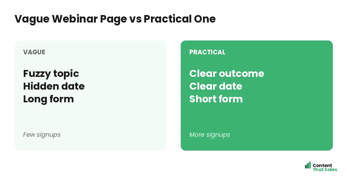
Webinars are a powerful lead and sales tool, but a weak page wastes the promotion that drives traffic to it. Your page has seconds to convince a busy person that an hour of their time is worth it. Clarity about the value and the logistics does that. Let’s build a page that packs the room.
Below, we cover the title, the takeaways, the host, the registration, and the follow-up that make webinar pages convert and keep attendees showing up.
Start With a Benefit-Led Title
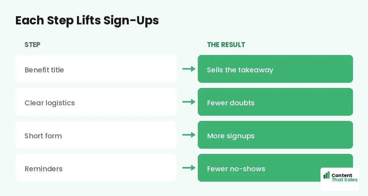
Your webinar title is the headline of the page, so make it about the attendee’s win. “How to book 20% more jobs from your ads” beats “Marketing webinar.” A specific, outcome-led title tells the reader instantly why the hour is worth their time.
Title the webinar like you would any strong headline, around a clear result. A vague topic earns a shrug, but a concrete promise earns a signup. The title does most of the convincing, so spend real effort getting it sharp.
List the Exact Takeaways
Spell out what attendees will learn, usually as three crisp bullets. “You’ll learn how to write a hook, structure your page, and test for wins.” This makes the value tangible and easy to scan in seconds, which is how most people read.
People scan more than they read, so three benefit bullets do more than a long description. Concrete learning points let the reader picture the payoff and decide quickly to register.
Show a Credible Host
People want to know the host is worth their time. Include a short bio with a photo and one line of credibility, like results delivered or years of experience. It answers the silent question, why should I listen to this person for an hour.
Keep the bio focused on why the reader should care, not a full resume. Authority makes the promise believable. A credible host, shown briefly and clearly, reassures the reader that the takeaways are real and the time will be well spent.
Make the Date, Time, and Format Clear
Logistics matter more than people expect. State the date, the time with the time zone, and the format clearly. Note whether there is a replay, which reassures people who fear they cannot attend live. Confusion about when or how to join quietly kills signups.
Remove every logistical doubt. A clear date, time zone, and replay promise let the reader commit without hesitation. Make attending feel easy and certain, and more of the interested visitors will actually register.
Keep Registration Short
Ask for as little as possible. A name and an email are usually enough. Every extra field, like company size or phone number, drops registrations. The form should feel like a two-second step, not a survey to complete.
This mirrors the short-form approach in our lead generation landing page examples. Follow solid landing page CTA best practices so the register button is clear and repeated. The easier you make signing up, the fuller your webinar.
Did you know?
Offering a replay to registrants can lift sign-ups, because it removes the fear of missing out for anyone who cannot attend the live session.
Add Light Urgency and Proof
A gentle nudge helps. Honest urgency, like limited seats or a closing registration date, encourages people to act now instead of later. A line of social proof, such as “join 2,000 marketers who attended last time,” adds reassurance.
Keep both genuine. Never fake a countdown or invent attendance numbers. A real reason to register now, paired with proof that others found the session worthwhile, lifts signups without harming the trust your webinar depends on.
Reduce No-Shows With Follow-Up
Getting the signup is half the battle; getting attendance is the other half. Confirm the registration immediately and send reminders before the event. A confirmation page that adds the webinar to their calendar boosts the show-up rate.
Plan a short reminder sequence: one a day before, one an hour before. Mention the value they will get if they attend live. A practical page does not stop at registration. It sets up the follow-up that turns signups into actual attendees.
Match the Page to Your Promotion
However you promote the webinar, the page must keep that promise. If your email or ad teased a specific topic, the page headline should echo it. Message match builds instant trust and tells the reader they reached the right registration page.
Build a focused page for each webinar and each promotion when you can. The page should reflect exactly what the promotion offered, so the visitor feels a smooth handoff from the click to the signup. Relevance lifts registrations.
Design for Mobile and Speed
Many people register from a phone, often between tasks. So design the page for mobile first. The title, the takeaways, and the register button must shine on a small screen. A slow or cramped page loses the signup before it loads.
Keep images light and the form short for mobile. A fast, thumb-friendly page captures the registration that a clunky one would lose. Test it on a real phone and make sure registering takes just a couple of taps.
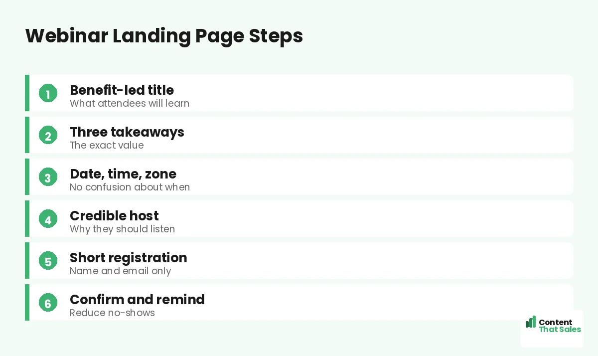
A Simple Webinar Page Recipe
Put it together. Lead with a benefit-led title. List three takeaways. Show a credible host. State the date, time, zone, and replay. Keep registration to a name and email. Add light urgency and proof, then confirm and remind.
This recipe works for live webinars, workshops, and masterclasses alike. Adjust the topic and host, but keep the clear value and easy signup. Clear, simple wording wins too, since easy reading lifts conversions. For more layouts, see our webinar landing page examples.
How Content That Sales Builds Webinar Pages
A webinar page lives or dies on how well it sells the takeaway, and that is our craft. That’s where we come in. At Content That Sales, we write the title, the learning points, and the registration copy that fill seats and reduce no-shows.
You share the topic, the host, and the date. We build the page on a proven webinar structure. The result is a focused page that turns visitors into registrants. If you want done-for-you landing page copy, we handle the whole build, and your event fills into a full, engaged room.
Ready to Turn Visitors Into Customers?
Now you have a practical guide to landing pages for webinars. Sell the takeaway. List the learnings. Show the host. Clarify the date and keep the form short, then confirm and remind. So why run a vague event page when this structure fills seats?
Let’s build a webinar page that packs the room. Book your free consultation now. Call us at 8801631988589 or email service@contentthatsales.com. Let’s turn your next visitor into your next registrant.
Frequently Asked Questions About Webinar Landing Pages
What makes a webinar landing page convert?
A benefit-led title, three clear takeaways, a credible host, clear logistics, and a short registration form. Sell the value of the hour, then make signing up effortless.
What should the webinar title say?
Promise a specific outcome, not just a topic. Title it like a headline around the attendee’s win, so the value is clear at a glance.
How short should registration be?
Usually a name and an email. Every extra field lowers signups, so ask for the minimum and learn more about attendees later.
Should I offer a replay?
Yes, it often lifts signups. A replay removes the fear of missing out for anyone who cannot attend live, so more people register.
How do I reduce no-shows?
Confirm the signup, add it to their calendar, and send reminders a day and an hour before. Reminders meaningfully boost the show-up rate.
Do I need a host bio?
Yes, a short one with a photo and a line of credibility. It tells the reader why the host is worth an hour of their time.
Should the page match my promotion?
Yes. Echo the email or ad that drove the traffic. Message match builds trust and confirms the reader reached the right registration page.
Can you write my webinar page?
Yes. Content That Sales builds webinar pages that fill seats. Reach out for a quick quote.