 Skip to content
Writing a CTA that converts on mobile means making the button easy to see, easy to read, and easy to tap with one thumb. Most of your visitors are on a phone now, yet most landing pages are still designed for a desktop first. That gap quietly costs you leads every single day. On a small screen, a buried button, a long label, or a slow page is enough to lose the click. This guide shows you how to write and place a mobile CTA that actually gets pressed.
Mobile is not just a smaller desktop. People scroll fast, one-handed, often distracted and in a hurry. Your CTA has to meet them in that moment. It must be obvious, instant, and effortless to act on. Get that right and you capture the majority of traffic that desktop-first pages leave behind.
Below, we cover the button size, the copy, sticky placement, form length, and speed that make a mobile CTA win. By the end, your phone visitors will tap with ease instead of bouncing in frustration.
Why Mobile CTAs Need Their Own Rules
A desktop CTA assumes a big screen, a mouse, and a patient visitor. None of that holds on mobile. The screen is small, the input is a thumb, and the visitor is often distracted and rushed. A button that works on a laptop can be a nightmare on a phone.
So mobile needs its own approach, not a shrunken copy of the desktop. The good news is that the fixes are simple and they help everywhere. A clearer, bigger, faster CTA wins on every device. Design it for the phone, and the desktop version only gets better.
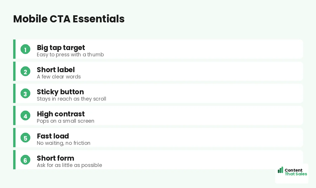
Make the Button a Big, Easy Tap Target
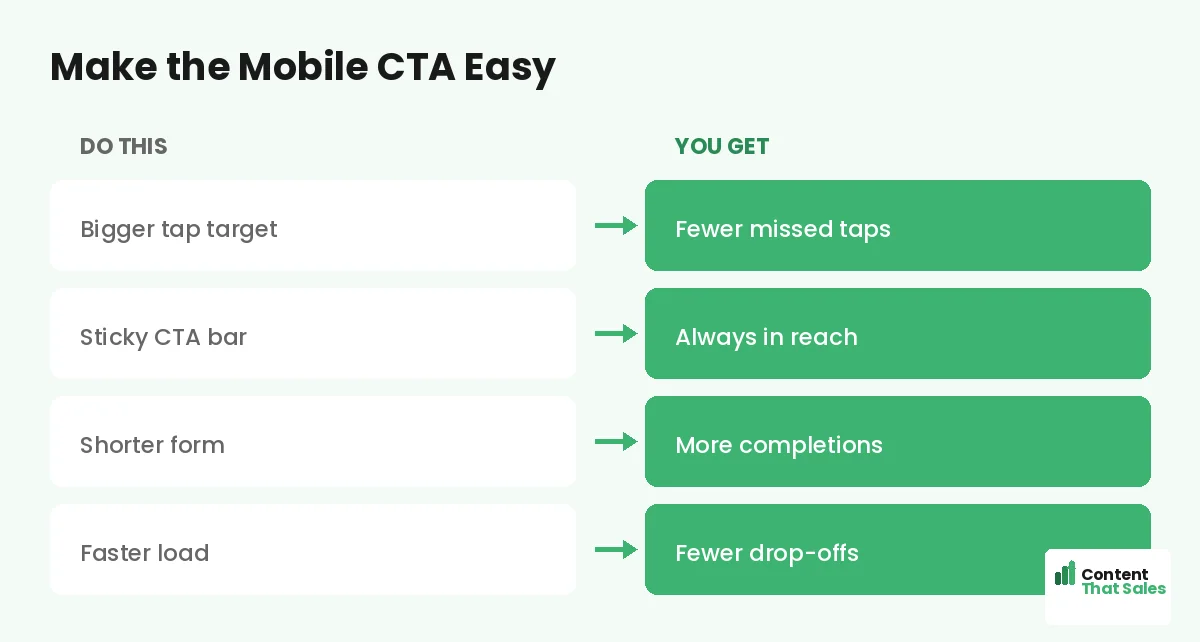
The first rule is size. A button must be big enough to tap with a thumb without zooming or squinting. Tiny buttons cause missed taps, and a missed tap is a lost lead. Give the button real height and width, with space around it so fingers do not hit the wrong thing.
Edges matter too. The button should look obviously tappable, with clear shape and color. A flat link is easy to miss on a phone. People scan more than they read, so the button must read as a button at a glance, even to a thumb in a hurry.
Keep the Copy Short and Punchy
Mobile screens have no room for long button labels. A wordy CTA wraps awkwardly or shrinks the text. Keep it to a few clear words that name the value. “Get my free quote” or “Start free” fits and still tells the reader exactly what they get.
Short does not mean vague. Lead with a verb and the value, then stop. For more ready-to-use lines that fit a small screen, see the best CTA copy for landing pages. On mobile, every extra word is a cost, so cut anything that does not earn its space.
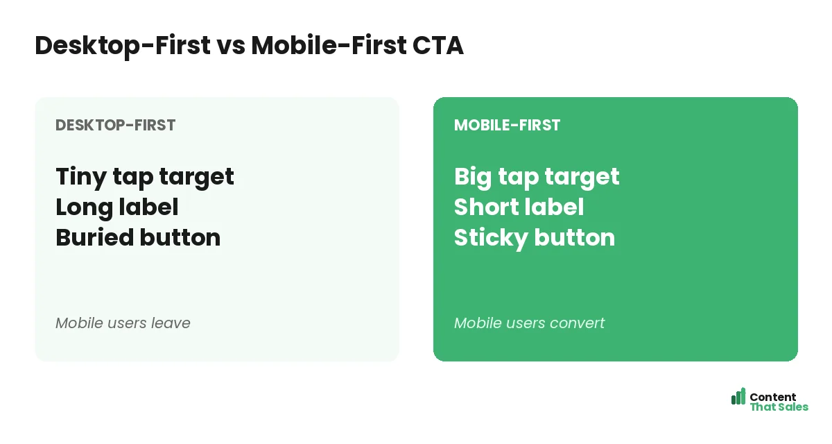
Use a Sticky CTA That Stays in Reach
On a long mobile page, the button can scroll out of view for ages. A sticky CTA fixes that by staying pinned to the bottom of the screen as the visitor scrolls. The moment they are ready, the button is right there under their thumb.
Keep the sticky bar small and clean so it does not block the content. One clear button, maybe with a short line of microcopy, is enough. A sticky CTA means the reader never has to hunt for the next step, which removes a quiet but real source of drop-off.
Make It Pop With Contrast
Small screens make weak contrast even weaker. A button that blends into the page disappears on a phone in bright sunlight. Use a high-contrast color so the CTA stands out instantly, even in poor light or at a glance.
Keep the rest of the mobile view calm so the button is the clear hero. Contrast, not a specific color, is what makes it visible. This is the same principle behind good CTA button color and copy, just made stricter by the small screen.
Did you know?
Mobile drives the majority of landing page visits, yet mobile often converts lower than desktop. A thumb-friendly CTA helps close that costly gap.
Shorten the Form Behind the Click
The click is only the start. What follows must be just as easy on mobile. A long form with ten fields is painful to fill on a phone, and many people give up halfway. Ask only for what you truly need, often just an email or a phone number.
Use mobile-friendly inputs too. The right keyboard for emails or numbers, big fields, and as few taps as possible. Every field you remove lifts completions. On mobile especially, the shortest path from click to done wins the most leads.
Speed Is Part of the CTA
A button no one waits to see cannot convert. Mobile users are quick to bounce from a slow page, often before the CTA even loads. Keep images light, scripts lean, and the page fast. Speed is invisible when it works and fatal when it fails.
Test your load time on a real phone and a normal connection, not just office wifi. If the page drags, fix that before you tweak the button. A fast page gives your CTA the chance to do its job in the first place.
Place the CTA Where Thumbs Land
On a phone, the easy-to-reach zone is the lower middle of the screen. Top corners are a stretch for one hand. Put your main button where a thumb naturally rests, and repeat it as the reader scrolls, following solid landing page CTA best practices.
Show the first CTA early, then again after the key benefits and proof. People decide at different points, so give them more than one easy chance. A sticky bar can carry the action through the whole scroll, so it is never out of reach.
Common Mobile CTA Mistakes
A few slips ruin mobile conversions. A tiny button that is hard to tap. A long label that wraps and breaks. A slow page that loads after the visitor gives up. A long form that feels endless on a phone. Each one quietly sheds leads.
The fix is to design for the thumb and the moment, and easy reading lifts conversions on mobile too. Big button, short copy, fast load, short form. Clear and effortless beats clever and cramped on every small screen.
How Content That Sales Optimizes Mobile CTAs
Most pages still treat mobile as an afterthought, and it shows in the results. That’s where we come in. At Content That Sales, we write CTAs and pages that are built for the thumb first, so your largest audience converts instead of bouncing.
You share the offer and the goal. We craft the button copy, the microcopy, and the flow that work on a small screen. If you want done-for-you landing page copy, we make it effortless. The result is a mobile page that turns thumbs into leads.
Ready to Turn Visitors Into Customers?
Now you know how to write a CTA that converts on mobile. Big tap target. Short copy. Sticky placement. Fast load and a short form. So why keep losing your biggest audience to a button built for a desktop?
Let’s build a mobile CTA your visitors love to tap. Book your free consultation now. Call us at 8801631988589 or email service@contentthatsales.com. Let’s turn your next visitor into your next customer.
Frequently Asked Questions About Mobile CTAs
How do I write a CTA that converts on mobile?
Make the button a big, thumb-friendly tap target with short, value-led copy, keep it sticky and high-contrast, and shorten the form behind it. Speed and simplicity win on mobile.
How big should a mobile CTA button be?
Big enough to tap easily with a thumb, with space around it so fingers do not hit the wrong thing. Avoid tiny buttons that cause missed taps.
What is a sticky CTA?
A button pinned to the screen, usually at the bottom, that stays in reach as the visitor scrolls. It means the next step is always one tap away.
How long should mobile CTA copy be?
A few clear words that name the value, like “Start free” or “Get my quote.” Long labels wrap awkwardly and shrink the text on small screens.
Why do mobile pages convert lower than desktop?
Often because they are designed desktop-first, with small buttons, long forms, and slow loads. Building mobile-first closes much of that gap.
How short should the mobile form be?
As short as possible, often just an email or phone number. Every extra field lowers completions, and long forms are painful on a phone.
Does page speed affect mobile CTAs?
Yes. Mobile users bounce fast from slow pages, sometimes before the CTA loads. A fast page gives the button a chance to convert.
Can you optimize my mobile landing page?
Yes. Content That Sales writes mobile-first CTAs and pages that convert. Reach out for a quick quote.