 Skip to content
 When it comes to CTA button color and copy, the words matter far more than the shade. Marketers love to argue about red versus green buttons, but the truth is that contrast and copy drive the clicks, not the color itself. A button that stands out and clearly names the value will beat a “perfect” color with a vague label every time. This guide cuts through the myths and shows you what actually moves the needle on your call to action.
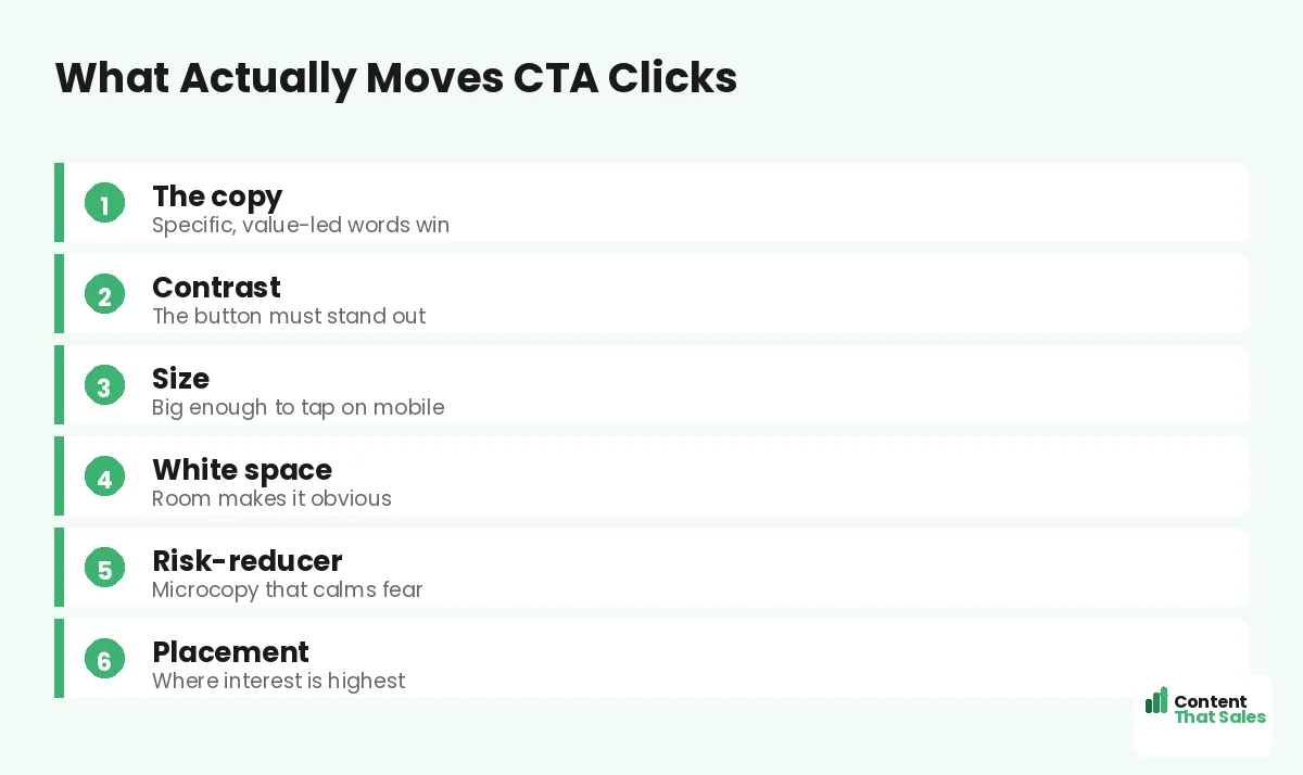
Here is the trap. People spend hours debating button color and skip the words entirely. But “Submit” in the prettiest green still loses to “Get my free quote” in almost any color. Color helps the button get noticed in the first place. Copy decides whether that noticed button actually gets clicked. Let’s give each its proper weight.
Below, we cover what color really does, why copy wins, how contrast beats any single hue, and how to test your way to the best button. By the end, you will stop guessing about color and start winning more clicks.
Why the Color Debate Is Mostly a Myth
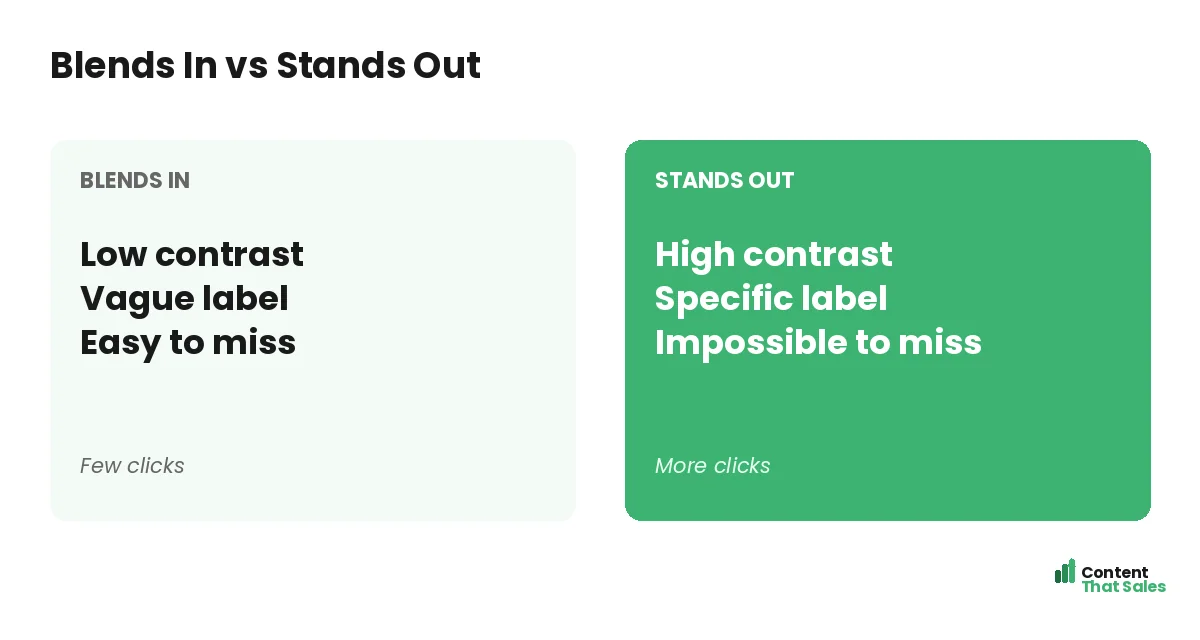
There is no magic button color. Studies that crown one color usually miss the real cause, which is contrast. A red button wins on a green page because it stands out, not because red is special. Swap the page colors and the result flips.
So stop hunting for the one perfect shade. It does not exist. What matters is whether the button pops against everything around it. Focus on contrast and you solve the color question without the endless debate.
Contrast Beats Any Single Color
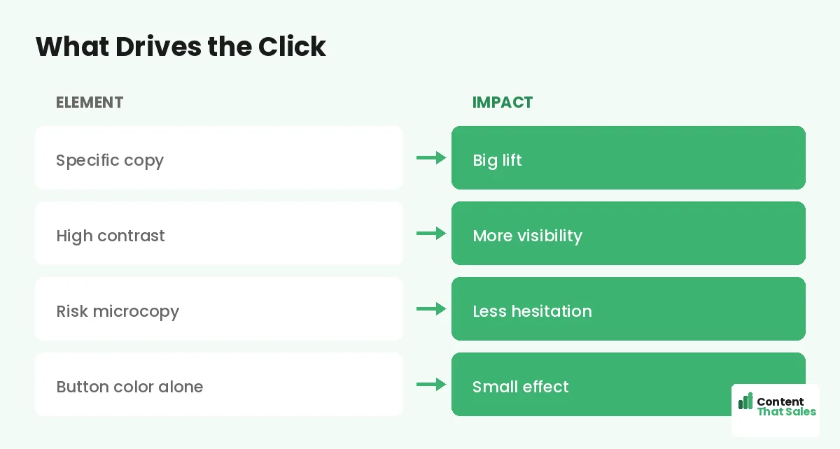
The job of color is visibility. Your button must be the most obvious element on the page. Pick a color that contrasts sharply with your background and your brand palette. If the rest of the page is calm, a bold button shines.
Keep most of the page low-key, then let the CTA pop. People scan more than they read, so the button must catch the eye in a quick pass. Contrast, not a specific hue, is what truly makes that happen on a real page.
Copy Is What Actually Earns the Click
Once the button is seen, the words decide the click. This is where most of the lift hides. A specific, value-led label beats a generic one by a wide margin. “Start my free trial” tells the reader exactly what they get.
Lead with a verb and speak to the value. Remove the fear with words like free and fast. For ready-to-use lines, see the best CTA copy for landing pages. The copy is the lever, so pull it first.
Specific Beats Generic Every Time
Generic buttons leak clicks. “Submit,” “Click here,” and “Learn more” name the task, not the reward. Specific buttons name the outcome. “Get my free quote” or “Book my free call” makes the next step clear and worth taking.
The fix is simple. Finish the sentence “I want to…” in the reader’s head, then put that on the button. When the label matches the reader’s desire, the click feels natural instead of forced, which is exactly what you want at the deciding moment.
Did you know?
Changing button copy from a generic label to a specific, value-led one has lifted clicks far more than any color swap in real tests.
Add Microcopy to Lower the Risk
The words around the button matter too. A short line under it can erase the last doubt. “No card needed.” “Takes 30 seconds.” “Cancel anytime.” This microcopy quietly lifts clicks more than any color tweak.
Think of the button and its microcopy as a pair. The button names the value, and the microcopy removes the fear. Together they make saying yes feel safe and easy at the moment of decision, right when a nervous reader needs one last gentle push.
Size, Shape, and Tap Targets
A button people cannot tap is a button people cannot click. Make it big enough for a thumb on mobile. Give it clear edges so it reads as a button, not a label. Small or flat buttons quietly lose mobile users.
Most traffic is mobile now, so design the button for a phone first. If it is easy to tap on a small screen, it works everywhere. Size and clarity beat any clever color choice here.
Placement Matters More Than Hue
Where the button sits affects clicks more than its color. Put the main CTA where interest peaks, high up for ready buyers and again after the proof. Repeat the same button down the page, following solid landing page CTA best practices.
A great button in the wrong spot still underperforms. A clear button in the right spot, repeated at the right moments, wins. Placement and repetition matter far more than the exact shade you choose.
How to Test Color and Copy
Stop guessing and test. Change one thing at a time so the result stays clean. Test a specific label against your current one first, since copy usually wins biggest. Then test contrast if the button is hard to spot.
Track clicks and conversions, not opinions. Keep the winner, then try to beat it. Simple, clear buttons tend to win, since easy reading lifts conversions. Let your visitors settle the color-versus-copy debate for your page.
Common CTA Button Mistakes to Avoid
A few slips quietly cost clicks. The biggest is a vague label like “Submit” that names the chore, not the reward. Close behind is a low-contrast button that hides in the design, so ready buyers never spot it.
Another trap is over-thinking color while ignoring everything else. A team can spend days on the perfect green and never fix the weak words on the button. That is effort aimed at the smallest lever instead of the biggest one.
The last common mistake is a tiny, hard-to-tap button on mobile. If a thumb misses it, the click is lost. Fix these four and your button will already outperform most pages, before you test a single color.
How Content That Sales Optimizes Buttons
The button is small but mighty, and the copy is where we shine. That’s where we come in. At Content That Sales, we write button labels and microcopy that name the value and remove the fear, then guide placement and testing.
You share the offer and the goal. We craft the CTA copy that earns the click. If you want done-for-you landing page copy, we make it effortless, and keep your page focused on one clear action. The result is a button that gets pressed.
Ready to Turn Visitors Into Customers?
Now you know what really matters with CTA button color and copy. Copy beats color. Contrast beats hue. Specific beats generic. Then test to confirm. So why lose another week debating shades when the words are the real lever?
Let’s write a button your visitors actually click. Book your free consultation now. Call us at 8801631988589 or email service@contentthatsales.com. Let’s turn your next visitor into your next customer.
Frequently Asked Questions About CTA Button Color and Copy
Does CTA button color really matter?
It matters only through contrast. A button wins when it stands out from the page, not because of a specific color. Focus on contrast, not a magic hue.
What matters more, button color or copy?
Copy, by a wide margin. The words on the button decide the click. Color only helps the button get noticed in the first place.
What is the best color for a CTA button?
Whatever contrasts most with your page and brand palette. There is no universal best color, only the one that makes your button pop.
What should a CTA button say?
Name the value, like “Get my free quote” or “Start my free trial.” Lead with a verb and remove the fear with words like free.
Does microcopy near the button help?
Yes. A short line like “No card needed” removes the last doubt and often lifts clicks more than any color change.
How big should a CTA button be?
Big enough to tap easily on a phone, with clear edges. Most traffic is mobile, so design the tap target for a small screen.
How do I test my button?
Change one thing at a time. Test a specific label first, then contrast. Track clicks and conversions, and keep the winner.
Can you write my CTA button copy?
Yes. Content That Sales writes and tests button copy that converts. Reach out for a quick quote.