 Skip to content
 The best CTA copy for landing pages is specific, value-led, and low-risk, so the click feels easy and obvious. Your call-to-action button is the last step between a reader and a lead, and the words on it decide whether they press or pause. Swap a vague “Submit” for a clear “Book my free call” and you can lift clicks without changing anything else. This guide gives you swipe-ready CTA copy by goal, plus the rules that make any button convert.
Button copy is small but mighty. Just a few words carry the weight of the whole page at the moment of decision. Get them right and the reader acts. Get them wrong and they hesitate, then leave. Let’s build your swipe file of CTAs that actually get clicked.
Below are the best CTA examples grouped by goal, with a note on why each works and how to adapt it. Steal them, tweak them, and test the winners on your own traffic.
What Makes CTA Copy Convert
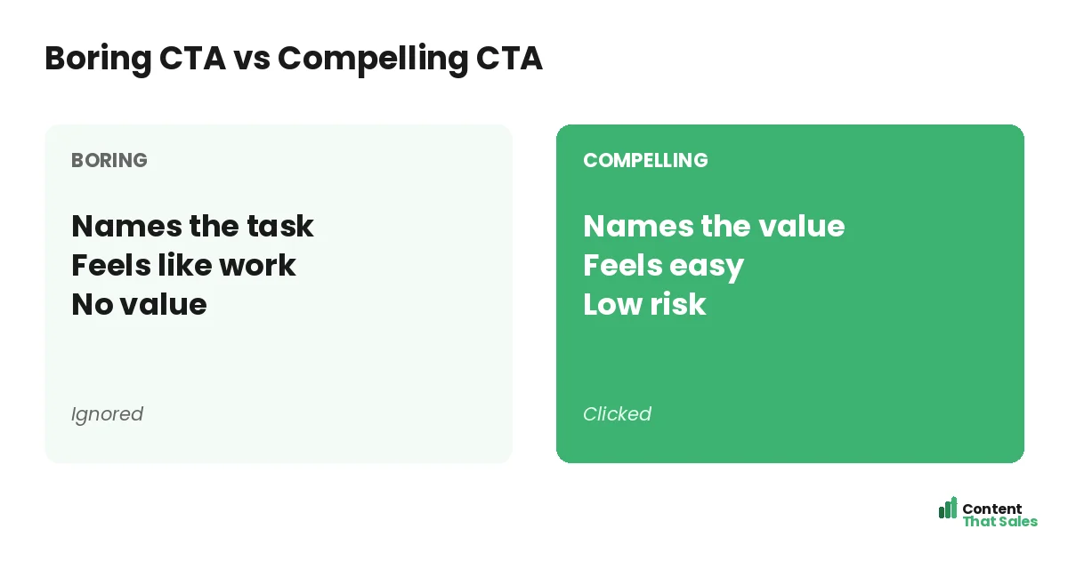
Strong CTA copy shares three traits. It is specific, so the reader knows what happens. It speaks to value, not the task. And it lowers risk, so the click feels safe. Hit all three and the button does its job.
Most weak buttons miss all three at once. “Submit” is vague, task-focused, and cold. The fixes below all push toward clear, valuable, and safe. Keep those three traits in mind as you browse the swipes.
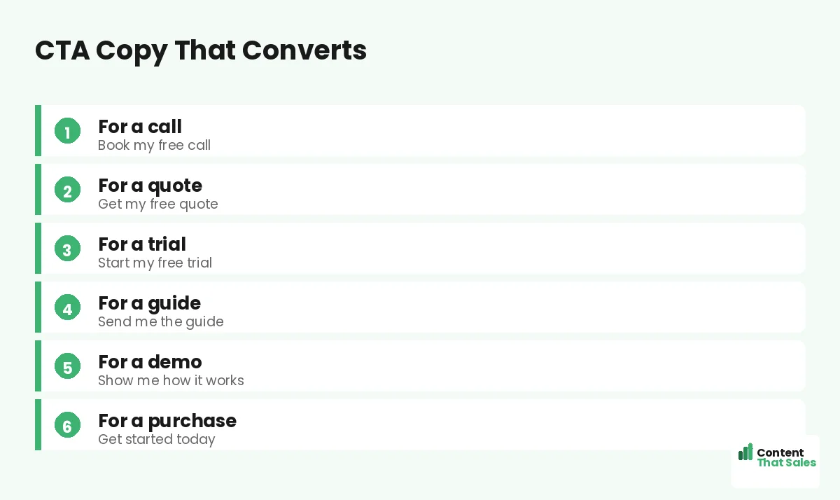
Best CTA Copy for Booking a Call
When the goal is a call or consult, name the call and remove the cost. Make it clear there is no charge and no pressure. The reader should feel they are booking help, not a hard sell.
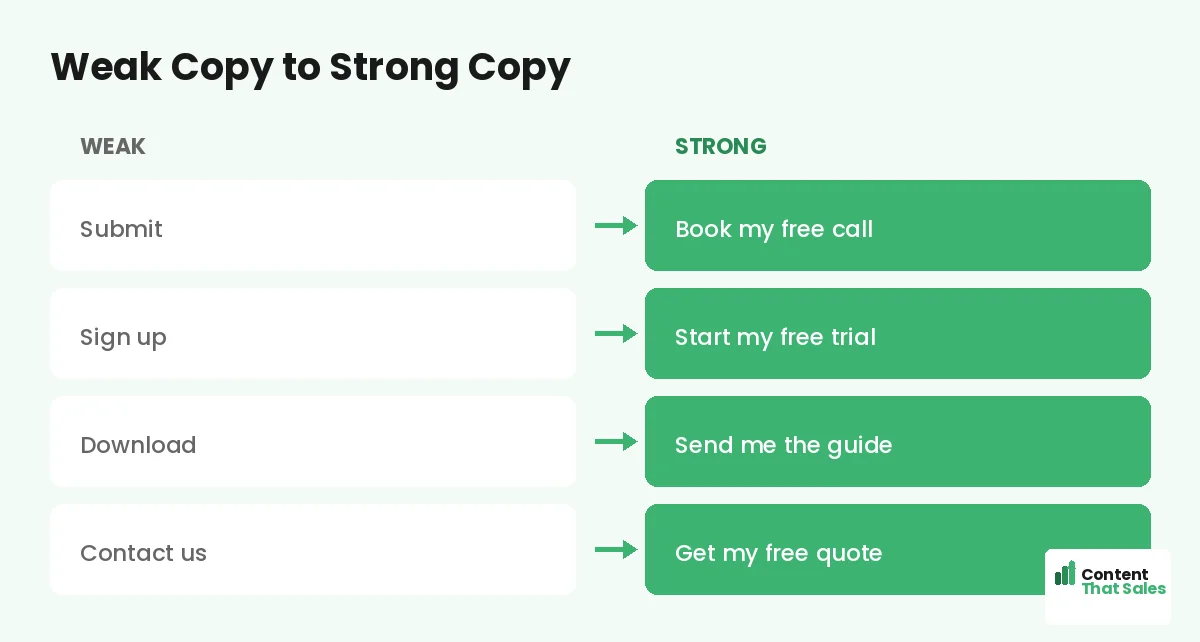
- Book my free call
- Schedule my free consultation
- Get my free strategy session
- Claim my free 15-minute call
- Talk to an expert, free
Each one names the action and the value. The word free does heavy lifting here, so use it when the call truly costs nothing.
Best CTA Copy for Getting a Quote
For quote requests, promise speed and zero obligation. People fear a quote means a sales trap. Calm that fear right on the button. Make it feel quick and commitment-free.
- Get my free quote
- Get my fast, no-obligation quote
- See my custom quote
- Get pricing in 60 seconds
- Request my free estimate
These work because they pair the value with a hint of speed or safety. A quote that feels fast and free is far easier to request.
Best CTA Copy for Free Trials
For a trial, stress that starting is easy and risk-free. The biggest fear is a hidden catch or a credit card wall. Answer it on the button and just below it.
- Start my free trial
- Try it free, no card needed
- Start free in 60 seconds
- Get instant free access
- Try it free for 14 days
First-person wording, like “Start my free trial,” can feel more personal and lift clicks. Pair the button with a line like “No card required” for an extra nudge.
Best CTA Copy for Lead Magnets
When you offer a freebie, name the freebie, not the form. The reader wants the guide, not the act of filling fields. Make the button about the prize they get.
- Send me the guide
- Get my free checklist
- Download my free template
- Get the free playbook
- Email me the cheat sheet
Notice how each names the asset. “Send me the guide” beats “Subscribe” because it speaks to the reward, not the chore behind it.
Did you know?
Switching a button from a generic label to a specific, value-led one has lifted click-through sharply in real tests. A few words can move the needle.
Best CTA Copy for a Demo
For a demo, promise a quick look with no commitment. People want to see the product without a sales gauntlet. Make the button feel like a low-stakes peek.
- Show me how it works
- Watch a 2-minute demo
- See it in action
- Get my free demo
- Take the quick tour
These invite curiosity without pressure. A demo CTA wins when it feels like learning, not like signing up for a pitch.
Best CTA Copy for a Purchase
For a sale, be direct and confident, but still remove risk where you can. Name the start of the journey and lean on any guarantee. Make buying feel safe and simple.
- Get started today
- Buy now, risk-free
- Claim my spot
- Yes, I want this
- Get instant access
Add a guarantee line nearby, like “30-day money-back.” For higher-priced offers, that reassurance can matter more than the button words themselves.
How to Adapt These to Your Offer
Pick the example closest to your goal, then swap in your specifics. Name your real offer and your real value. Add a word that removes the main fear. Keep it short enough to fit a button on mobile.
Then place it well and repeat it, following solid landing page CTA best practices. People scan more than they read, so the button must read in a glance. A swipe gives you speed, and your details give it truth. For the bigger picture, fold these buttons into a full plan for how to write landing page copy that converts.
Support the Button With Microcopy
The words around the button matter too. A short line under it can erase the last doubt. “No card needed.” “Takes 30 seconds.” “Cancel anytime.” This microcopy quietly lifts clicks.
Think of the button and its microcopy as a team. The button names the value, and the microcopy removes the risk. Together they make saying yes feel easy and safe, right at the moment of decision.
Common CTA Copy Mistakes
A few slips weaken button copy. Generic labels like “Submit.” Task-focused words that feel like work. Vague phrases like “Learn more” that promise nothing. Each one drops the click rate.
The fix is value and clarity, and easy reading lifts conversions here too. Name the value. Remove the risk. Keep it specific. This follows the rule of one goal per landing page, so every button points the same way.
How Content That Sales Writes CTA Copy
The perfect button takes more thought than people expect. That’s where we come in. At Content That Sales, we write CTA copy that names the value, removes the fear, and matches your offer, then test it to be sure.
You share the goal and the offer. We craft the button and the microcopy that earn the click. If you want done-for-you landing page copy, we make it effortless. The result is a CTA your visitors are glad to press.
Ready to Turn Visitors Into Customers?
Now you have the best CTA copy for landing pages, ready to swipe. Name the value. Remove the risk. Keep it specific and consistent. Then test your top picks. So why settle for “Submit” when a sharper button is one swap away?
Let’s write CTA copy that turns readers into leads. Book your free consultation now. Call us at 8801631988589 or email service@contentthatsales.com. Let’s turn your next visitor into your next customer.
Frequently Asked Questions About CTA Copy for Landing Pages
What is the best CTA copy for landing pages?
The best CTA copy is specific, value-led, and low-risk, like “Book my free call” or “Get my free quote.” It names the reward and makes the click feel safe and easy.
Why is “Submit” a weak CTA?
It names the task, not the value, and feels like work. A specific button like “Send me the guide” tells the reader exactly what they get.
Should CTA copy use first person?
Often, yes. First-person wording like “Start my free trial” can feel more personal and lift clicks. Test it against second person to be sure.
How long should CTA copy be?
Short enough to fit a button on mobile, usually two to five words. Make every word count and lead with the value.
What is CTA microcopy?
It is the short line near the button, like “No card needed.” It removes the last doubt and supports the button, lifting clicks.
Should every button say the same thing?
Keep one consistent action down the page. Repeating the same CTA builds momentum, while mixing labels splits focus and confuses the goal.
How do I know which CTA copy works best?
Test two versions against each other and track clicks and conversions. Keep the higher performer, then try to beat it later.
Can you write CTA copy for me?
Yes. Content That Sales writes and tests CTA copy that converts. Reach out for a quick quote.