 Skip to content
 Landing page CTA best practices come down to one idea: make the next step obvious, specific, and safe. Your call to action is where interest becomes a lead, so a vague or hidden button quietly wastes everything above it. Get the CTA right and the whole page finally pays off the work above it. Get it wrong and even great copy stalls at the finish line. This guide covers the best practices that turn more readers into action-takers.
The CTA is the moment of truth. A reader can love your offer, but if the button is unclear or scary, they hesitate, and hesitation kills action. The good news is that strong CTAs follow simple rules. Master them, and you lift conversions without touching anything else. Let’s walk through what works.
Below, we cover the wording, the design, the placement, and the trust signals that make a CTA convert. By the end, your button will feel like the easy, obvious next step, the kind a reader takes almost without thinking because nothing is standing in the way.
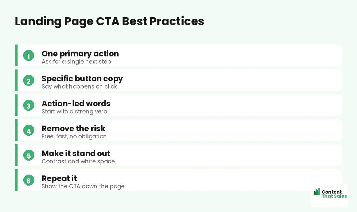
Start With One Primary Action
The first rule is focus. Pick one main action you want the visitor to take, then make the CTA all about it. A page with three competing buttons splits attention and lowers results. One clear ask beats a menu of choices. Every extra button you add is one more decision the reader has to make, and every decision is a chance for them to stall.
This ties straight to the rule of one goal per landing page. Decide the single action before you design the button. When the whole page points at one CTA, the reader knows exactly what to do next.
Write Specific, Action-Led Button Copy
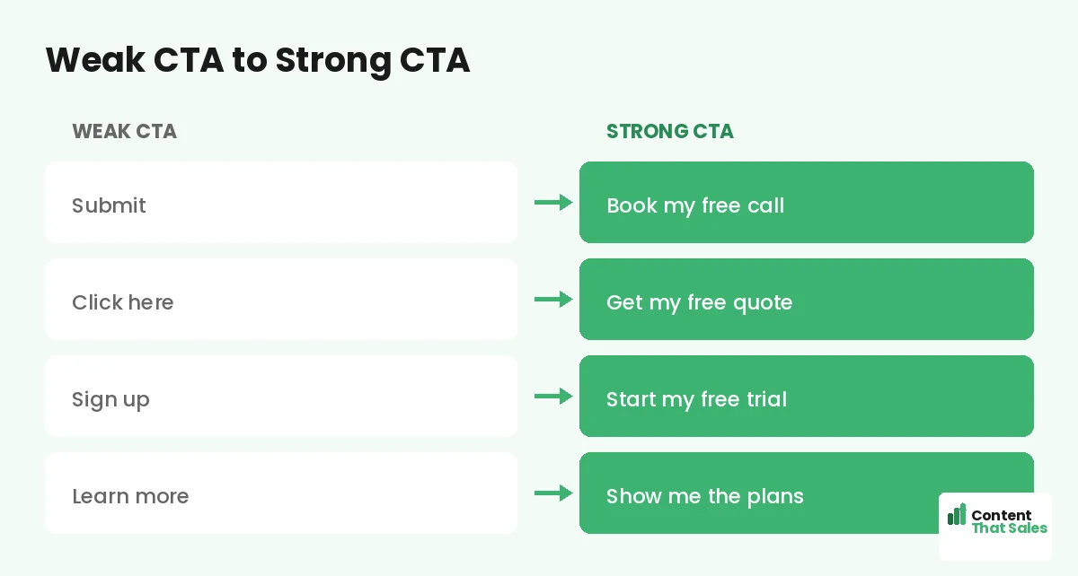
Generic buttons kill momentum. “Submit” and “Click here” tell the reader nothing. Specific copy tells them what happens next. “Book my free call” or “Get my free quote” makes the outcome clear and the click easy.
Start with a strong verb and speak to the value. First-person wording, like “Start my free trial,” can feel more personal and lift clicks. The button should finish the sentence, “I want to…” in the reader’s own head.
Remove the Risk Around the Click
Fear stops clicks. So lower the risk right on and around the button. Words like free, fast, and no obligation calm the reader. A short line under the button, like “No card needed,” can do the same.
Reassurance turns a maybe into a yes. Tell people what they are not signing up for. No spam, no contract, cancel anytime. When the next step feels safe, far more people are willing to take it.
Make the Button Impossible to Miss
A CTA only works if people see it. Use a color that contrasts with the rest of the page. Give it plenty of white space so it stands alone. The button should be the brightest, clearest element on the screen.
Size matters too. Make the button big enough to tap easily on a phone. People scan more than they read, so the button must pop during a quick scan. If they have to hunt for it, you have already lost some of them.
Place the CTA Where It Counts
Put your main CTA high on the page, above the fold, for ready buyers. Then repeat it down the page for those who need more convincing. People decide at different points, so give them more than one chance to act.
On a long page, place a CTA after each major section that builds desire. After the benefits. After the proof. Each one catches the reader at a moment of high interest. To see how it fits the whole, study the anatomy of a landing page.
Did you know?
Changing a button from a vague label to a specific, value-led one has lifted clicks sharply in real tests. The words on the button matter.
Keep One Message Across Every Button
Repeat the CTA, but keep it consistent. Every button should point to the same action and use similar wording. Mixing “Book a call” with “Get the guide” on one page confuses the goal and splits the result.
One action, repeated, builds momentum. The reader sees the same clear ask again and again, and it feels like the natural path. Consistency is quiet, but it keeps the whole page pulling in one direction.
Add Proof Right Beside the CTA
Doubt peaks at the button. Proof melts it. Place a short testimonial, a star rating, or a trust line right next to the CTA. It gives the reader one last reason to believe before they click.
Even a simple count works, like “join 5,000 happy owners.” The proof and the button together form a strong close. Seeing that others took the step makes the reader feel safe taking it too, since people trust what other people have already done.
Reduce Friction in What Comes Next
The click is only half the battle. What follows must feel easy too. If the CTA leads to a long form, trim it. Ask only for what you truly need. Every extra field sheds a few leads.
Keep the path from click to done as short as possible. A name and an email often beat ten fields. The smoother the next step, the more people finish it. Make saying yes the easiest thing on the page, easier than closing the tab and walking away.
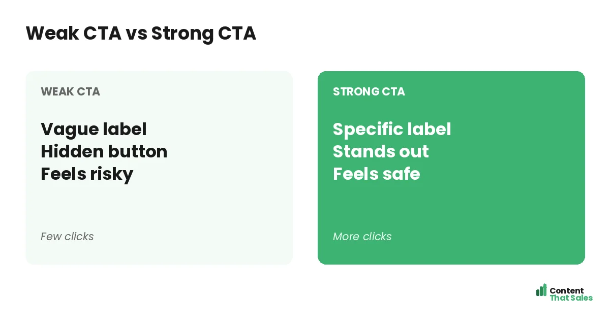
Common CTA Mistakes to Avoid
A few slips weaken even good CTAs. Vague labels like “Submit.” A button that blends into the page. Too many competing actions. A long, scary form behind the click. Each one quietly costs you conversions.
The fix is clarity and focus, and easy reading lifts conversions here too. One action. Specific words. A button that pops. A short next step. Clear beats clever on the button, just like the headline.
How Content That Sales Writes CTAs
A great CTA blends clear words and smart placement. That’s where we come in. At Content That Sales, we write button copy that names the value and removes the fear, then place it where readers are ready to act.
You share the offer and the goal. We craft the CTA and the lines around it that earn the click. If you want done-for-you landing page copy, we make it effortless, and pair it with the right approach to how to write landing page copy that converts. The result is a button readers actually press.
Ready to Turn Visitors Into Customers?
Now you know the landing page CTA best practices that win clicks. One action. Specific words. Low risk. A button that pops, placed where it counts. So why let a weak button waste a page full of great copy?
Let’s craft a CTA that turns readers into leads. Book your free consultation now. Call us at 8801631988589 or email service@contentthatsales.com. Let’s turn your next visitor into your next customer.
Frequently Asked Questions About Landing Page CTA Best Practices
What are the most important landing page CTA best practices?
Use one primary action, write specific and action-led button copy, remove the risk, make the button stand out, and repeat it down the page. Focus and clarity drive the clicks.
What should a CTA button say?
Say what happens on click, like “Book my free call” or “Get my free quote.” Start with a strong verb and speak to the value, not the task.
How many CTAs should a landing page have?
One primary action, repeated several times. Every button should point to the same goal so the page does not split the reader’s attention.
Where should the CTA go?
Place the main button above the fold, then repeat it after each section that builds desire. People decide at different points, so give them more than one chance.
How do I make my CTA stand out?
Use a contrasting color, plenty of white space, and a size that is easy to tap on mobile. The button should be the clearest element on the page.
Should I add proof near the CTA?
Yes. Doubt peaks at the button, so a short testimonial, rating, or trust line beside it gives one last reason to click.
Does the form after the click matter?
A lot. A long form sheds leads. Ask only for what you need so the path from click to done stays short and easy.
Can you write my landing page CTAs?
Yes. Content That Sales writes and places CTAs that convert. Reach out for a quick quote.