 Skip to content
 A strong SaaS free trial landing page sells the outcome, not the feature list, and makes starting the trial almost effortless. That is the core of any landing page strategy for SaaS free trials. People do not sign up for tools. They sign up for results, like saved time, less chaos, or more sales. Your page has to promise that payoff fast, then remove every reason to hesitate. This guide shows you how.
SaaS is a crowded space. Visitors compare three tabs at once. A page packed with jargon loses them in seconds. A page that shows the result and a quick start wins the click. Trust matters too, since people fear wasting time on yet another tool that does nothing. Ready to build a trial page that actually converts?
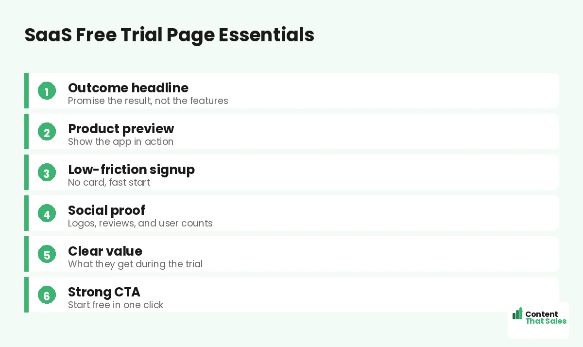
We will cover the headline, the product preview, the signup, the proof, and the activation step. Each piece pulls a hesitant visitor closer to that first valuable action inside your app.
Why a SaaS Free Trial Page Is Different
A trial page is not a normal sales page. You are not asking for money yet. You are asking for time and attention. The ask feels smaller, but the doubt is real. People worry the tool is hard, useless, or a trap.
So the job is twofold. Promise a clear outcome, then prove the start is painless. When both land, signing up feels like a small, safe step. That is what fills your trial funnel with the right people.
It also protects your sales team. When the page sets clear expectations, the trials you get are a better fit. Fewer tire-kickers, more real prospects. The page does quiet qualifying work long before anyone hops on a call.
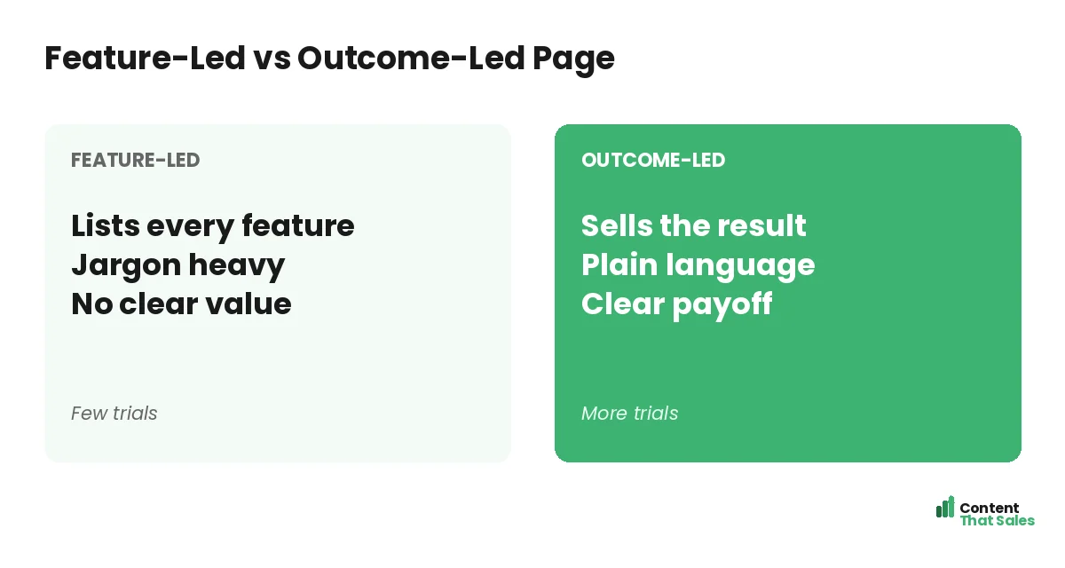
Lead With the Outcome, Not the Features
Most SaaS pages drown in features. Tabs, toggles, integrations, and dashboards all blur together. The visitor does not care yet. They care about the result your tool delivers. Lead with that.
Swap “Advanced analytics dashboard” for “See what’s working in one glance.” One is a feature. One is a win. Sell the result, then let features back it up. To master this shift, see how to write landing page copy that converts.
Show the Product in Action
People trust what they can see. Show real screenshots, a short demo clip, or a clean product preview. Let the visitor picture themselves using it. A clear visual beats a paragraph of promises every time.
Keep the preview simple and honest. Show the one screen that delivers the main outcome. People scan more than they read, so let the image carry part of the pitch. Seeing the result makes the trial feel worth it.
Avoid a wall of tiny screenshots, though. One clear image of the main win beats ten cluttered ones. If you use a video, keep it short and silent-friendly, since many people watch with the sound off while comparing tools.
Cut Friction From the Signup
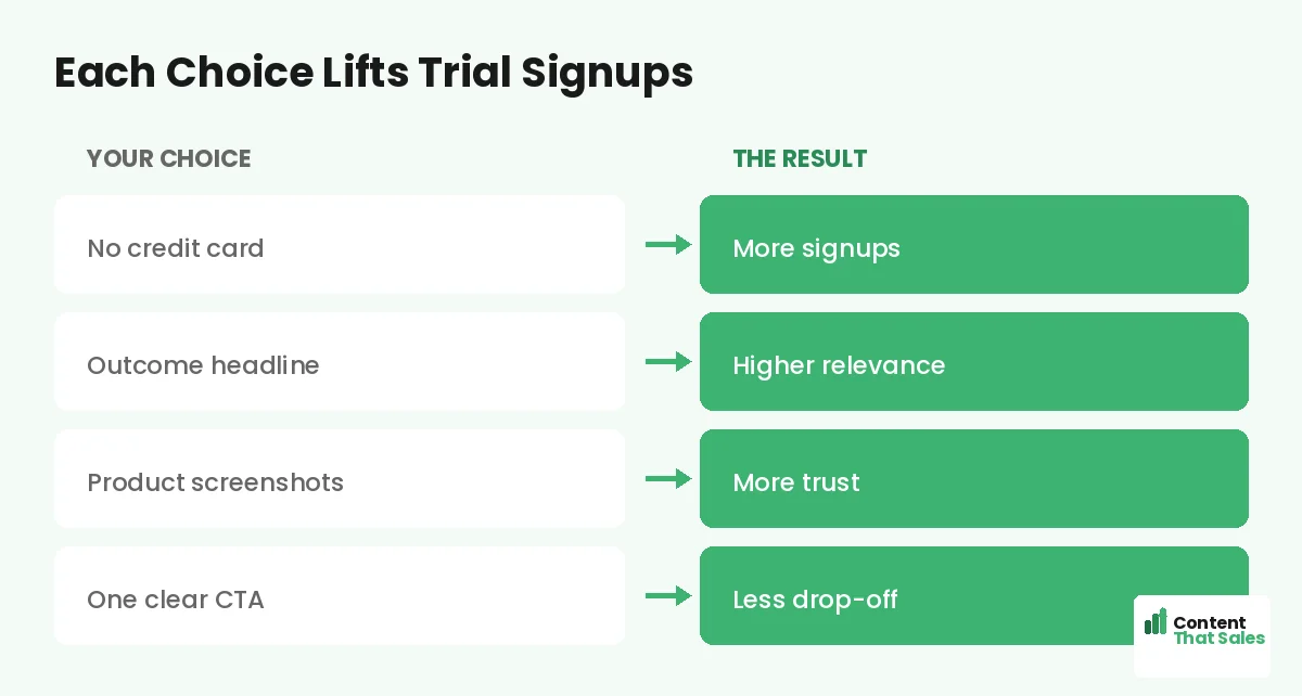
Every extra step costs you trials. Asking for a credit card up front scares people off. Long forms do the same. The smoother the start, the more people begin.
Offer a no-card trial when you can. Ask for an email, maybe a name, and let them in. Social or one-click signup helps too. When the door swings open easily, more people walk through it.
Did you know?
Dropping the credit card requirement from a free trial can lift signups sharply. Lower risk at the door means more people step inside.
Stack Proof That Lowers Risk
SaaS buyers fear wasting time. Proof calms that fear. Show customer logos, star ratings, short quotes, and user counts. Each signal says other people trusted this and got value.
Place proof near the signup button, where doubt peaks. A line like “Join 10,000 teams” can tip a maybe into a yes. Real names and real numbers beat vague claims. Trust is the currency of the trial.
Write a CTA That Starts the Trial
Your button should make starting feel easy. “Start free, no card needed” beats “Sign up.” Tell them what they get and how little it costs. Remove the risk right on the button.
Repeat the CTA down the page. People decide at different moments, so give them more than one door. Keep the words action-led and warm. A clear, low-risk button turns interest into a real trial.
Guide Users to the First Win
The signup is the start, not the finish. The real goal is activation, the first moment the tool delivers value. Your page can tease that win and your onboarding should deliver it fast.
Tell them what to expect in the first five minutes. Point them to the one action that shows the payoff. Strike while interest is hot. A fast first win turns a trial into a paying customer.
Your landing page and your onboarding should tell one continuous story. The promise made on the page must be kept inside the app within minutes. When the two line up, trials convert. When they drift apart, users sign up, get lost, and quietly disappear before they ever see the value.
Match the Page to Your Traffic
Your ad and your page must agree. If the ad promises faster reporting, the page must promise faster reporting. When the message matches, trust builds instantly. When it clashes, people bounce and your spend is wasted.
Build one page per campaign and per audience. A page for founders should sound different from one for marketers. To structure each one well, study the anatomy of a landing page and tailor the message to the reader.
Common SaaS Trial Page Mistakes
A few traps repeat across SaaS pages. Feature dumping with no clear value. A credit card wall at the door. Jargon only insiders understand. Each one quietly drops your signup rate.
The fix is focus and plain language, and easy reading lifts conversions too. Sell one outcome. Cut the friction. Speak like a human. For more lead-capture tactics, see our landing page strategy for lead generation.
How Content That Sales Helps SaaS Brands
Turning features into outcomes is hard from the inside. You know the product too well. That’s where we come in. At Content That Sales, we translate your tool into the results your buyers crave.
You share the product and the goal. We craft the headline, the proof, and the signup copy. If you want done-for-you landing page copy, we make it effortless. The result is a trial page that turns curious visitors into active users.
Ready to Turn Visitors Into Customers?
Now you have a clear landing page strategy for SaaS free trials. Sell the outcome. Show the product. Cut the friction. Guide users to a fast first win. So why let a feature-heavy page scare off your next signup?
Let’s build a trial page that fills your funnel. Book your free consultation now. Call us at 8801631988589 or email service@contentthatsales.com. Let’s turn your next visitor into your next active user.
Frequently Asked Questions About SaaS Free Trial Landing Pages
What makes a good SaaS free trial landing page?
A good SaaS free trial landing page sells the outcome, shows the product, and makes signup almost effortless. It promises a clear result, then removes every reason to hesitate.
Should I require a credit card for a free trial?
Usually no. A no-card trial lifts signups by lowering risk at the door. You can ask for payment details later, once the user sees value.
How do I reduce signup friction?
Ask for less, load fast, and offer one-click or social signup. Every field you remove and every second you save brings more trials.
Should the page list every feature?
No. Lead with the outcome and show one or two key features that prove it. Save the full list for inside the app or a details section.
How important is social proof for SaaS?
Very. Logos, ratings, and user counts lower the fear of wasting time. Place proof near the signup button where doubt peaks.
What is trial activation and why does it matter?
Activation is the first moment the tool delivers value. It matters because users who reach that win fast are far more likely to become paying customers.
How long should a SaaS trial page be?
Long enough to show the outcome, the product, and the proof. Keep it focused and skimmable, with the signup easy to find.
Can you write my SaaS landing page?
Yes. Content That Sales writes SaaS trial pages that turn features into outcomes and visitors into users. Reach out for a quick quote.