 Skip to content
 The anatomy of a landing page is the set of core sections that work together to turn a visitor into a lead. Get the parts right and in the right order, and the page sells for you. Get them wrong, and even great traffic leaks away. This guide breaks down each piece, what it does, and where it goes. No fluff, just the blueprint.
Think of a landing page like a body. Each part has a job, and they only work as a team. Miss one, and the whole thing limps. Ready to see what a high-converting page is really made of?
What Does the Anatomy of a Landing Page Mean?
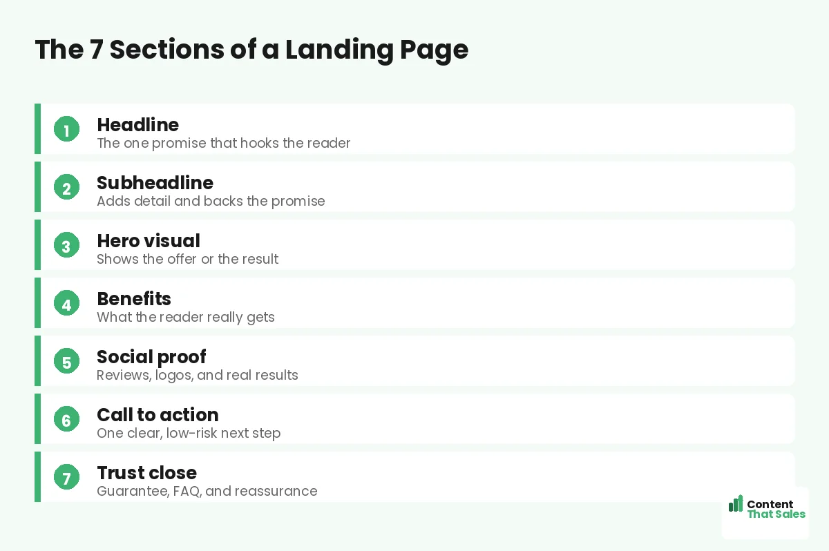
The anatomy of a landing page means its building blocks. These are the sections every strong page shares. A headline, a subhead, a hero visual, the problem, the benefits, proof, and one clear call to action. Each block has a single job.
Stacked in the right order, they guide the reader step by step. The page answers each question right as it pops up. To see how this fits the bigger picture, start with what a landing page is. Then we’ll break down each part.
Section 1: The Headline
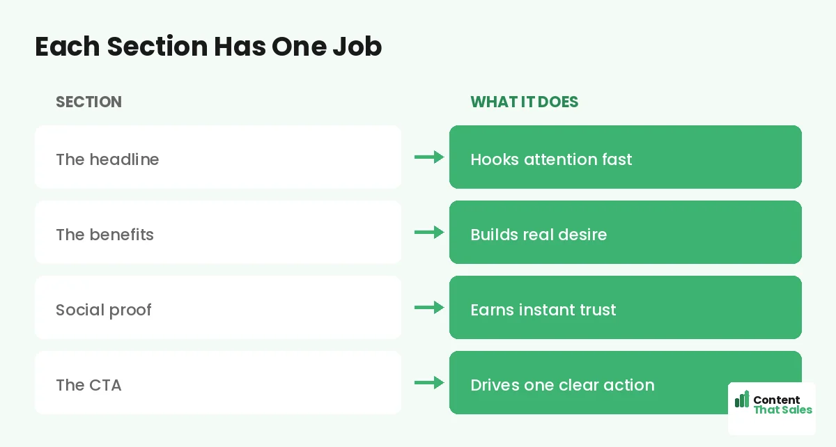
The headline is the hardest worker on the page. Roughly eight in ten people read it and skip the rest. So it must promise one clear win. Lead with the reader’s goal, not your brand name.
Make it specific. Swap “We help businesses grow” for “Get more booked jobs in 30 days.” One is noise. One is a promise. A sharp headline stops the scroll and pulls the reader in.
Section 2: The Subheadline
The subhead backs up the headline. It adds the detail the headline left out. If the headline promises more jobs, the subhead can say how fast or how easy. Together they form a one-two punch.
Keep it short and human. The subhead should answer the quiet “how” without slowing the reader down. It bridges the big promise and the proof below.
Section 3: The Hero Visual
The hero visual shows the offer or the result. A clear image beats a clever one. Show the product, the outcome, or a happy customer. Skip the random stock photos that say nothing.
The right picture makes the promise feel real in a glance. People believe what they can see. So let the visual carry part of the message, not just decorate the page.
Section 4: The Problem and Promise
Next, name the problem in the reader’s own words. Show them you understand the late nights and the wasted spend. When you describe the pain well, they trust you have the cure.
Then turn fast toward relief. A doctor names the symptom, then writes the prescription. Your copy should move the same way, from ache to answer, calm and quick.
Section 5: Benefits Over Features
Features tell. Benefits sell. A feature is what your offer has. A benefit is what the reader gets. “24-hour turnaround” is a feature. “Wake up to finished work” is a benefit.
Run every feature through one question. So what? Keep asking until you reach the feeling. People don’t want a drill, they want the shelf on the wall. For the full method, see our landing page copywriting guide. Sell the result, not the tool.
Did you know?
Most visitors never scroll past the first screen unless the headline and hero earn it. Your top section decides the rest.
Section 6: Social Proof
Anyone can claim to be the best. Proof makes people believe it. Show real results, real names, and real numbers. A short client quote beats a page of adjectives.
Place proof close to your button, where doubt creeps in. Reviews, logos, ratings, and case results all help. Seeing is believing, and proof lets the reader see before they leap.
Section 7: The Call to Action
Every page needs one main action. Just one. Decide it before you write a word. Then point every section toward that single door.
Make the button copy specific and easy. “Book your free consultation” beats “Submit.” Remove the risk with words like free, fast, and no obligation. For the exact words and structure, see how to write landing page copy that converts. A safe-feeling click is a click you win.
Supporting Parts: Trust Signals and FAQs
A few extra parts seal the deal. Trust badges, guarantees, and a short FAQ answer last-minute worries. They sit near the close, where people hesitate.
People scan more than they read, so keep these parts short and skimmable. A simple guarantee can tip a maybe into a yes. Reassure, then ask for the click.
How the Sections Work Together
No section stands alone. The headline earns the read. The benefits build desire. The proof earns trust. The button collects the win. Each block hands off to the next.
When the flow is smooth, the reader never has to think. They glide from promise to proof to action. A place for everything, and everything in its place.
This hand-off is the secret most pages miss. They list features in a pile and hope. A real page builds a path instead. Each section removes one more reason to leave, so by the time the reader hits the button, saying yes feels natural and easy.
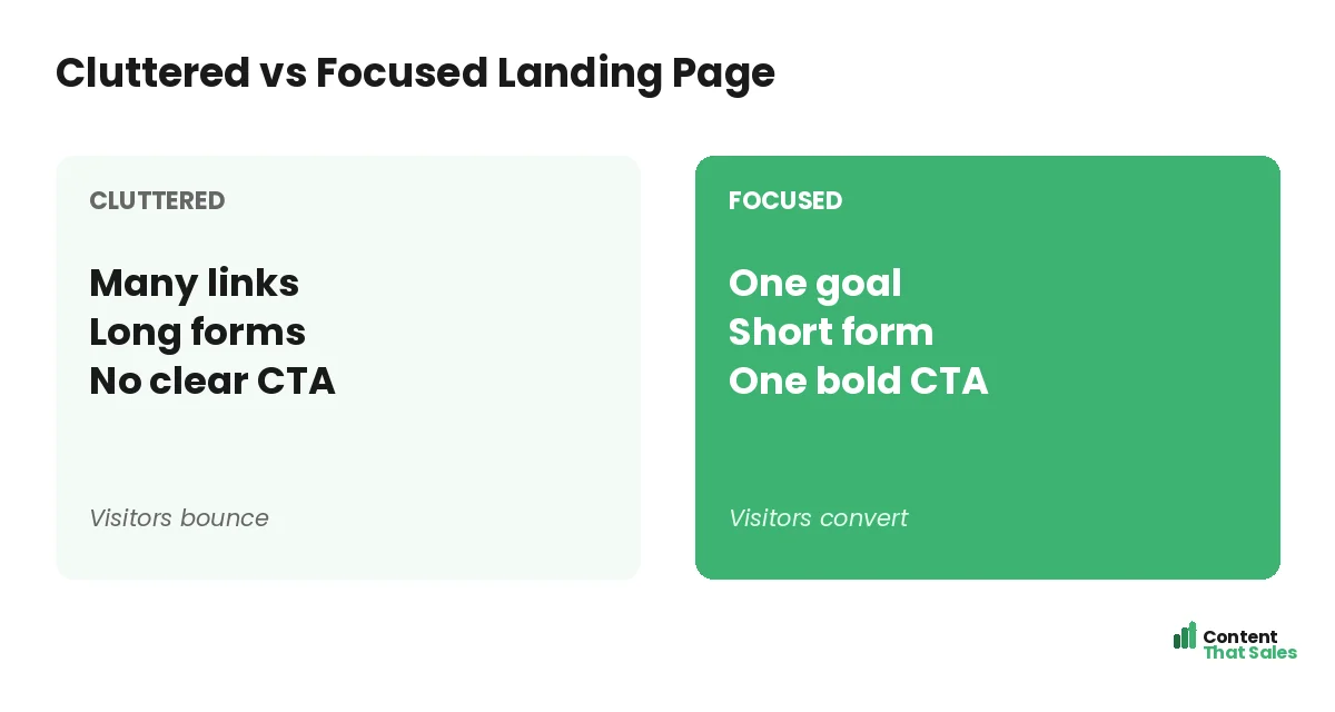
Cluttered vs Focused: Why Layout Matters
Layout can make or break the page. A cluttered page hides the offer behind noise. A focused page puts one path front and center. Fewer choices mean faster decisions.
Strip the menu. Cut the side links. Keep one button as the star. Simpler copy and a cleaner layout tend to lift conversions, as easy reading lifts conversions shows. Clean beats busy, every time.
Common Anatomy Mistakes to Avoid
Some slips repeat across weak pages. A vague headline. A missing proof section. A buried button. Two or three competing offers. Each one quietly costs you leads.
The fix is always the same. One goal. Clear words. Proof near the button. A short path to yes. Don’t dig a well when you’re already thirsty, so plan the parts before you build.
How Content That Sales Builds Pages That Convert
Knowing the anatomy is step one. Writing each part to convert is the real work. That’s where we come in. At Content That Sales, we craft every section to do its job and hand off to the next.
You bring the offer and the goal. We bring the headline, the proof, and the button. If you want done-for-you landing page copy, we make it effortless. The result is a page that feels like you and sells like a pro.
Ready to Turn Visitors Into Customers?
Now you know the anatomy of a landing page, part by part. One headline. One promise. One clear action, backed by proof. So why let a missing section keep costing you leads?
Let’s build you a page where every part pulls its weight. Book your free consultation now. Call us at 8801631988589 or email service@contentthatsales.com. Let’s turn your next visitor into your next customer.
Frequently Asked Questions About Landing Page Anatomy
What is the anatomy of a landing page?
The anatomy of a landing page is its core sections working together: headline, subhead, hero visual, problem, benefits, social proof, and one call to action. Each part has a single job.
What is the most important part of a landing page?
The headline. Most visitors read it and little else, so it must promise one clear win in plain words.
How many sections should a landing page have?
Most strong pages use around seven core sections. The exact number flexes with the offer, but the order and focus matter more than the count.
Where should the call to action go?
Put your main button high on the page, then repeat it after the benefits and proof. People convert at different points, so give them more than one chance.
Should a landing page have a navigation menu?
Usually not. Removing the menu keeps people focused on the one goal and cuts the chance they wander off.
How long should a landing page be?
As long as it needs to be. Simple offers stay short. Bigger or costlier offers need more proof and detail to close.
Do I need images on a landing page?
Yes, when they show the offer or the result. Real, relevant images build belief. Skip random stock photos that add nothing.
Can you design and write my landing page?
Yes. Content That Sales writes done-for-you landing page copy built around proven anatomy. Reach out for a quick quote.