 Skip to content
 How many calls to action should a service page have? Not one, and not so many it overwhelms, but several instances of the same primary action, placed where visitors become ready. A single CTA at the bottom loses visitors ready earlier; too many competing CTAs confuse. The answer is one consistent action, repeated at key points. This guide explains how many CTAs a service page should have, so the next step is always available without confusion.
CTA count is part of your service page content conversion strategy. It builds on CTA best practices and page layout.
More Than One, But One Action
A service page should have more than one CTA instance, but they should all drive the same primary action. Repeat your main call to action (e.g. “Book a free consultation”) at several points, but do not offer many different competing actions, which confuses visitors. The principle is one primary action, repeated, so the next step is consistently available and clear wherever the visitor is on the page.
Repeating one consistent action keeps the page clear and available. As Semrush notes, a single repeated CTA outperforms many competing ones. Having more than one CTA but one action, repeating your single primary call to action at multiple points rather than offering many different ones, keeps the next step consistently available and clear, so the right answer to how many CTAs is multiple instances of one consistent action, which captures readiness throughout the page without the confusion of competing calls to action.
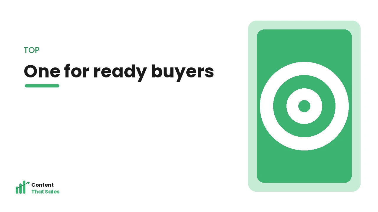
One Near the Top
Place a CTA near the top of the page (in or near the hero), so visitors who are already ready can act immediately without scrolling. Some visitors arrive ready to enquire, and an early CTA captures them right away. Without one, ready visitors might leave while searching for how to act. A top CTA ensures the most ready visitors have an instant path to convert from the start.
A top CTA captures already-ready visitors immediately. As the Nielsen Norman Group notes, an early action serves ready users. Placing one CTA near the top, in or near the hero, captures the visitors who arrive ready to act, giving them an instant path to convert, so including an early call to action ensures you do not lose the most ready visitors while they search for how to proceed, which is why a top CTA is one of the key placements on a service page.
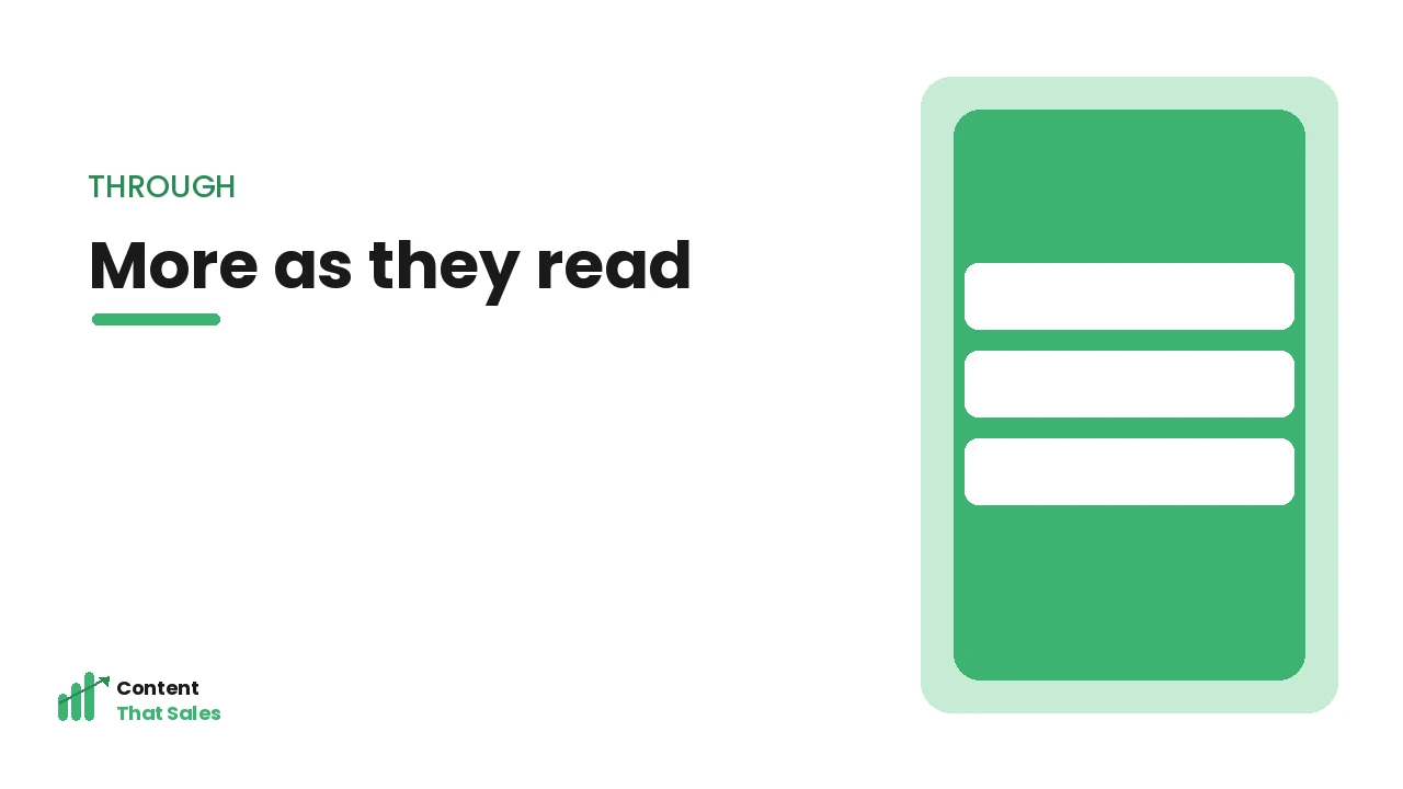
Some Through the Middle
Place CTAs at logical points through the middle of the page, after key sections (like benefits, proof, or your offer), so visitors who become ready as they read always have a nearby way to act. Different visitors reach readiness at different points, so mid-page CTAs capture them whenever the page has convinced them. These repeated CTAs ensure the next step is always close at hand as the visitor moves through the content.
Mid-page CTAs capture visitors ready at different points. As Semrush notes, CTAs after persuasive sections lift conversion. Placing some CTAs through the middle, after key sections, captures visitors who become ready as they read, ensuring the action is always nearby whenever the page convinces them, so including mid-page calls to action at logical points captures conversions throughout the page rather than only at the top or bottom, catching each visitor at their moment of readiness.
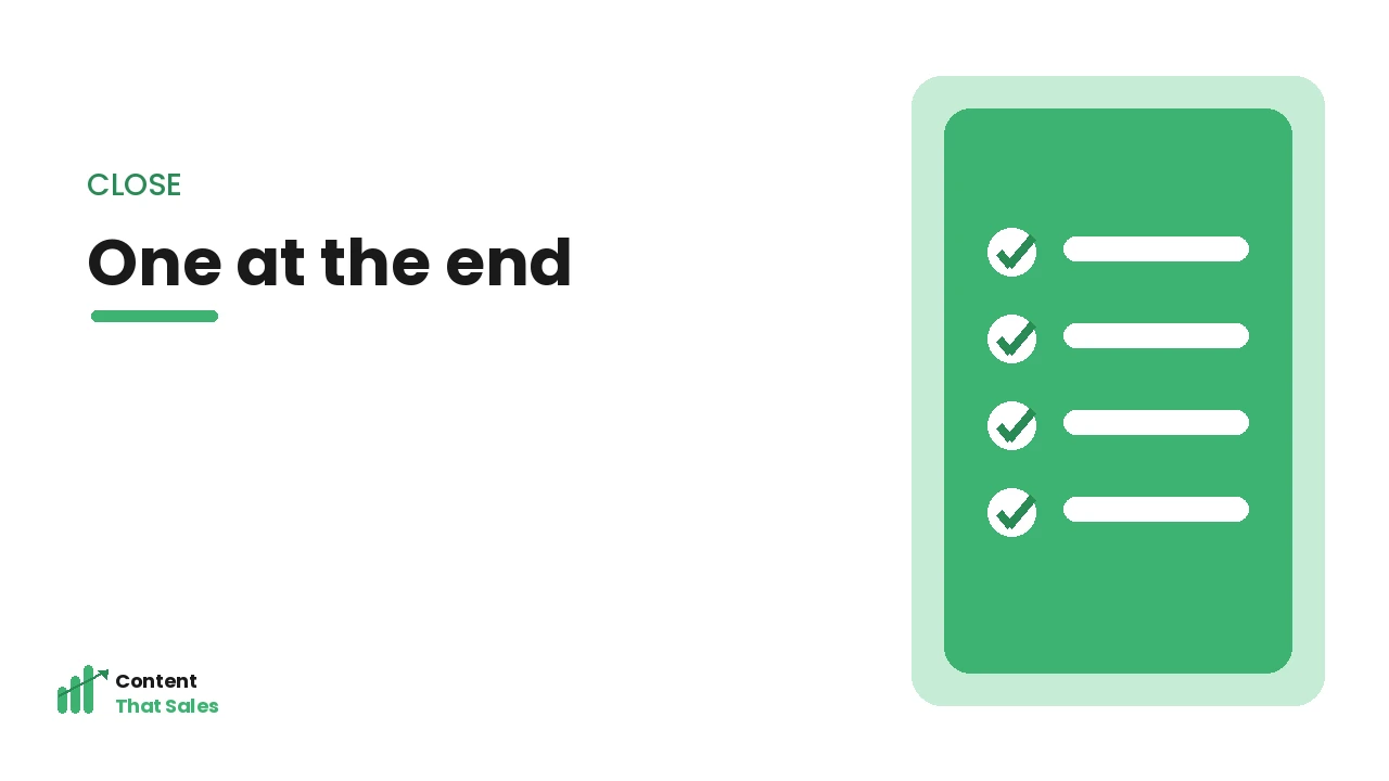
One at the Close
Always place a strong CTA at the close of the page, after the full case has been made, to capture visitors who needed the whole page to be convinced. This closing CTA is essential: it catches the visitors who read everything and are now ready to act. Ending the page without a clear, compelling CTA loses these convinced visitors. The closing CTA captures the conversion the entire page has built toward.
A closing CTA captures fully-convinced visitors. As the Nielsen Norman Group notes, a clear final action is essential. Placing one CTA at the close, after the full case is made, captures the visitors who needed the whole page to be convinced and are now ready, so ending with a strong, clear call to action ensures these convinced visitors are captured rather than lost, which is why the closing CTA is an essential placement completing the set on a service page.
Don’t Overdo It or Confuse Visitors
While repeating your CTA is good, do not overdo it or offer competing actions. Cramming in too many CTAs can feel pushy or cluttered, and offering many different actions (call, email, download, subscribe) confuses visitors about what to do. Keep it to a sensible number of instances of one primary action, with perhaps one secondary option at most. Clarity and focus matter, repeat one clear action without overwhelming or confusing the visitor.
Too many or competing CTAs confuse; focused repetition converts. As Semrush notes, CTA clarity beats CTA quantity. Not overdoing it or confusing visitors, keeping to sensible repetition of one primary action rather than cramming in many competing CTAs, maintains the clarity and focus that convert, so repeating your single clear call to action at key points (without cluttering the page or offering confusing alternatives) is the right balance, ensuring the next step is always available and unmistakable.
Let Page Length Guide CTA Frequency
The ideal number of CTA instances is not a fixed figure, it scales with the length of the page. A short, simple service page might convert well with just a top and a closing CTA, because a ready visitor is never far from one. A long, detailed page for a considered service needs more, because a visitor convinced two-thirds of the way down should not have to scroll a long way to find the next step.
A useful rule of thumb is that a CTA should be within easy reach at any point a visitor might realistically become ready, which on a long page means placing one after each major persuasive section. The goal is availability without clutter: enough CTAs that readiness is always met, not so many that the page feels like a sales pitch on repeat. Letting page length guide CTA frequency ensures the number of calls to action fits the page rather than following an arbitrary count, which is what keeps the next step consistently accessible whether your service page is short and direct or long and detailed.
Keep CTAs Consistent and Recognisable
When you repeat a call to action, consistency matters as much as frequency. Each instance should look and read similarly, the same wording, the same button style, the same destination, so visitors learn to recognise it instantly and know exactly what will happen when they act. CTAs that vary wildly in label or appearance from one section to the next force the visitor to re-evaluate each time, adding small friction and doubt.
Consistency also reinforces a single, clear next step in the visitor’s mind, rather than presenting what feels like several different decisions. A page where every CTA says “Book a free consultation” and looks the same builds a simple, repeated message: here is the one thing to do. Keeping CTAs consistent and recognisable ensures repetition works in your favour, reinforcing the action rather than fragmenting it, which matters because the strength of repeating a call to action comes from driving home one unmistakable next step, and inconsistency quietly undermines exactly that.
How Content That Sales Can Help
We place CTAs effectively on service pages, one primary action repeated near the top, through the middle, and at the close, so the next step is always available without confusion. Explore our service page content service to see how well-placed, consistent CTAs capture more of your visitors at their moment of readiness and turn them into enquiries.
Frequently Asked Questions
How many CTAs should a service page have? Several instances of one primary action, not just one, and not many competing ones. Place a CTA near the top (for ready visitors), some through the middle (after key sections), and one at the close (after the full case). Repeat one consistent action.
Should all the CTAs be the same? They should all drive the same primary action (e.g. “Book a consultation”), repeated for consistency and availability. You might include one secondary option at most, but avoid many different competing CTAs, which confuse visitors about what to do.
Why not just one CTA at the bottom? Because visitors become ready at different points. A single bottom CTA loses those ready earlier, who may leave while searching for how to act. Repeating the CTA near the top and through the page captures readiness whenever it occurs.
Can a page have too many CTAs? Yes, if they clutter the page or offer many competing actions, which feels pushy and confuses visitors. The goal is sensible repetition of one clear primary action, keeping the next step always available without overwhelming or confusing the visitor.