 Skip to content
Service page layout, the order in which you place your sections, directly affects conversion. The right layout leads the visitor from a strong opening hook, through a building case, to a clear call to action, mirroring how they decide. Getting the order right guides visitors smoothly toward enquiring. This guide explains service page layout and how to order your sections, so your page flows logically and converts more of your visitors.
Layout puts your service page content in the right order. It builds on the best service page structure and connects to above-the-fold strategy and page hierarchy.
Lead With the Hook
The top of your layout, the first thing visitors see, must lead with the hook: the customer’s problem or desired outcome, your offer, and a compelling promise. This top section determines whether visitors stay, so it must engage them immediately. Place your strongest, most relevant hook at the very top, above any company background or secondary content, to capture attention from the first moment.
A layout that opens weakly loses visitors; one that leads with a strong hook holds them. As the Nielsen Norman Group notes, the top of the page is decisive. Leading with the hook, placing your most compelling problem-and-promise opening at the top of the layout, ensures the page engages visitors immediately, which is the essential first step in the layout since everything below depends on the opening capturing attention, so the top section must hook the visitor before the rest of the page can do its work.

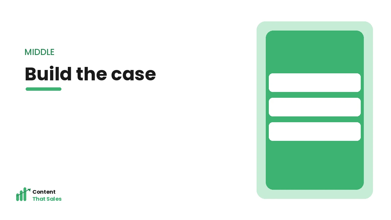
Build the Case in the Middle
The middle of your layout builds the case: benefits (what they gain), how it works (the process), proof (testimonials, results), and why choose you (differentiation). Order these to build progressively, showing value, then how, then proof, then your edge, so the visitor’s confidence and desire grow as they read. This middle section does the persuasive work, moving the visitor from interested to convinced.
A well-ordered middle builds the case logically; a jumbled one confuses. As Semrush notes, the body should build the argument step by step. Building the case in the middle, ordering benefits, process, proof and differentiation to progressively convince, ensures the layout’s central section does its persuasive job, growing the visitor’s confidence and desire through a logical sequence, which is essential for moving them from the interest the hook created toward the readiness to act that the closing section will capture.
Handle Objections Before the Close
Before the final call to action, place objection handling, typically an FAQ, addressing the doubts that might hold visitors back. Positioning this near the end, after the case is made but before the close, removes the last barriers to action just as the visitor is deciding. This placement ensures lingering doubts are resolved at the right moment, clearing the way for the visitor to act on the CTA that follows.
Handling objections right before the close removes final barriers at the decisive moment. As Semrush notes, addressing objections near the decision point lifts conversion. Handling objections before the close, placing your FAQ or reassurance after the case and before the final CTA, removes the last doubts at the moment the visitor is deciding, which is the ideal position in the layout for objection handling, clearing the remaining barriers just before you ask for action so nothing stops the ready visitor from converting.
Close With a Clear Call to Action
End your layout with a clear, compelling call to action, after the full case is made and objections handled, telling the visitor exactly what to do. This closing CTA captures visitors who needed the whole page to be convinced. Place CTAs earlier too (in the hero and throughout) for ready visitors, but ensure a strong one closes the page, capturing the decision the layout has built toward.
A strong closing CTA captures the conversion after the case is complete. As the Nielsen Norman Group notes, a clear final action is essential. Closing with a clear call to action, ending the layout with a compelling CTA after the case and objections, captures the visitors convinced by the full page, completing the layout’s job of leading visitors from hook to action, so while CTAs appear throughout, a strong closing one ensures those who needed the whole argument are captured at the end.
Keep the Visual Flow Clear
Beyond section order, the visual layout should support the flow: clear headings, scannable sections, logical visual hierarchy, and a clean design that guides the eye down the page toward the CTA. Use visual cues (spacing, headings, emphasis) to lead the reader through the layout smoothly. A clear visual flow reinforces the logical section order, making the page easy to follow toward conversion.
Poor visual flow undermines even a good section order; clear visuals support it. As the Nielsen Norman Group notes, visual hierarchy guides attention and aids conversion. Keeping the visual flow clear, using headings, scannable sections and visual hierarchy to lead the eye down the page, reinforces the logical section order so visitors follow the layout smoothly toward the CTA, which is essential since the layout’s order only works if the visual presentation also guides the reader, making clear visual flow a key complement to the right section sequence.

Designing the Layout for Mobile
A large share of service page visitors arrive on a phone, so the layout must work in a single narrow column, not just on a wide desktop screen. On mobile, sections stack vertically, so the order you choose is experienced even more strictly, one block after another, and anything buried low down may never be seen. This makes leading with the hook and surfacing your offer and a call to action early even more important on small screens.
Practical mobile layout means large tap-friendly buttons, short paragraphs, generous spacing, and a sticky or frequently repeated call to action so the next step is always within thumb’s reach. Long sections that feel manageable on desktop can become exhausting scrolls on mobile, so tightening and chunking content matters more. Designing the layout for mobile ensures the majority of your visitors get a smooth, persuasive experience rather than a cramped one, which is essential because a layout that only works on desktop quietly loses the very visitors who now make up most of your traffic.
Use Visual Anchors to Guide the Eye
Within a good section order, visual anchors help visitors navigate and keep moving toward the call to action. Strong headings act as signposts that let scanners locate the offer, proof or pricing quickly; buttons and contrasting colour draw the eye to the next step; images, icons and short highlighted callouts break up text and mark the important moments. These anchors turn a wall of content into a guided path.
The aim is for a visitor’s eye to land naturally on the things that matter most, the promise, the proof, the CTA, in the right order, even if they never read every word. Used with restraint, visual anchors reinforce the layout’s logic rather than competing with it. Using visual anchors to guide the eye ensures your carefully ordered layout actually directs attention as intended, which is what allows both skimmers and readers to follow the page toward conversion instead of getting lost in undifferentiated text.
How Content That Sales Can Help
We lay out service pages to convert, leading with the hook, building the case, handling objections, and closing with action, in a clear visual flow that guides visitors toward enquiring. Explore our service page content service to see how a well-ordered service page layout, mirroring the visitor’s decision journey, converts more of your high-intent traffic into leads.
Frequently Asked Questions
How should I order service page sections? Lead with the hook (problem + promise + offer) at the top, build the case in the middle (benefits, process, proof, differentiation), handle objections before the close (FAQ), and end with a clear CTA, with CTAs throughout. This order mirrors the visitor’s decision journey.
Where should objection handling go? Near the end, after the case is made but before the final call to action. This position removes the last doubts at the moment the visitor is deciding, clearing the way to act on the CTA that follows, which is the ideal placement for an FAQ.
Where should the call to action go? A strong one should close the page after the full case is made, plus CTAs in the hero and throughout for ready visitors. The closing CTA captures those who needed the whole page to be convinced, while earlier ones catch visitors ready sooner.
Does visual layout matter too? Yes. Beyond section order, clear headings, scannable sections, and visual hierarchy guide the eye down the page toward the CTA. A clear visual flow reinforces the logical section order, making the page easy to follow toward conversion. Both matter together.