 Skip to content
 Visual hierarchy, the way you use headings, size, emphasis and spacing to signal what matters, leads the reader through your service page toward conversion. A clear hierarchy guides the eye, helps visitors scan, and emphasises your key messages and CTA. Without it, the page is a confusing wall of equal-weight content. This guide explains service page hierarchy and how to lead the reader, so your page guides visitors smoothly toward enquiring.
Hierarchy organises your service page content visually. It works alongside your page layout and good use of bullet points to guide the reader.
Guide With Clear Headings
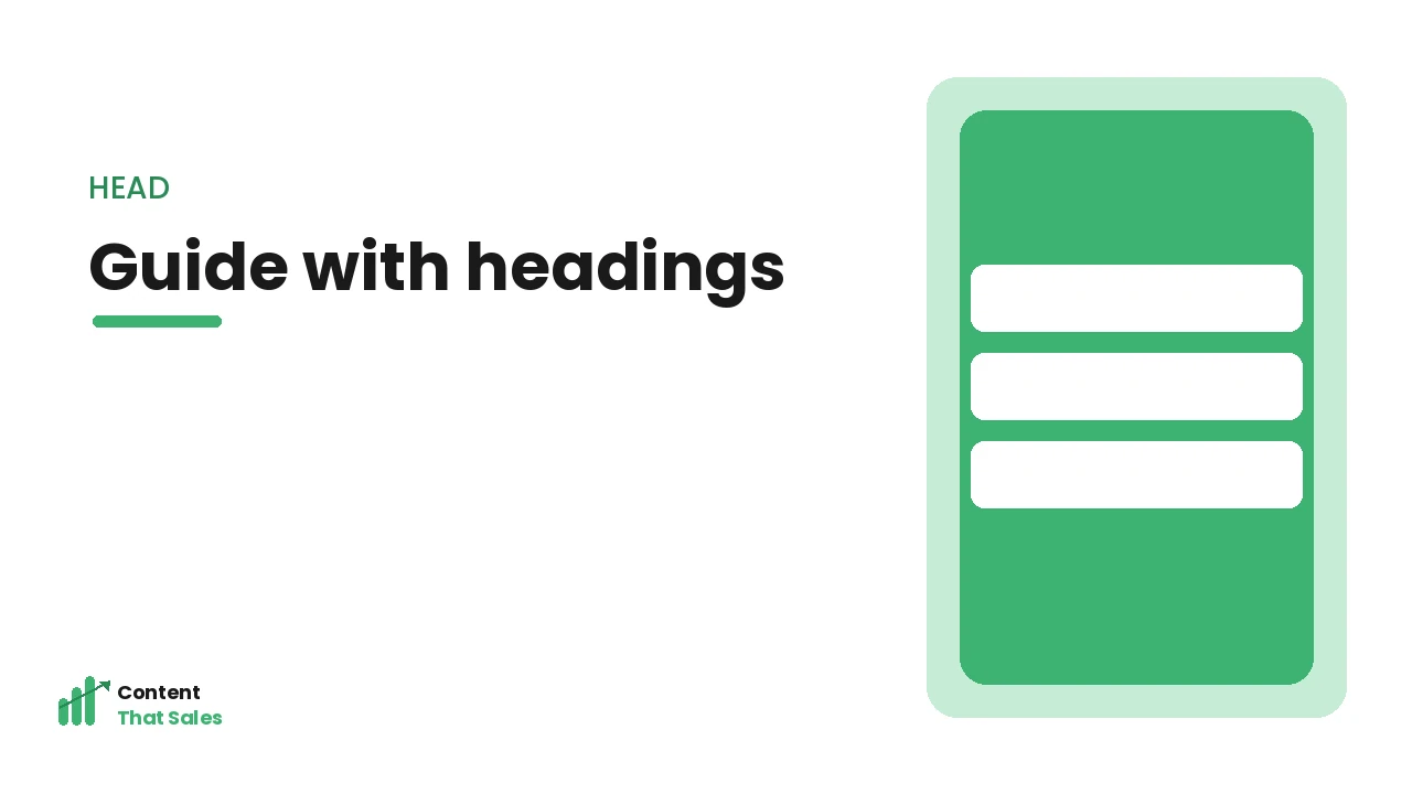
Headings are the backbone of hierarchy, they signal the structure, let visitors scan, and guide the reader through the page. Use clear, descriptive headings for each section, so a scanning visitor can follow the page’s flow and find what interests them via the headings alone. Strong headings create a scannable structure that leads the reader through your service page logically toward the conversion.
Clear headings guide and aid scanning; their absence leaves visitors lost. As the Nielsen Norman Group notes, headings are essential for scannability and navigation. Guiding with clear headings, using descriptive section headings that signal structure and let visitors scan, creates the backbone of your page’s hierarchy, leading the reader through the content logically and helping scanning visitors follow the flow, which is essential since most visitors scan, so well-crafted headings are the primary tool for leading the reader through your service page.
Emphasise What Matters
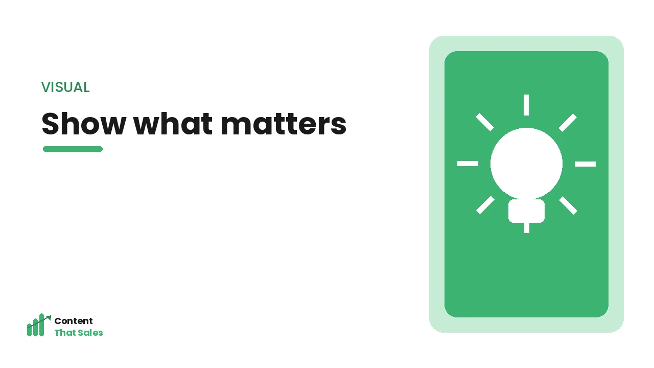
Use visual emphasis, size, bold, colour, placement, to highlight what matters most: your key value proposition, important benefits, proof points, and especially your CTA. Visual hierarchy directs attention to these crucial elements, ensuring visitors notice them even when scanning. Emphasising the right things ensures your most important messages and your call to action stand out, guiding the visitor’s attention toward what drives conversion.
Emphasis on key elements draws attention; uniform formatting hides them. As Semrush notes, visual emphasis guides attention to what converts. Emphasising what matters, using size, bold, colour and placement to highlight your key value, proof and CTA, directs the visitor’s attention to the elements that drive conversion, ensuring they notice your most important messages even when scanning, which is essential for leading the reader, since visual emphasis is how you ensure the crucial parts of your page stand out and are seen.
Create a Clear Visual Path
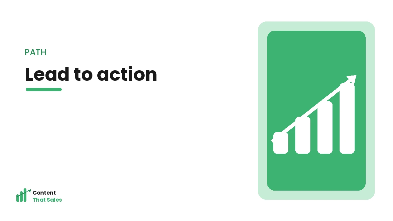
Hierarchy should create a clear visual path down the page, guiding the eye from the hero, through the building case, to the CTA. Use consistent, logical formatting and spacing so the visitor’s eye flows naturally downward, following the page’s structure. A clear visual path leads the reader smoothly through the content toward the conversion, rather than leaving them to navigate a confusing, undifferentiated page.
A clear visual path leads the reader; a cluttered one loses them. As the Nielsen Norman Group notes, visual flow guides users through content. Creating a clear visual path, using hierarchy and spacing to guide the eye down the page from hero to CTA, leads the reader smoothly through your service page toward the conversion, which is the purpose of hierarchy, ensuring visitors follow the intended flow rather than getting lost, so a deliberate visual path is essential for leading the reader to act.
Keep It Clean and Uncluttered
Effective hierarchy requires a clean, uncluttered design. Too much emphasis, competing elements, or clutter destroys hierarchy, when everything stands out, nothing does. Use white space, restraint, and clear priorities so the important elements genuinely stand out against a clean background. A clean design lets your hierarchy work, guiding attention effectively, while clutter overwhelms the visitor and undermines the visual path.
Clean design enables hierarchy; clutter destroys it. As the Nielsen Norman Group notes, white space and restraint support visual hierarchy. Keeping it clean and uncluttered, using white space and restraint so important elements stand out, ensures your hierarchy works effectively, since clutter and over-emphasis destroy hierarchy by making everything compete, so a clean design with clear priorities is essential for the hierarchy to guide attention and lead the reader, making restraint as important as emphasis in creating effective visual hierarchy.
Lead Toward the Conversion
Ultimately, hierarchy should lead the reader toward the conversion, guiding their attention and eye through the persuasive content to the CTA. Every element of hierarchy, headings, emphasis, visual path, should serve this goal of leading the visitor to act. So design your hierarchy with conversion in mind, ensuring it guides the reader through the case and toward the call to action that captures the enquiry.
Conversion-focused hierarchy leads visitors to act; aimless hierarchy does not. Leading toward the conversion, designing your hierarchy to guide the reader’s attention through the content to the CTA, ensures the visual structure serves its ultimate purpose of leading visitors to enquire, which is what hierarchy is for, so every hierarchical choice should help lead the reader toward the conversion, making your service page’s visual structure a tool for guiding visitors to act rather than just organising content.
Hierarchy Helps SEO Too
Visual hierarchy is not only about guiding human readers, it also helps search engines understand your page. Proper heading structure, a single clear H1 followed by logical H2s and H3s, signals the page’s topic and how its content is organised, which supports relevance and ranking. A page where headings are used semantically, not just for visual styling, is easier for search engines to interpret and more likely to surface for the right queries.
This means the same heading discipline that leads human readers also strengthens your SEO, a rare case where usability and search optimisation point in exactly the same direction. Using real heading tags rather than bold styled text, and keeping the heading order logical, serves both audiences at once. Recognising that hierarchy helps SEO too gives you another reason to invest in clear heading structure, because a well-structured service page is simultaneously easier for visitors to navigate and easier for search engines to understand and rank, doubling the return on getting hierarchy right.
Test Your Hierarchy With the Squint Test
A quick, practical way to check whether your hierarchy is working is the squint test: look at the page with your eyes half closed, or blur it, so the words become unreadable and only the shapes, weights and colours remain. If the most important elements, your headline, key proof, and call to action, still stand out as the dominant shapes, your hierarchy is doing its job. If everything blurs into an even grey mass, nothing is being emphasised.
This test reveals at a glance whether attention is being directed where you want it, without getting distracted by the actual wording. You can do the same on mobile, where limited space makes hierarchy even more important. Using the squint test to check your hierarchy gives you a fast, repeatable way to confirm that your page leads the eye to what matters, which is valuable because it catches hierarchy problems that are easy to miss when you are reading the words instead of seeing the page as a visitor first does.
How Content That Sales Can Help
We design service pages with clear visual hierarchy, headings that guide, emphasis on what matters, and a clean visual path that leads the reader toward the CTA. The result is pages that guide visitors smoothly to enquiring. Explore our service page content service to see how strong visual hierarchy leads more of your visitors through your service page and toward conversion.
Frequently Asked Questions
What is service page hierarchy? The use of headings, size, emphasis, spacing and visual structure to signal what matters and lead the reader through the page. A clear hierarchy guides the eye, aids scanning, and emphasises key messages and the CTA, guiding visitors toward conversion.
How do headings help? Headings signal structure, let visitors scan, and guide the reader through the page. Clear, descriptive section headings create a scannable backbone that helps scanning visitors follow the flow and find what interests them, leading them through the page logically.
How do I emphasise the right things? Use size, bold, colour and placement to highlight your key value proposition, important benefits, proof points and especially your CTA, so they stand out and draw attention even when visitors scan. But use restraint, when everything is emphasised, nothing stands out.
Why does clean design matter for hierarchy? Because clutter and over-emphasis destroy hierarchy, when everything competes, nothing stands out. White space and restraint let important elements genuinely stand out, so a clean, uncluttered design is essential for hierarchy to guide attention and lead the reader effectively.