 Skip to content
 Common landing page form mistakes quietly cost you leads at the very last step, after your copy did the hard work of convincing the visitor. The form is where interest becomes a lead, so a form that is too long, too nosy, or too confusing throws away conversions you already earned. The good news is that form mistakes are easy to spot and fix. This guide covers the form errors that lose leads and how to make your form effortless to complete.
Here is the painful part. A visitor can love your offer and still abandon a bad form. They reach the finish line, see ten fields, and give up. Every field, every unclear label, every moment of friction sheds a few more leads. Let’s fix the form so your hard-won interest actually converts.
Below, we cover the most common form mistakes, why each one loses leads, and the simple fix to make your form easy and trustworthy.
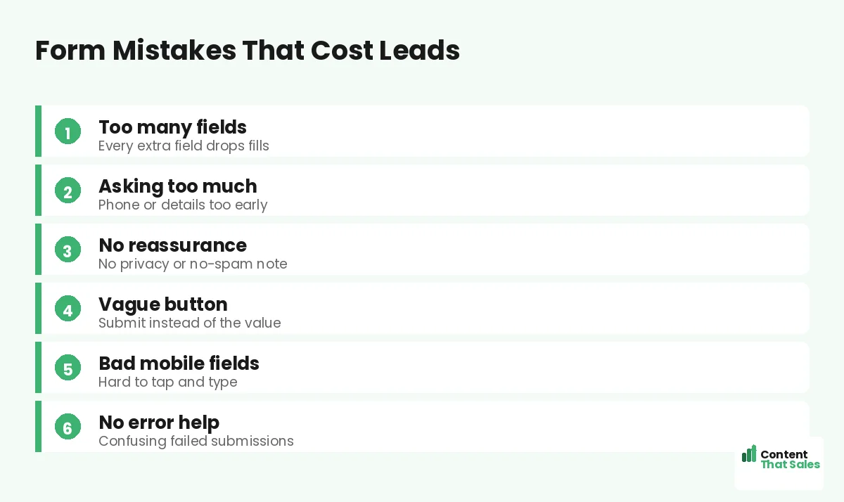
Mistake 1: Too Many Fields
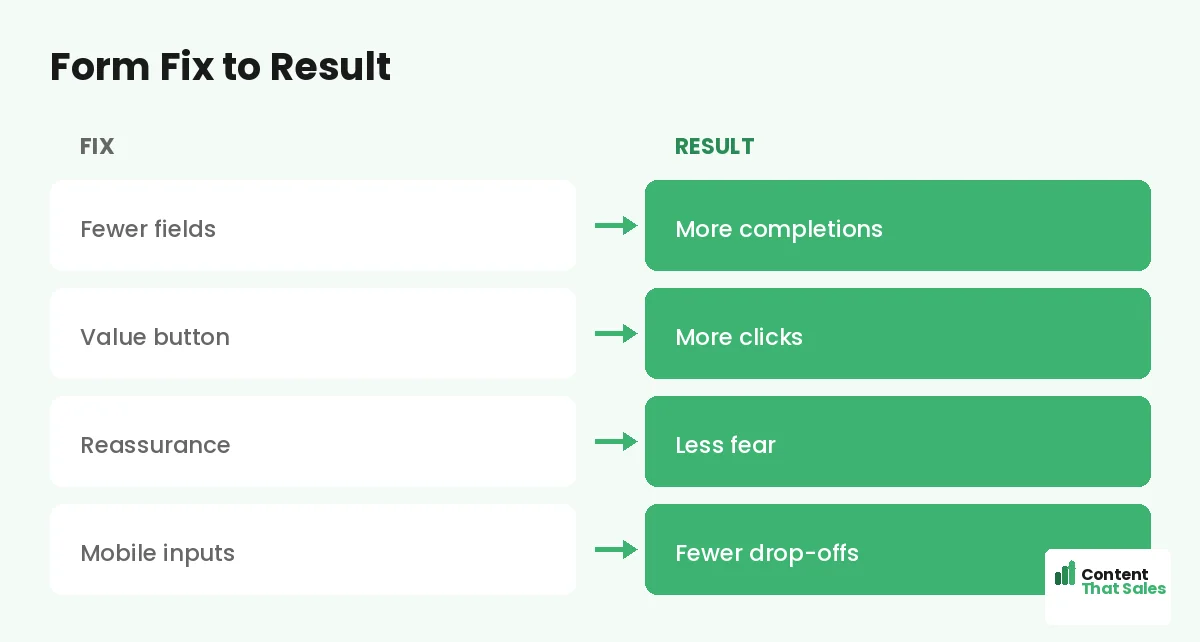
The most common form mistake is asking for too much. Every extra field lowers completions, and a long form feels like work before the visitor even starts. Name, email, phone, company, budget, and more is a wall that stops people.
The fix is to ask for only what you truly need to take the next step. Often that is just a name and an email. You can gather more later. A short form is one of the fastest ways to lift lead capture, a core idea in our lead generation landing page examples.
Mistake 2: Asking for Too Much Too Soon
Some fields feel intrusive early in the relationship. Asking for a phone number, budget, or company details before any trust is built makes people hesitate. They are not ready to share that just to grab a guide or a quote.
Match the ask to the stage. For a top-of-funnel freebie, an email is plenty. Save deeper questions for later, once trust is built. People scan more than they read, and they judge a form’s effort at a glance, so keep it light.
Mistake 3: No Reassurance Near the Form
Visitors worry about spam, privacy, and what happens next. A form with no reassurance leaves those fears unanswered. Without a calming word, even a short form can feel risky to a cautious visitor.
Add simple microcopy near the form: “We never share your details,” “No spam, ever,” or “Takes 30 seconds.” These small lines remove the last doubt. A reassured visitor is far more likely to hit submit.
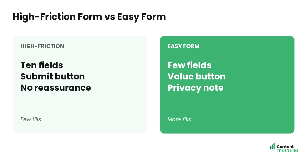
Mistake 4: A Vague Submit Button
The button label matters more than people think. “Submit” is cold and generic. It names the task, not the reward. A vague button gives the visitor no reason to feel good about clicking it.
Make the button name the value. “Send me the guide” or “Get my free quote” tells the visitor exactly what they get. This follows solid landing page CTA best practices. A specific, value-led button lifts form completions.
Mistake 5: Poor Mobile Fields
Most visitors fill forms on a phone, so clunky mobile fields kill conversions. Tiny inputs, the wrong keyboard, and fields that are hard to tap all frustrate the user. A form that is painful on mobile loses the lead.
Use big, tappable fields and the right input type, like a number pad for phone numbers. Make labels clear and the form easy to complete one-handed. A smooth mobile form captures the lead that a fiddly one would lose.
Did you know?
Cutting a form from many fields down to just a couple can lift completions sharply. The form is often where the most leads quietly leak away.
Mistake 6: No Clear Error Handling
Nothing frustrates a visitor like a form that fails without explanation. If they submit and nothing happens, or an unclear error appears, they often give up. A confusing failed submission is a lost lead at the finish line.
Make errors clear and helpful. Show exactly which field needs fixing and why, in plain language. Keep the data they already typed. A form that handles errors gracefully keeps the visitor moving toward a successful submission.
Mistake 7: Hiding the Form or Burying It
Some pages make the visitor hunt for the form. It sits far below the fold with no clear path to it. A ready visitor who cannot find where to act may simply leave instead of scrolling to look.
Make the form or a clear path to it easy to find. On a short page, keep the form visible. On a long page, repeat a button that jumps to it. The action should never be hard to reach. A buried form is one of the wider landing page mistakes that quietly drain conversions.
Mistake 8: No Sense of What Happens Next
Visitors hesitate when they do not know what follows the submit. Will someone call? When? What will they receive? Uncertainty about the next step adds friction right at the moment of action.
Set expectations clearly. A line like “We’ll email your guide instantly” or “We’ll call within one business day” removes the unknown. When the visitor knows exactly what happens next, they submit with confidence.
Consider a Multi-Step Form
If you truly need several fields, a multi-step form can help. It starts with one easy question, which builds momentum, then asks the rest. Breaking a long form into small steps often beats one intimidating wall of fields.
The first easy step gets the visitor invested, so they are more likely to finish. This works well for quotes and assessments. Just keep the total ask reasonable. A multi-step form reduces the perceived effort, even when the field count is similar.
Test Your Form
Do not guess which form works best. Test it. Try removing a field, changing the button copy, or adding reassurance, and watch completions. Forms are one of the highest-leverage things to test, since they sit at the moment of conversion.
Change one thing at a time so the result stays clean. Keep what wins. Simple, clear forms tend to convert best, since easy reading lifts conversions. A tested form captures more of the interest your page works hard to build.
How Content That Sales Optimizes Forms
The form is where leads are won or lost, and the copy around it matters. That’s where we come in. At Content That Sales, we trim forms, write value-led buttons, and add the reassurance that turns hesitation into completed submissions.
You share your page and your goal. We optimize the form copy and the flow around it, part of our broader landing page copy work. The result is a form your visitors actually finish, so more interest becomes real leads.
Ready to Turn Visitors Into Customers?
Now you know the common landing page form mistakes to avoid. Trim the fields. Ask only what you need. Add reassurance. Use a value-led button, fix mobile, and set clear expectations. So why lose leads at the finish line to a clunky form?
Let’s make your form effortless to complete. Book your free consultation now. Call us at 8801631988589 or email service@contentthatsales.com. Let’s turn your next visitor into your next customer.
Frequently Asked Questions About Landing Page Form Mistakes
What is the most common landing page form mistake?
Asking for too many fields. Every extra field lowers completions, so a long form sheds leads. Ask only for what you truly need to take the next step.
How many fields should a form have?
As few as possible, often just a name and an email. Match the ask to the stage, and save deeper questions for after trust is built.
Should I add reassurance to my form?
Yes. A short line like “no spam, ever” or “takes 30 seconds” removes last-minute fears about privacy and effort, which lifts completions.
What should the submit button say?
Name the value, like “Send me the guide” or “Get my free quote.” A specific, value-led button beats a cold “Submit” every time.
Do multi-step forms work?
Often, yes. Starting with one easy question builds momentum, so people are more likely to finish. They reduce the perceived effort of a longer form.
Why does mobile matter for forms?
Most visitors fill forms on a phone. Clunky fields and the wrong keyboard frustrate them. Big, tappable, mobile-friendly fields capture more leads.
Should I test my form?
Yes. Forms sit at the moment of conversion, so they are high-leverage to test. Change one thing at a time and keep what lifts completions.
Can you optimize my landing page form?
Yes. Content That Sales trims forms and writes the copy that lifts completions. Reach out for a quick quote.