 Skip to content
 How many CTAs on a landing page is too many? The honest answer is that more than one distinct action is usually too many. You can, and should, repeat the same call to action several times down the page. But the moment those buttons ask for different things, you split the reader’s focus and your conversions drop. This guide explains the difference between repeating one CTA and piling on many, and how to find the right number for your page.
It feels generous to offer choices. Buy now, or book a call, or grab the guide. But choice is not a gift here. It is actually a real burden on the reader. Every extra option makes the decision harder, and a harder decision means more people simply decide to do nothing at all. Let’s clear up how many CTAs your page really needs.
Below, we cover why one action wins, when repeating it helps, the rare cases where a second option is okay, and the signs you have gone too far. By the end, you will know exactly how many buttons belong on your page.
The Short Answer: One Action, Repeated
Aim for one distinct call to action per page. That single action can, and should, appear several times. A button up top, one after the benefits, and one near the end all pointing to the same goal is perfect.
So the magic number is not really a number of buttons. It is a number of actions. One. This is the heart of the rule of one goal per landing page. Repeat the ask, but never change it.
Repeating a CTA vs Adding New Ones
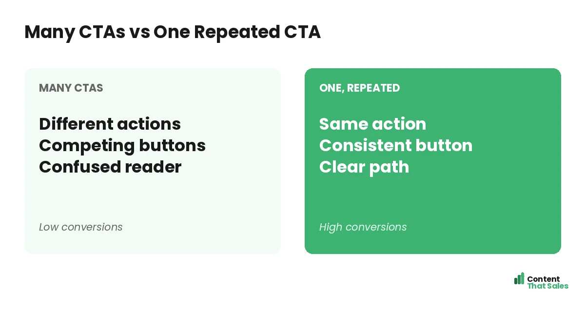
There is a big difference between repeating and multiplying. Repeating the same CTA builds momentum. The reader sees the same clear ask again and again, and it feels like the natural path. That repetition helps, not hurts.
Adding new, different CTAs does the opposite. “Buy now” next to “Book a call” next to “Download the guide” forces a choice. The reader has to stop and pick. That pause is where conversions leak away.
Why Too Many CTAs Hurt Conversions
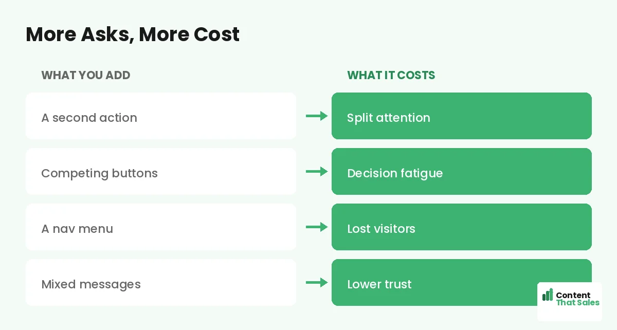
More options cause decision fatigue. Faced with several choices, people often choose none. This is a well-known effect, and it quietly kills landing pages. A single clear path is far easier to follow than a fork with five branches.
Competing buttons also dilute your design. When everything begs for a click, nothing stands out. People scan more than they read, so a page full of buttons just looks busy and confusing. Focus wins the click. A page that asks for one thing, clearly and repeatedly, will almost always beat a page that asks for five.
How Often Should You Repeat the CTA?
Repeat the CTA wherever the reader hits a moment of high interest. After the headline, for the ready buyers. After the benefits, once desire builds. After the proof, when trust peaks. And near the end, as a final nudge.
On a short page, two or three placements are plenty. On a long page, more is fine, as long as every button is identical in purpose. The rule stays simple. Same action, shown again when the reader is most likely to act.
Did you know?
Adding a second, competing offer to a page has been shown to cut conversions by a wide margin. One focused ask almost always beats two.
When a Second CTA Is Okay
There is one safe exception. You can offer a primary CTA and a softer, secondary one, as long as the secondary clearly takes a back seat. For example, a bold “Book my free call” with a quiet “Or download the guide” below it.
The key is hierarchy. The main action must dominate in size, color, and placement. The secondary option is a fallback for those not ready to commit. Keep it visually quiet so it never competes with the primary ask.
The Danger of the Navigation Menu
Here is a hidden source of extra CTAs. Your header menu. Every nav link is a tiny call to action pulling the reader away from your goal. On a landing page, that menu is working against you.
The fix is simple. Remove or trim the menu on landing pages. Keep the focus on the one action. This is a core part of landing page CTA best practices, and it can lift conversions on its own.
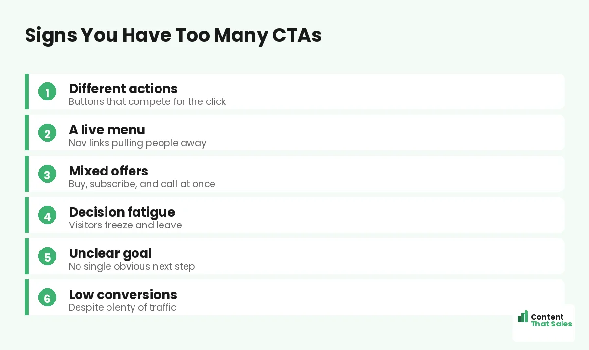
Signs You Have Too Many CTAs
Watch for the warning signs. Buttons that ask for different things. A full nav menu up top. Several offers competing on one screen. A page where you cannot name the one action in a second. Each points to CTA overload.
The clearest sign is your own confusion. If you are unsure what the page wants the reader to do, the reader is too. When in doubt, cut back to one action and watch what happens to your numbers.
How to Find Your Right Number
Start with one action and repeat it a few times. Then test. Try more placements of the same CTA and see if conversions rise. Try adding a quiet secondary option and see if it helps or hurts. Let the data guide you.
Keep the wording specific and consistent, drawing from the best CTA copy for landing pages. Simple, clear buttons win, since easy reading lifts conversions. The right number is the one that converts best for your page, proven by testing.
Quick Rules to Remember
Keep it simple with a few rules. One distinct action per page. Repeat that action at natural high-interest points. Use a secondary CTA only if it stays visually quiet. And trim the menu so it does not compete.
Follow these and you will never wonder if you have too many buttons again. The page will have one clear job, shown clearly, more than once. That focus is what turns readers into leads, and leads into the customers your business actually runs on.
How Content That Sales Gets CTAs Right
Knowing how many buttons to use is part judgment, part testing. That’s where we come in. At Content That Sales, we build pages around one clear action, repeat it well, and cut anything that competes.
You share the offer and the goal. We design the CTA strategy and write the copy that earns the click. If you want done-for-you landing page copy, we make it effortless. The result is a page that asks for one thing and gets it.
Ready to Turn Visitors Into Customers?
So, how many CTAs on a landing page is too many? More than one distinct action. Repeat one ask, keep any secondary option quiet, and trim the menu. So why let competing buttons split the focus you worked so hard to build?
Let’s build a page with one clear, winning action. Book your free consultation now. Call us at 8801631988589 or email service@contentthatsales.com. Let’s turn your next visitor into your next customer.
Frequently Asked Questions About How Many CTAs to Use
How many CTAs on a landing page is too many?
More than one distinct action is usually too many. You can repeat the same call to action several times, but asking for different things splits focus and lowers conversions.
Can I repeat the same CTA multiple times?
Yes, and you should. Repeating one clear action at high-interest points builds momentum. Just keep every button identical in purpose and wording.
Why do too many CTAs hurt conversions?
They cause decision fatigue. Faced with several choices, people often choose none. One clear path is far easier to follow than many competing ones.
Is it ever okay to have two CTAs?
Yes, if one is clearly primary and the other is a quiet secondary option. The main action must dominate in size, color, and placement.
Does the navigation menu count as a CTA?
In effect, yes. Every nav link pulls the reader away from your goal. On a landing page, trim or remove the menu to keep the focus.
How often should I repeat my CTA?
After the headline, the benefits, the proof, and near the end. Short pages need two or three placements, while long pages can use more.
How do I find the right number for my page?
Start with one action repeated a few times, then test more placements or a quiet secondary option. Let the conversion data decide.
Can you set up my landing page CTAs?
Yes. Content That Sales builds focused CTA strategies that convert. Reach out for a quick quote.